Quantcast
Channel: Painting My World
Viewing all 2266 articles
Browse latest View live

Make More Art...March Madness Challenge

$
0
0

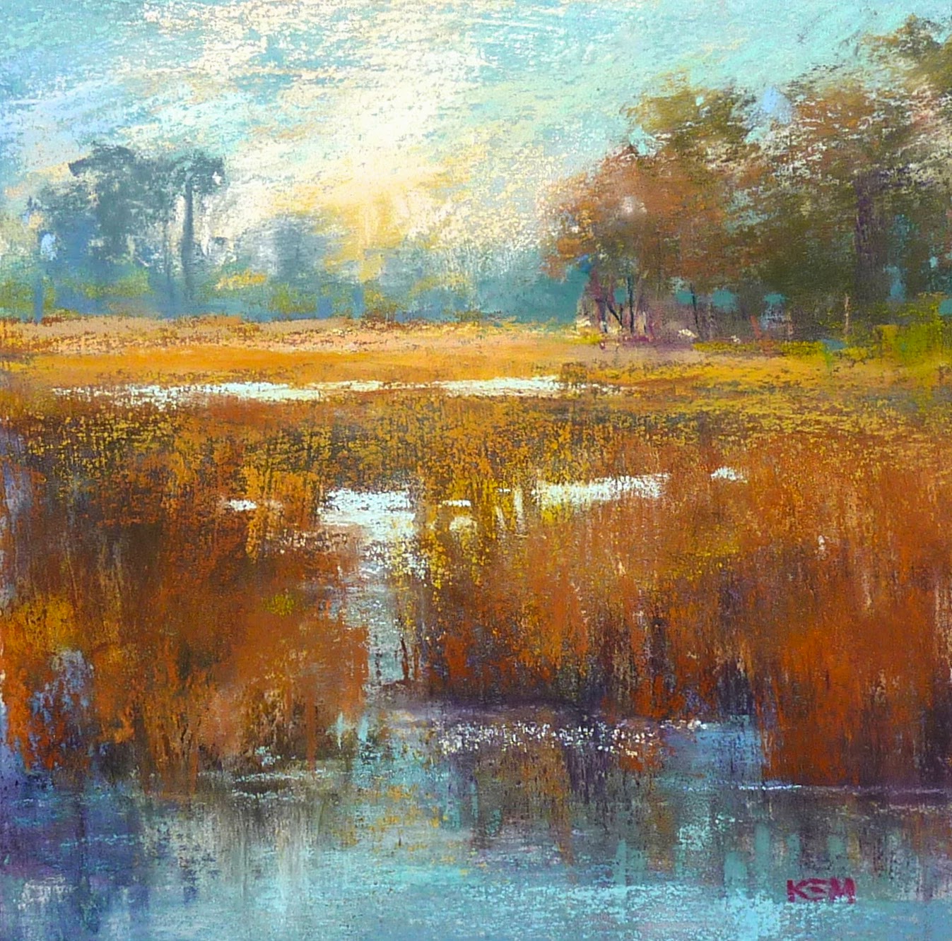
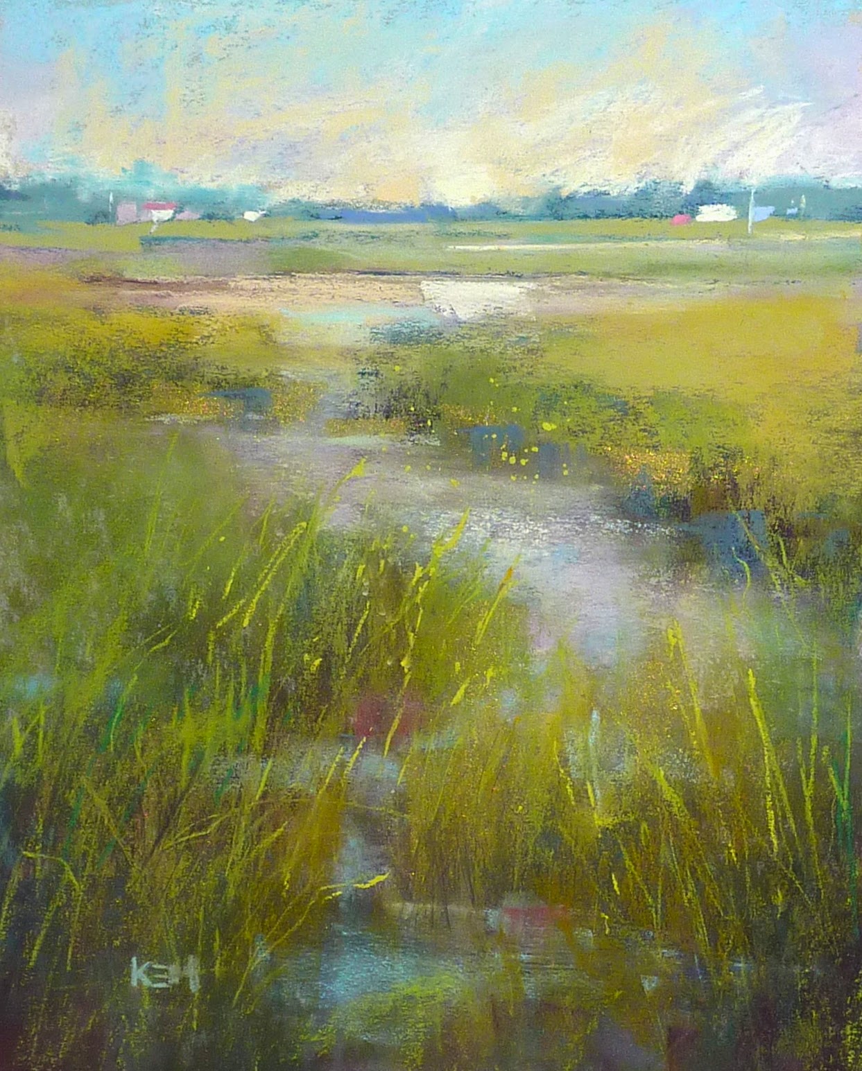
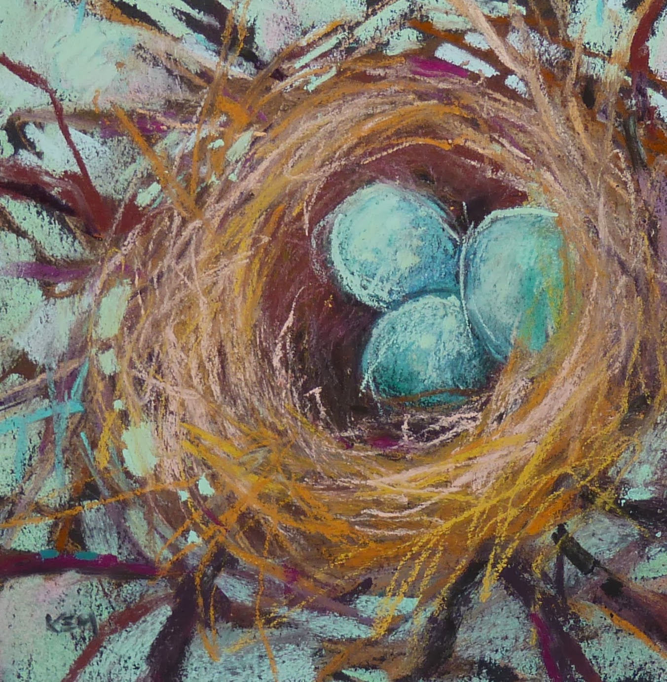
'A Bird's Eye View'           6x6          pastel          ©Karen Margulis
click here to purchase in my Etsy store $45

Sometimes I feel like a mad artist in my studio. I furiously go from one project to the next. I have several paintings going at once and ideas for many more on the back burner.  There aren't enough hours in the day to do all that I dream about.

So it seems a bit mad to add yet another project to my day but this is one I can't resist. I am calling it March Madness.  It is a challenge I put together for one of my private students who needed a gentle nudge to get in the studio to paint more. It sounded fun so I will be joining her.

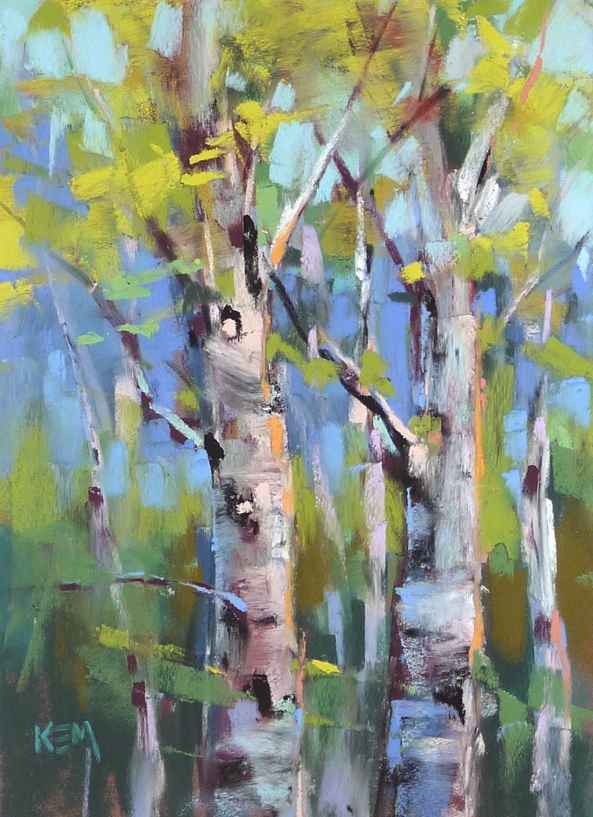
The idea is to choose a very simple subject such as a pear or a sunflower. I am choosing a nest in anticipation of spring and the arrival of my grandbaby Greta. (she is due March 11).  For the month of March we will paint our simple subject as many times as we can. Every day if possible.  It doesn't matter what medium or what size.....in fact it will be more fun to mix it up and try new ways to interpret the subject. I began with two pastel nests but who knows what the rest of the month may bring!

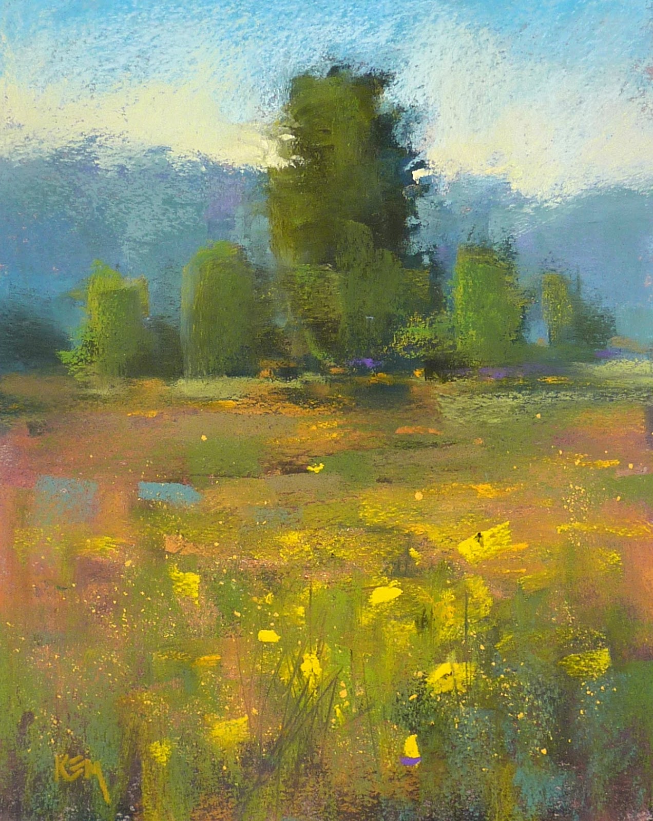
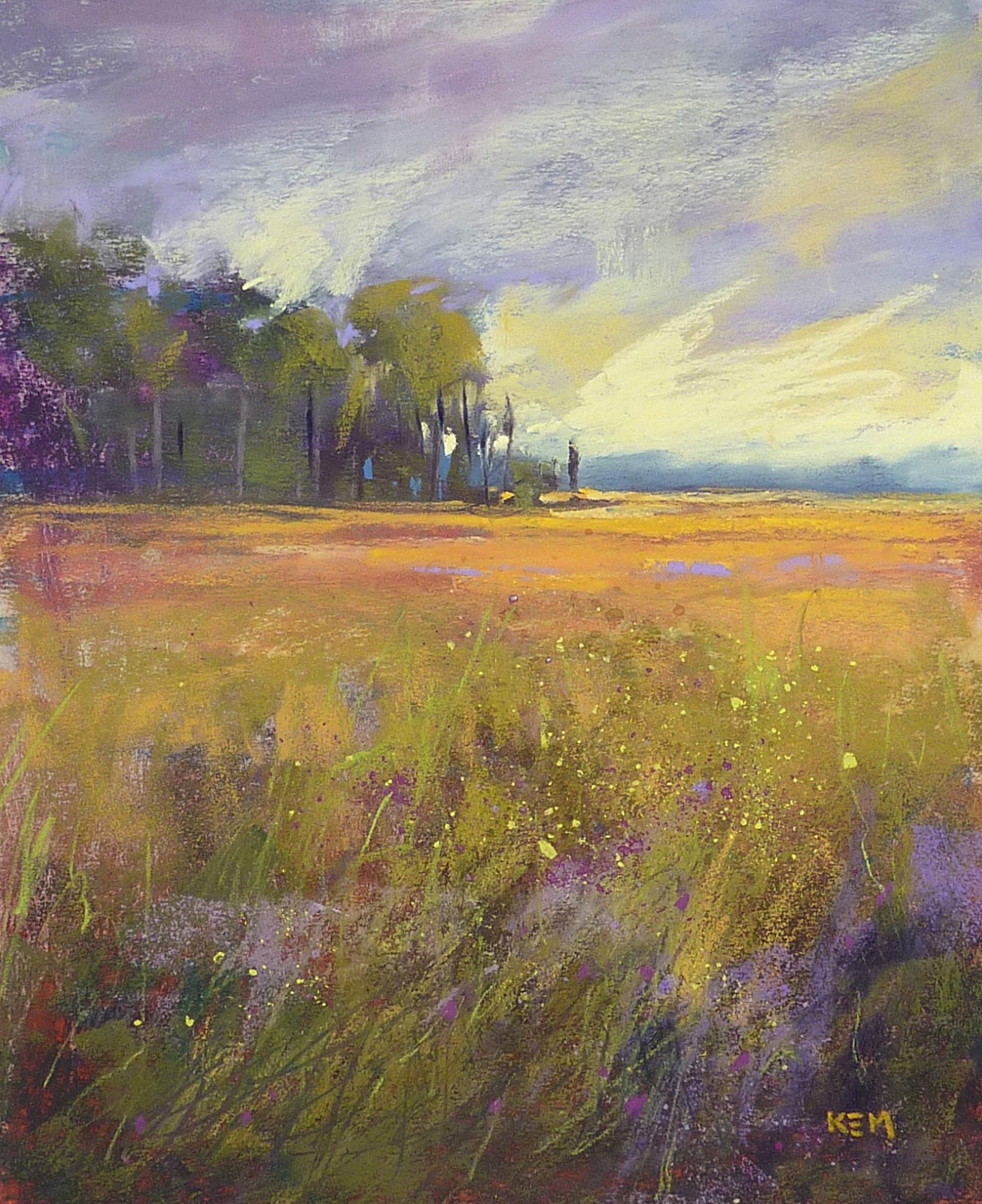
'New'           6x6            pastel
click here to purchase $45
The idea behind this challenge is to have fun creating art.  It doesn't matter what may be holding you back from creating art....fear of failure, lack of time or motivation....maybe a combination of things.  By taking the pressure off and just painting for creation's sake my hope is to emerge from the challenge invigorated and inspired.  It is time to Play!

I'll post my new nests here on the blog and on Instagram.  If you are on Instagram I invite you to follow me! KarenMargulis

Both of today's nests are pastel on Strathmore Black Artagain paper.

Landscape Painting Tip of the Week...The Sun Tool

$
0
0
'Chasing the Sun'           12.5 x 18           pastel              ©Karen Margulis
purchase here $145
I couldn't have planned it better if I tried.  It was one of those teachable moments that I had to jump on. And now I have another tool in my bag of tricks!  I'll call it the Sunlight Tool. What is it?  A tool that helps remind you where your light source is coming from so you can make sure your landscape painting makes sense. Here is how it came about.

In my pastel class today we are starting a new series on painting the landscape.  We were discussing how we don't always have to copy a reference photo and the subject of the light source came up. (my students always have such great questions!)  I wanted to point out that if we change the direction  of the light we needed to remember to be consistent in our treatment of the light and shadows on the entire landscape.  We can no longer rely on the reference photo. You don't want some bushes to be lit on one side and some on the other. You want to make sure the shadows fall away from the light and are consistent over the entire painting.

How can we remember to do this once we move away from the photo?  I usually like to draw a little circle on my drawing board to represent the location of the sun. It works.  But today a student happened to have a scrap paper taped to her board and on it was a bright yellow mark.  Aha!  It gave me an idea. 

 Why not have a small sun that you can position on your board to represent the location of the sun in the painting! This sun can be laminated and kept by your easel to be used in any landscape with a light source. 


I came home from class, made my sun and gave my idea a try.  Have a look at the photo above. I decided that the sun in my reference was setting. It was low in the sky and coming from behind me.  The tops of the distant trees and a small sliver of the marsh was still lit from the sun. The foreground was all in shadow.  I placed my Sun Tool on my board in the lower left. As I painted it was a visual reminder to keep my lighting consistent.

This painting was pretty straightforward but the Sun Tool will come in handy for more complicated landscapes and ones in which I change the direction of the light.

 So now When I ask myself what kind of day is it....what direction is the sun coming from and is it high or low in the sky? ....I have my own little sun to make sure I remember my answers!

watercolor underpainting on Uart with additional clear Gesso


Nest #3  Monotype with pastel      5x7
Today's nest is a monotype I had done with black ink but I added pastel for color.

The Most Important Thing about Creating Depth in a Landscape Painting

$
0
0

'Into the Sunflower Field'          5x7        pastel     ©Karen Margulis
sold
 It was another one of those 'AHA' moments.  I love when that happens. When all  of the sudden someone says something about painting and it clicks. Sometimes it is cumulative.  You read about a painting concept and hear instructors talk about it and when it finally clicks....all of the stuff you stored away begins to make perfect sense.

It happened like that for me with the idea of creating depth in a landscape painting. I understood the principles of Aerial or Atmospheric Perspective. I could recite the list of things that happen as we view things through the layers of atmosphere. But I didn't really put it to work in my paintings as well as I could have.

Here is what did it for me....the idea that we are putting on a show and sometimes need to exaggerate things. This idea is probably cumulative with a lot credit going to the wonderful instruction of Richard McKinley and Stan Sperlak and my first teacher, Marsha Savage. It took a lot to get this concept drilled into my brain!

To Create the Illusion of Depth in a Landscape Painting we sometimes need to Exaggerate the effects of aerial perspective 

reference photo

Why do we need to exaggerate and what do we need to exaggerate?

To quickly review aerial perspective... the appearance of things change as they recede into space due  to the influence of the atmosphere .....colors get lighter and cooler and less intense, detail is lost, edges become softer. The more stuff ...moisture, pollution...in the atmosphere, the more pronounced the changes.

  • Sometimes these changes are obvious sometimes not. Many times our reference photos do not capture these changes.  A point and shoot camera especially tends to capture crisp detail from front to back.  The camera or print often doesn't capture the subtleties of the color and value shifts. 


  • We then need to exaggerate these effects so that our paintings have a sense of space and depth.

My reference photo (above) didn't really show the cooling and lightening of color and values. It didn't show the loss of detail. The green in the foreground looks like the same color green as in the background. I decided to push these effects and exaggerate them. I also added some yellow flowers and made them get smaller and duller as they went back into the picture....another way to create depth.

It is important to understand the tools we have to create depth but even more important is to understand that sometimes we need to exaggerate for a better painting!

Get Ready for Green!

$
0
0
'Back to Stone Harbor'                12 x 19.5             pastel              ©Karen Margulis
purchase here $165
 Green. I used to avoid it.  Dare I say I didn't even like it! Painting with it that is.  But since I live in the Southeast which is the Land of Green I have come to embrace it and maybe even like it.  I still long for the desert and the wonderful colors of the Southwest. But as long as I can visit at least once a year I am happy living and painting in the Land of Green.

 Most of my paintings have been very green this week.  I think it is partly due to being winter weary and ready for spring.  I also did some green paintings as demos for my classes on creating depth. It is easy to show how to create depth with a green landscape. It gets trickier with warmer colors.

Are you ready to paint the greens of spring and summer?  Here are a few quick tips....


'Florida Wetlands'            8x10            pastel
click here to purchase $125
  • Make sure you have the *right* green pastels. If you plan to paint a lot of green landscapes you will want to have a good selection of greens.....light, middle and dark values. You need some warm and cool greens but you also need some neutral of gray greens.  Many introductory sets don't include enough of the right greens. Many have a majority of middle value in bright artificial looking greens. These greens can be overpowering in a landscape unless balanced with neutrals.
  • Lay out all of your green pastels....give them a good cleaning with a paper towel or by shaking them in cornmeal or sand.....now evaluate them. Make a list of the greens you are lacking and order some open stock of your favorite brands.
  • Remember that you can make your green landscapes more interesting by incorporating the complement in your green masses. Greens are more exciting with some red or orange.  Add some purple for the finishing touch.


'Down by the Creek'         8x10        pastel
click here to purchase $125

How to Have Success with Canson Paper

$
0
0
'Fairyland'          9 x 12.5           pastel         ©Karen Margulis
available for purchase here $145
It never ceases to amaze and intrigue me. It is such a simple thing but can make a big difference in a painting on Canson paper.  Canson Mi-Teintes paper is actually one of my favorite pastel papers. I know many artists dislike it. I know many also love it.  I have blogged about it before and heard from both sides.  I have decided that knowing a few tricks can make it into a great surface.  Which is a good thing since it is so affordable.

One of the problems many have with Canson is they fill the tooth of the paper too quickly and colors start turning muddy. It is impossible to add fresh layers of pastel to it. Frustrating!

Here are a few things to try to help you avoid this problem:

  • Try using softer pastels but be sure to apply them with a light touch. The lighter the touch the more layers possible.
  • Have a plan...if you have a value and color plan it is easier to make a mark and leave it alone rather than fiddling as you try to figure out what you want. (and filling the tooth in the process)
  • Try using sandpaper to roughen the paper and making it more receptive. (I don't do this but I have heard it works)
  • When you do fill the tooth of the paper try my FAVORITE TIP....spray the area with a light spray of workable fixative. I use Blair Low odor workable fixative.  When it dries your next pastel layers will easily go over the fixed areas without disturbing these areas. This has a great textured look. (see the photos below) Be sure you only uses a light spray. You don't need to soak the paper. You might want to cover areas you don't want spray but I kind of like the extra droplets!


close up views of my marks and texture created by applying pastel over fixative

I used the fixative several time in the creation of today's painting. I used it to make the suggestion of foliage in the trees. I also used it to darken the bottom of the path.  I love workable fixative especially on Canson!


How to Avoid the Long Lost Pastel Syndrome

$
0
0

'Spring Comes to the Mountains'           5.5 x 7.5         pastel on Pastelmat        ©Karen Margulis
sold
 They are the illusive ones.  I would love to replace them but I don't remember the details....a warm peach, a medium mauve and a distant mountain blue. These three colors remain a mystery.  The mauve and blue are long gone. As the peach dwindles down to an ever smaller nub I continue my search. I find pastels that are close....but they are still not my long lost friends.

Perhaps if I had made color swatches or charts of each new pastel I acquired I might have better luck funding a replacement.  But I didn't always take time to make charts and the ones I made I can't find.  Lesson learned.

Making a Color Chart
When my latest set arrived I was happy to see a blank color chart inside the box. I got a great deal on this set of Great American Plein air set of 60 half sticks. I was anxious to try them but I made myself wait until I had a chance to fill in the color chart. The chart is now safely kept on my pastel shelf. And I was thrilled to discover some very close matches for my illusive colors! So at least now I will be able to replace them when needed.

I don't usually worry so much about matching exact colors. So I never really saw the need for a color chart.  I was happy to find something close. If I was low on a color I just asked myself what it was close to....was it warm or cool? Was it dark, medium or light? Intense or greyed?  This system works pretty well and it kept my palette from always looking the exact same.  

This approach is still the best way to replace pastels for me.  But sometimes we just have certain colors that we really love.  There may be colors that are close....but we still feel we need the exact match. Taking the time to make a color chart is worth the effort to help you avoid the frustration of a search for a long lost favorite!


'Down by the River'         5x7         pastel on Uart
click here to purchase $45
Both of today's paintings are done with this new set of pastels with no underpaintings.

How to Paint Daisies in Pastel...New Demo

$
0
0

'Daisies Make me Smile'            9x12              pastel            ©Karen Margulis
click here to purchase $165
Daisies make me smile!  I love to paint them but I wasn't always successful. In fact anytime I tried to add wildflowers to a painting they would look childish and sweet. I didn't want that! I wanted my wildflowers to look authentic ...to look like they belonged in the landscape and not just an afterthought. I wanted them to look as wild and free as I saw them.  But they always looked stiff and boring.

I didn't give up.  I just practiced and observed and tried different techniques.  I am still learning but at least now my daisies don't look like they were painted by a preschool child!  I have discovered ways to help me paint them better.  I am excited to be able to share my discoveries with you in my latest demo.
The demo is available as a pdf booklet in my Esty shop for $6. Click here for details 

The cover of the pdf booklet
This demo is my biggest one yet!  It is 30 pages filled with 60 color photos. I have documented each step of the painting from the watercolor underpainting all the way through the layering of the pastels.  I extensively cover the watercolor underpainting stage....something I didn't always have great success with!  Through the many photos and my description you will be able to see how I work through the addition of pastel while preserving the underpainting. Here are a few sample photos:


close up photo of watercolor underpainting
sample from the pdf demo

This demo is a PDF file so you can either print it out and staple the pages into a booklet or just save it and follow on your computer or tablet. I know several artist who like to follow and paint along on their iPads.
I would love for you to take a closer look and consider giving this demo a try. I have 6 other demos available as well. They can be found in my Etsy shop.
Here is a link to the demos.

The Roller Coaster Ride of Juried Shows

$
0
0
'A Moment of Silence'        24x36          pastel on board          ©Karen Margulis
available $650 click here
 It was a good weekend. No it was an amazing weekend!  My granddaughter Greta was born on Saturday. Mom, dad and baby are all doing well and we can't wait to meet Greta!  It really can't get any better than that!  So when I found out I had two paintings accepted in the Southeastern Pastel Society's 16th International Exhibition it was a very nice way to end the weekend.

I was lucky this time.  I entered what I felt was my best work at the time. I picked my personal favorites. But you just never know what will resonate with the juror. I am always prepared for rejection. I realize that being an artist is like riding a roller coaster....full of ups and downs. And I have discovered over time that when you don't get through one door....there is another one waiting for you. So I keep trying even when things don't go my way.

Don't let the fear of failing stop you from trying!  There is a lot to be gained from entering juried exhibitions.  Entering shows has helped me become a better artist!  How?


  • It gives me a goal...a reason to work hard and paint enough so that my work continues to grow. The first year I began painting I went to the SPS exhibition. I was inspired and awed at the wonderful pastel work. I decided I would work hard to get better and eventually get in that show. It wasn't my only goal but it was a big one...and it helped push me to paint everyday.(I did get in that next show)
  • It validates  me as an artist. Some of us don't need validation. But some of us find it helpful. If we are recognized by our peers and have someone say we painted well....it helps motivate us to do more. Even if you don't have your work accepted just going through the process makes it all real. 
  • It helps me get out and meet other artists.  Art can be a lonely business. I love my alone time in the studio but I enjoy sharing with other artists. Joining art groups and entering shows gets me out of the studio and has allowed me to meet the most amazing people.
  • It makes me stronger....whether accepted or not ...entering a show and going through the process puts me on that roller coaster.  I have  learned to adjust and deal with the ups and downs and how to make the best of the ride. Just remember you have to enter to ride! 


Here are the two paintings that were accepted. The painting at the top of this post was not accepted.

'Treasures of the Marsh'        18x24    pastel

'North Garden in Winter'       8x10       pastel 


Why We Need to Stop Painting

$
0
0

'Stop for the Poppies!'              11x14             pastel              ©Karen Margulis

STOP PAINTING!  Put the pastel down and back away from the easel!  I need to remind myself to do this more often.  We can get so caught up in a painting that we sometimes forget just how important it is to take a break, back up and see what is happening in the painting.  Things look different when we aren't on top of the painting. We see potential problems before they grow out of control.  We might even be closer to being finished than we thought.

Today's painting is a perfect example of what can happen when we don't stop and step back.  The picture below is the demo I did for my class last week.  I was demonstrating the creation of depth in a painting. When I demo I don't step back.  I am usually too busy painting and explaining what I am doing.  In this case I didn't notice some bad compositional decisions that I might have seen if I had moved away from the painting.  Can you spot them?

Before making changes
After my class left I looked at the painting from afar and immediately saw that I had everything in the center. I also had the two larger poppies lined up with the two big trees. They were also the same height.  It seemed too regular and even. There wasn't anything to balance this big heavy shape of trees and flowers. Here is what I did:

I decided to add another medium size poppy in the top right to break up the boring tree shape and pull the eye out of the center. I then added some more purple flowers on the left to balance the bigger flowers in the center.  I like it better but it took moving away from the painting to see these issues.

It really does make a difference when you Stop Painting and Step back!  If you tend to get so engrossed  in your painting that you forget to take frequent breaks to step away....make it a point to get into the habit.

  • Set a timer for 20 minutes. Stop painting when the timer goes off. Step back and evaluate the painting. Decide what your next step will be. Repeat every 20 minutes. When you don't know what else to do Stop again. Don't just keep fiddling...every mark needs a purpose at this stage and if you don't know what that purpose is...take a break and come back to the painting with fresh eyes!
  • If you sit to paint it is still important to take a break and step back from the painting. I stand usually but when I do sit I use my rolling office chair and wheel back to have a better look!

How to Organize Your Pastels for Under $10

$
0
0


'Summer of the Art Spirits'          11x14           pastel        ©Karen Margulis
Available for purchase here $175
You know it is time.  That moment when it takes you longer to set up and put away your pastel boxes than it does to paint.  That moment when you struggle to find the right color even though you know you must have it...somewhere.  One of the best things I ever did for my growth as a pastelist was getting a Heilman box and organizing all of my pastels in one place... one box with sections that allowed me to see all of the colors and values I had at a glance.  Once organized I quickly made progress. It allowed me to paint efficiently without spending time hunting through a pile of open boxes. It also allowed me to see what pastels I was lacking so I spent my money wisely. Read my post here on organizing pastels.

Pastel Boxes can be expensive and while they are definitely worth it, your budget may not allow it.  I have made my own boxes and even used cigar boxes which work. Many artists like to use tackle boxes or plastic containers but these don't really allow you to spread out the pastels the way a pro box does.

Here is a solution for a studio organizer for pastels and it costs less than $10!

Julie Whitehead's $8 Pastel Organizer
My artist friend, Julie Whitehead from Australia shared this wonderful solution for organizing pastels in the studio. Here is her description:

"After reading your blog about sorting pastels into values etc I decided I needed to do this even though I don't have that many ( got some TL's winging their way to me as I write this!)  After buying new pastels there was no way I could afford a Pastel Box so I had to get creative and came up with an old stretched canvas (flipped) with some corrugated paper lining it and then some dividers made from old card stock.  It works great and only cost me $8 ---- now obviously it would be no good for outdoors but until I can save up for a good pastel box it does the job.  I thought maybe it may be of interest to other beginners who follow your blog. Anyway, thank you sooo much for your daily blogs and the inspiration you give me every time I read."


Thank you for sharing Julie!  I love your ingenuity!  It is best used as a studio box but in a pinch you could make a foamcore cover and large rubber bands if you needed to take it to class....just be sure to keep it flat! 
I know my readers are very creative so if you have a homemade box you would like to share send me some pictures and a description and I'll share in an upcoming post!  Email me  if you have a box you'd like to share!

Remember this...The KEY to painting well is to be organized with your supplies and having your pastels arranged so you can easily find the value and color you need(click to tweet)

Watercolor Underpainting....Choosing Colors

$
0
0
'The Morning View'            8x8          pastel            ©Karen Margulis
available for purchase $65 click here

It's the million dollar question!  What colors do we choose for a watercolor underpainting?  Actually, it doesn't matter what kind of underpainting we are doing....whether it be a pastel block-in or a wet media such as watercolor.....we have to pick colors.  But which ones?  It can be a bit scary. What if we choose the wrong colors?

There is good news and bad news.  The good news is there really is no such thing as the wrong color.  Any color that we put down in the underpainting will have an effect on how the pastel layers we add will look so some color choices will better than others in expressing our idea for the painting.  Cool colors will generally make a painting cool and moody and a warm underpainting will help a painting feel warm and sunny. 

Having an idea of what we want to achieve will help. But we can certainly work with any colors we put down so never be afraid of trying a color.

The bad news....there is no formula to help us know what color choices are better...there is no quick answer.  You just have to do lots of underpaintings until you start to see what works. Then your color choices will become more intuitive. Practice is fun though!

Watercolor underpainting on matboard with clear gesso 
In my daily painting practice I have done hundreds of underpaintings of all kinds. Choosing colors is easier than it used to be. I am not afraid to try different combinations of colors to see what might happen. I am not afraid of always getting it right.  A lot can be discovered by unexpected colors!  Here are a few ideas to get you started in underpainting practice:

  • Choose to underpaint with values rather than worry about color....make a value map
  • Use Complimentary colors...decide what your ending colors will be and choose the compliment for the underpainting colors.
  • Use bolder than usual colors....it is always easier to tone down a bright color than try to put it in on top of a lot of layers of pastel.
  • Use colors to help suggest depth....cooler in the distance and warmer in the foreground.
  • Use local color. There's nothing wrong with that! But try a bolder version of the local color to add some punch.
In my underpainting for today's painting I used a combination of the ideas above. I used bolder local colors with a value map.  Underpainting practice is a lot of fun and you never know what you might discover!

If you would like to learn more about watercolor underpainting and see lots of progress photos have a look at my latest pdf demo (available in my Etsy Shop)


The Beauty of Brown Pastels

$
0
0
'Nestled'           10x10         pastel           ©Karen Margulis
available for purchase $145
 I feel bad about it.  Maybe I was a bit too harsh. There really is nothing wrong with the color brown.  I just wanted to encourage my students to look for colors other than 'crayon brown' for their tree trunks.  So I said I never used brown pastels. I need to clarify that statement.

I think Brown is a beautiful color. My Siamese cats are brown. Chocolate is brown. Brown is a rich comforting color.  But....when I think of painting things that are considered brown I rarely reach for the brown in the pastel set that looks like the brown crayon in a box of Crayolas. It is hard to resist. After all....this is the color we grew up with. If it was brown this is the color we reached for. It is hard to break this habit.

'Gently into Spring'        5x7       pastel
click here to purchase $45
Brown is not always Brown!

 It's all how you look at it.  If the local color of something is brown. I ask myself what kind of brown is it?  Is it a warmish brown? Does it look orange or yellowish?  Maybe it is a coolish brown. Can a see it leaning towards blue, green or maybe purple?  Brown is more than crayon brown. I will often use brown pastels but I never think of them as brown. I think of them as a dark orange or maybe a dark ochre yellow.  My nest paintings are brown but they are painted with many different browns.

Some Brown Pastels
Sometimes I challenge myself to try other colors as a substitute for brown. I do this often for animal fur. My Siamese cats have brown fur but I use mauves, greens and purples to paint it.

Brown Subsitutes
Tree trunks can be more interesting when painted with colors other than brown. Does the trunk look blue or maybe purple?  Does it look more orange or yellow? I look for a mix of colors and values to suggest brown without taking out that one crayon brown pastel that calls out to me!  I resist the temptation!

Tree trunks aren't always just brown!

Three Tips for Painting the Green Stuff

$
0
0

'Wanderings'          12 x 19              pastel            ©Karen Margulis
click here to purchase $150
 The Green Stuff is coming!   It can't come soon enough for some of us who have been buried all winter in the white stuff!  So in honor of Spring and St. Patrick's Day (I am half Irish) I thought I would share my top three tips for painting a landscape that has lots of green stuff.

I call anything that grows 'Green Stuff' even if it isn't always green.  Just to keep it simple and to remind myself that the tips don't just apply to painting trees. It includes trees, groups of trees, bushes, scrub and grasses. Landscapes often include many of these elements and I go about painting them in the same way. Here are the tips that I shared with my classes last week and I will summarize them below:

click on photo to enlarge

'California Meadows'          8x10        pastel
click here to purchase $125


These are some of the top things I think about when I paint the Green Stuff:

  • The further back you go in the landscape the less strokes you need.(tweet this) This reminds me to utilize the principles of aerial perspective...less detail, contrast, cooler and lighter.
  • Start with a lump of clay and carve your tree or bush using the background color. Add 'clay' to build volume by layering pastel to depict believable light (rather than lots of random leaves)
  • Orange is the Secret of Green and Violet is the Friend....my favorite tip for painting green from Richard McKinley. Make your greens more interesting with this tip.

'The Turning Point'          13 x 19        pastel
click here to purchase $150
The painting in this post are the demos I did for my classes on painting the Green Stuff. They are all on Canson Mi-Teintes paper with mostly Terry Ludwig pastels.

Want to save some Green?  I am offering a selection of paintings that will be available for 20% savings for my annual Spring Studio Sale. All paintings in my Etsy shop are included. Use coupon code SPRING20 at checkout.   Visit my Etsy Gallery here.

IAPS 2015.....How to Paint Wildflowers in the Landscape demo preview

$
0
0

'Coming in for a Landing'         12x12         pastel             ©Karen Margulis
purchase painting here $175
I've been buzzing ever since I got the word that I will be presenting two programs at the next IAPS convention!  I am thrilled to have the opportunity to share with my fellow pastelists. I have attended the last three conventions and have learned so much from the demos and workshops I took. It is always so much fun to spend a few days immersed in all things pastels. I highly recommend planning to attend this next convention. Here are some details:

What: International Association of Pastel Societies (IAPS) 11th Biennial Convention
When: June 2-7 2015
Where:  Albuquerque, NM at the Hotel Albuquerque at Old Town

I will be presenting two programs at the convention. Here are the preliminary details with more information to come:
- a 3 hour seminar:  An Artist's Guide to Blogging  all about starting & maintaining an art blog
-  a 3 hour demo:      Wildflowers in the Landscape. This will be a demo packed full of my favorite tips and techniques for creating authentic and natural looking flowers in the landscape...both close up and distant views. 

I will be sharing more details about both programs but just wanted to share my news and give you a sneak peak at my process for painting Queen Anne's Lace. My demo will include a Queen Annes Lace painting! 
 There is plenty of time to start planning and saving for a trip to Albuquerque in 2015!  IAPS is an experience you will not want to miss!


watercolor underpainitng on mounted uart paper
This is a 12 x 12 painting on mounted Uart paper. I began with a watercolor underpainting and used my Terry Ludwig greens and Great American pastels. click on any photo to enlarge.


Finished!

close up photo of bees
I hope you enjoyed this mini demo. If you would like to see a more detailed step by step demo of a watercolor underpainting and wildflower painting see my pdf demo download here.  Or make plans to see my demo at IAPS 2015!


Painting Spring Color with an Alcohol Wash

$
0
0
'The Road to Renewal'                8x10            pastel        ©Karen Margulis
purchase here $145
It felt like cheating.  Underpaintings can give our paintings a head start. When I first tried an alcohol wash underpainting I was surprised at how far along the painting seemed with just the underpainting. The underpainting provided a value map and a start on color. The bonus was the interesting drips that came from the evaporation of the alcohol.  I was hooked.  But I get bored with the same techniques so I   am always using a different method of starting a painting.

It was time to revisit the alcohol wash underpainting. Spring color was the perfect subject.


  •  I wanted to keep it simple so I chose two values of blue Nupastels to block in my shapes. You don't have to press hard or cover the entire surface since the alcohol will spread the pastel.  You do need to use paper that can get wet. I am using an 8x10 piece of Uart 500 grit.  I could use other colors but I just want to make a value map. Keep it simple!
  • I used a cheap bristle brush and some isopropyl alcohol to wet the pastel.  I use the brush to paint my shapes and not just wet them down. I start with the lightest shapes. I take my time! 
  • I like to have drips occur but I don't want the paper so wet that everything washes together.
  • Once the alcohol is dry I apply my pastels. I used mostly Great American pastels for this painting.
  • Just like with the watercolor underpainting in my recent post....I try to have restraint and not cover up all of the drips!


Have you noticed that early spring foliage is a lot like fall color only a bit softer?

How to Deal with a Common Foreground Challenge

$
0
0

'Some Distant Island'            8x10          pastel             ©Karen Margulis
available for purchase $135 here 
Foregrounds should be easy.  It's the rest of the painting that requires the work and thought. All we need to do is put in some grasses and stuff and we have our foreground!  Wrong!  Foregrounds can be challenging.  If you have too much stuff you can create a barrier or fence keeping the viewer from entering the painting. If you don't have enough stuff you have a boring space that can take away from the rest of the painting. It's a balancing act.

A common foreground challenge occurs in a landscape with grasses....marshes, meadows, prairies, fields.  Often the reference photo shows a dense area of grass....lots of blades of grass marching across the foreground forming a fence of grass.  See my photo below.


If we fall into the mode of copying the reference exactly as we see it we might end up with a solid band of grass across the bottom of the painting.  If we take it even further and paint many blades of grass we might end up with a fence of grass.  This fence is a barrier. It makes it difficult for the viewer to move into the painting to see what is behind the fence.

What can we do to avoid the fence?

  • We need to give ourselves permission to make changes to the reference. Just because the grass is across the bottom in the photo doesn't mean we have to have it the same way in our painting.
  • We need to find a way to invite the viewer into the painting. We can create an opening in the grass....a subtle break up of the solid shape of grasses to allow some of the water to flow down. This peek at the water acts as a path for the eye....it invites the viewer into the painting...calling them to follow.
  • This path for the eye can be obvious like water or a road or it can be suggested...more about that tomorrow.
This painting is 8x10 on Uart paper with a tonal alcohol wash underpainting. The foreground was created by applying pastel and spraying it with workable fixative...repeated a few times until I got the shapes and detail I wanted.

How to Simplify a Foreground

$
0
0
'Marsh Madness'           8x10          pastel         ©Karen Margulis
purchase here $125
 Dark. Warm. Simple. I love this type of foreground.  It can be a bit mysterious. It should have some interest but not so much that is keeps you there.  It should lead you out of the darkness and into the light....into the rest of the painting. Like the opening chapter of a good mystery story it should entice you to read more and not give away the ending.  I call them DWS foregrounds. Dark, warm and simple.

It should be easy to create a foreground that doesn't have too much in it. But I find it to be a challenge. Sometimes I get lucky with a few successful strokes and if I recognize it in time I can leave it alone. But more often than not I end up overworking the foreground and put in too much stuff.

How can we simplify an overworked foreground?  Read on for some ideas.

close up detail of foreground stuff

some tools of the trade


  • The first thing I do for an overworked foreground is brush out some of the stuff with a stiff brush. Sometimes this is enough.  We tend to want to add things to make it better when we really should be taking things away!
  • If that isn't enough I will turn to workable fixative or rubbing alcohol.  A light spray of fixative or a spritz of rubbing alcohol will darken and fix the pastel so that subsequent layers will go on fresh and clean. The added bonus is a nice rich dark under the pastel and the pastel will have more of a textured look when applied over 'fixed' areas.
  • When I apply more pastel I am careful to make sure every mark I make has a purpose. I try to create a suggested pathway into the painting. I do this with value, color and details. It is easy to fall into the trap of putting in too much stuff....so I slow down and try to have restraint!
  • Often it takes more than one layering of fixative and pastel. I have often used several layers of both until I am happy with the results. I want it to be simple and yet complex. (see photo)
  • Once the pastel is built up I sometimes have it thick enough to scrape it to reveal some of the under layers. This adds to the texture and interest without being too obvious.
  • I will sometimes use the dusting technique using a palette knife to shave pastel dust to create foreground interest.


plein air frame from Blick.com
DISCLAIMER:  If you are going to try the workable fixative I recommend you practice with the spray before you spray the painting. Once you have the flow going then spray the painting. Spray lightly and not too close and keep the can moving.  Be sure to cover any areas of the painting that you don't want to spray!  This isn't a perfect technique and you may end up with too much spray or even spotty spray so be prepared to experiment!

Must Have Pastel Accessories

$
0
0
'Majesty'         11x14        pastel            ©Karen Margulis
available for purchase $150 click here
 I wouldn't trade anything for mine. There are less expensive alternatives. I have many of them.  But it's my Heilman Box that stands at the top of the heap.  It has been with me for eight years now and traveled all over the country and back and forth to weekly classes. It has never let me down.

I've written about the importance of organizing pastels by value and color in one box. (read post here)
I am always happy to share do-it-yourself pastel boxes. I have made many myself and use them for my extra pastels. But there is nothing better for your pastels than a Heilman Box. For me it is a Must Have pastel accessory.

Pastel artists know that pastels are expensive. We start out with only a few pastels but our collection inevitably grows.  We know we need a box but a nice box isn't always in the budget. But think of a good box as a protector of your investment.  We wouldn't  throw a good camera with expensive lenses in a thin cheap bag....so why would we take a chance with our expensive pastels. A good box like a Heilman is worth saving for.

My Heilman Box....Backpack size

8 years later and still going strong
Here are some reasons why I love my Heilman Box:

  • It is well padded with memory foam. I have dropped the box and had no broken pastels...not the case with my cheaper boxes.
  • It has plenty of room to organize my pastels by color and value. (I have the backpack size)
  • I like the turnbuckles on the lids....they are easy on the fingers and don't get loose.
  • I love that it has a catch on both sides to keep the box rigid when open. I can lift the open box to move it without it folding.
  • Quality materials and finish. I just looks great. I decorated mine with stickers from my travels.
  • It has a nice handle and carry strap and a lock (I don't use)
  • It isn't really too heavy as solid as it is.
  • It has held up well with no issues for the last 8 years! 
Yes, a good box is a must have for your pastel collection and the Heilman Box is definitely a box to consider! Available on their website:http://heilmandesigns.com

Just for Fun ...Surf's Up!

$
0
0
'Surf's Up'         6x6         pastel       ©Karen Margulis
click here to purchase $50
 Sometimes I have to paint something just for fun. It was like that today.  My to-do list is long and I really needed to get started on it. But I just felt like painting something for fun. Sometimes I feel guilty when I do that. Shouldn't I be painting something that would make a consistent body of work? Shouldn't I be more serious?  I feel like I should but the feeling quickly passes and I paint what I want.

Today I felt like painting some surfers at the beach.  I had taken photos of a group of surfers at Deerfield Beach Florida on my January visit.  I thought they would be fun to paint in a square format. I cut some grey Pastelmat into 6x6 squares and took out some Terry Ludwig pastels.

Pastelmat paper is fun to work on because it grabs the pastel so well. It is great practice for making bold strokes. You can blend on it but it seems like you need a few layers to allow the pastels to blend. I'd rather practice using less layers and more thoughtful strokes.

These were fun and I am glad I took a surfing break!  These little detours are needed and the downtime and play are what is often needed so the next breakthrough can happen.


'The Surf is Calling'         6x6          pastel 

A Simple Tip for Saving Money on Pastel Paper

$
0
0

'Take me There'           8x10          pastel           ©Karen Margulis
purchase here $125
You know you want it.  Sanded papers. Pastels and sanded pastel papers make a wonderful combination but paper can be expensive.  You might think that you aren't good enough yet to spend the  money on sanded paper. You might not be able to find it easily in your local art store or of you do it is only sold in the pricey pads.

I haven't bought a pad of sanded paper in years.  Instead I purchase my paper by the sheet and cut it down to smaller sizes. It is a huge money saver and I can mix and match paper brands.  It is even a better value when I use the VIP coupons that the big online art stores offer by email.

Cutting down sanded paper is easy.  All you need is a ruler, pencil and some scissors!


You don't need a paper cutter or cut it with an exacto knife.  A pair of sharp scissors does the job very nicely.  The paper will eventually dull the scissors and when mine get dull I buy another pair at the dollar store....for $1.  I thought I would buy a nice pair and sharpen them but the dollar scissors work great!

I like to buy full sheets 18x24 of Uart paper. (my favorite) I leave them as a full sheet until I need paper. Sometimes I will paint large and use the full sheet. Sometimes I like 16x20 or 11x14. Most of the time I cut a sheet into smaller pieces. I can get four 8x10's from one sheet.  I use the remaining scraps to cut some minis (2.5x3.5)

Buying sanded paper by the full sheet can cost anywhere from $6 to $15 a sheet depending on the sales. I always wait for a coupon. Consider getting together with friends to split a paper order. (splitting pastels is also another great way to add to your collection)


My favorite online store is Blicks.com. They have always been quick to deliver and correct any issues. I also like Dakotapastels.com as they always have everything a pastel artist needs!

Today's painting:  8x10 on Uart with a value alcohol wash. This was a demo showing how to create a path into a painting. 
Viewing all 2266 articles
Browse latest View live