Quantcast
Channel: Painting My World
Viewing all 2266 articles
Browse latest View live

Monday Mini Demo...Trying Schminke Pastels

$
0
0
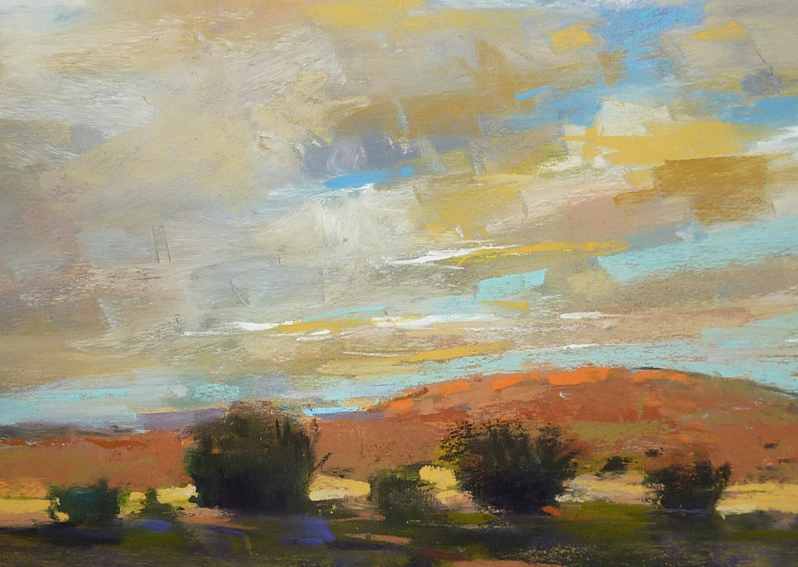
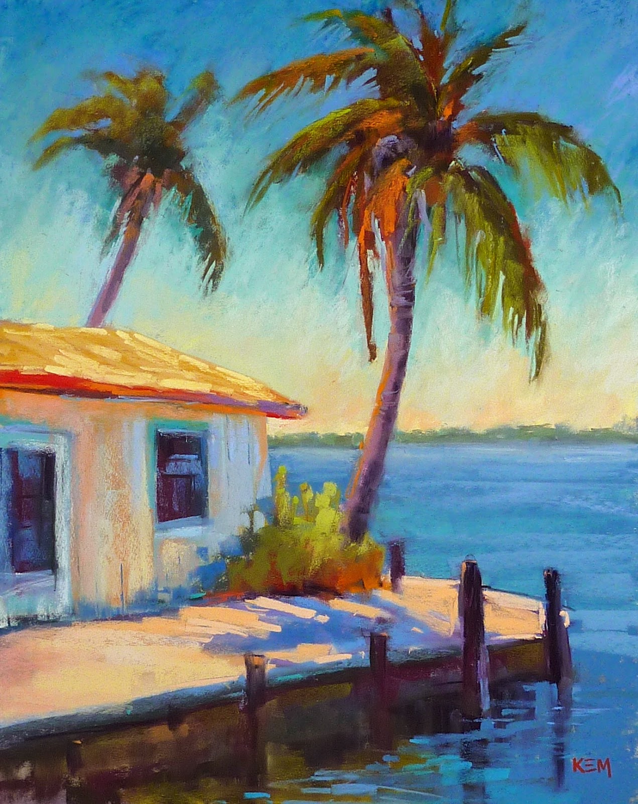
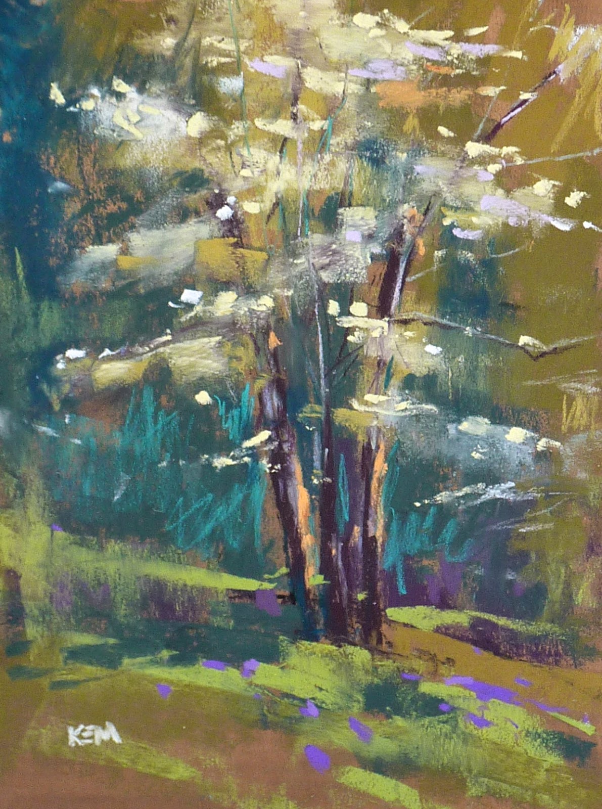
'Down to Earth'           8x10            pastel           ©Karen Margulis
click here to purchase $125
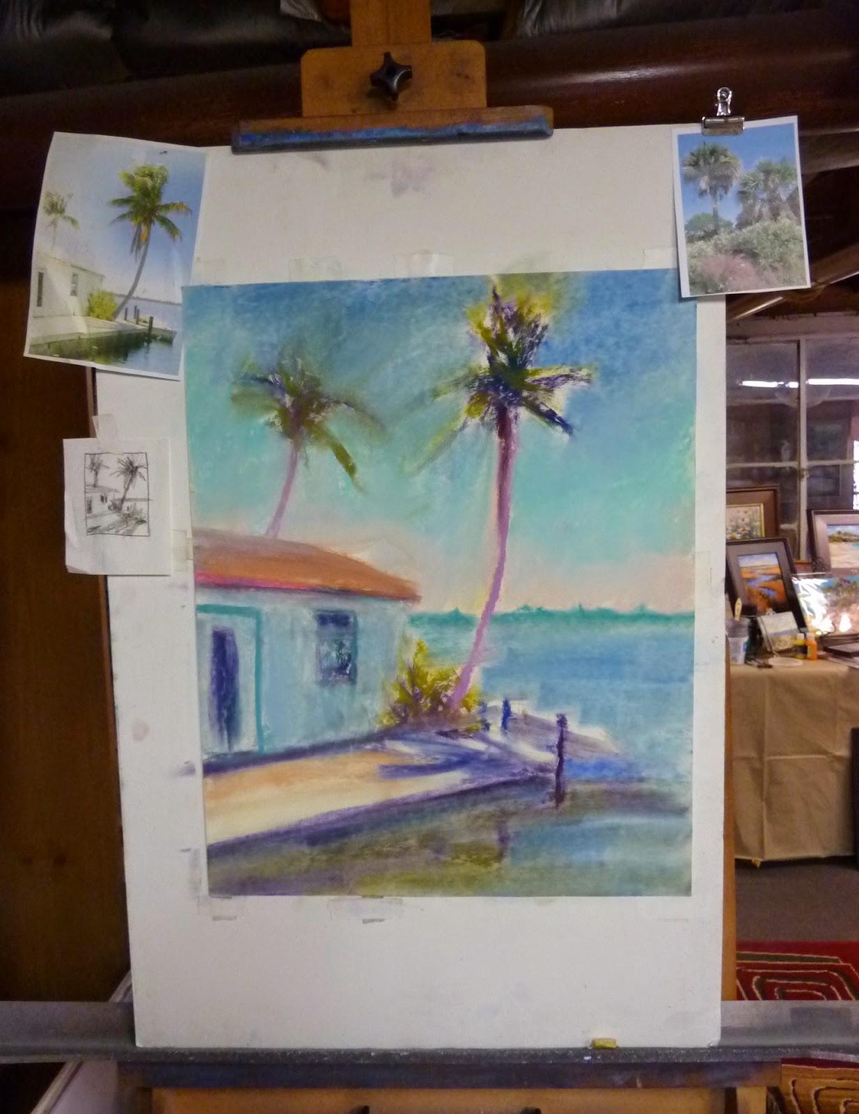
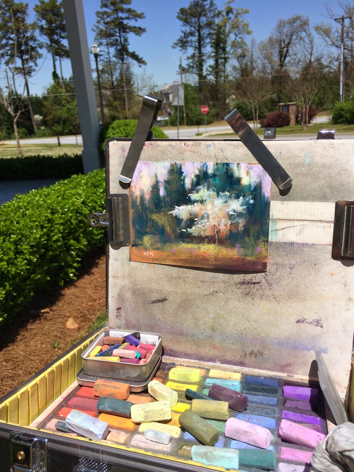
I am a pastel addict. I know this. I'm not sure what the proper treatment is but I continue to collect pastels even though I have more than I can possibly use.   I try my best to use them all.  Every once in awhile I visit my pastel shelf...where I store all of the random boxes of collected sets...and I choose a set to work with. I challenge myself to use the set in a painting.

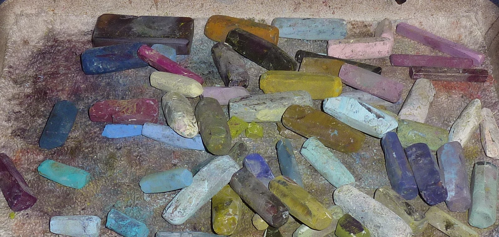
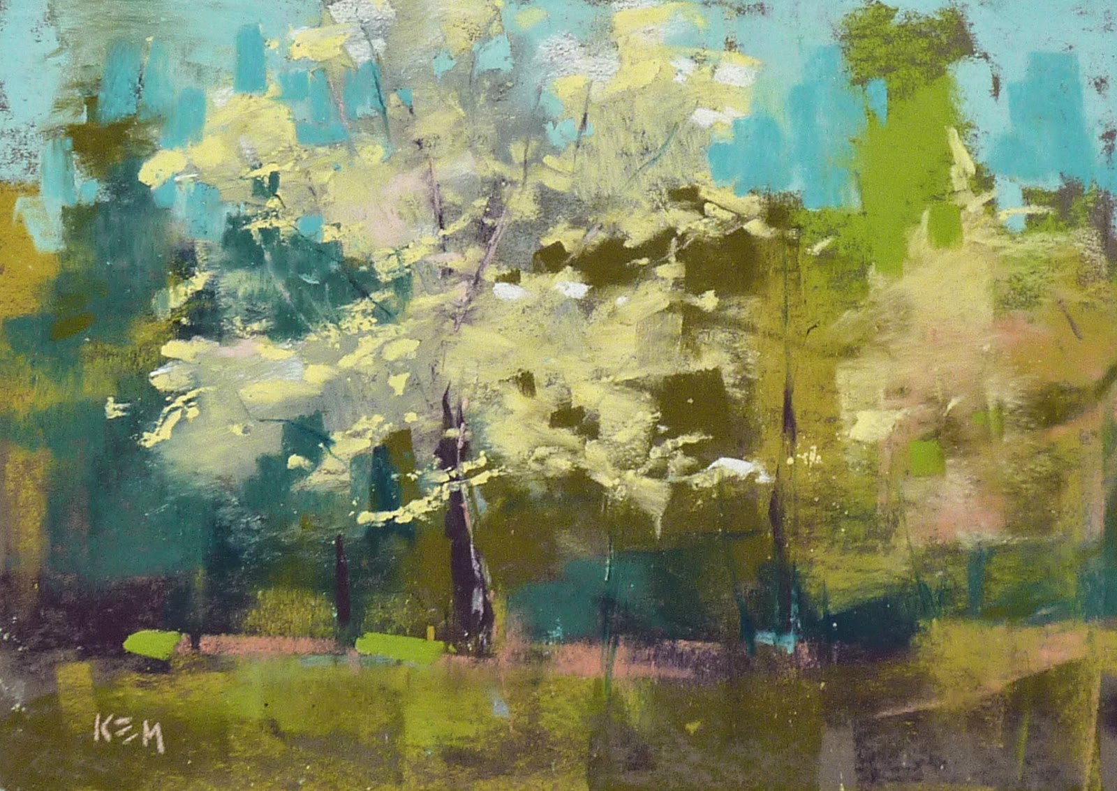
Today I decided to try to incorporate these two sets of Schminke pastels into my latest marsh painting. I got these sets at the IAPS convention last June. (always a fun place for a pastel collector)  I like Schminkes. They are very soft and are perfect for my final marks...my punctuation.  For this painting I used them in all layers. They were wonderful for the sky. I may just have to get some more!  

Enjoy today's mini demo!


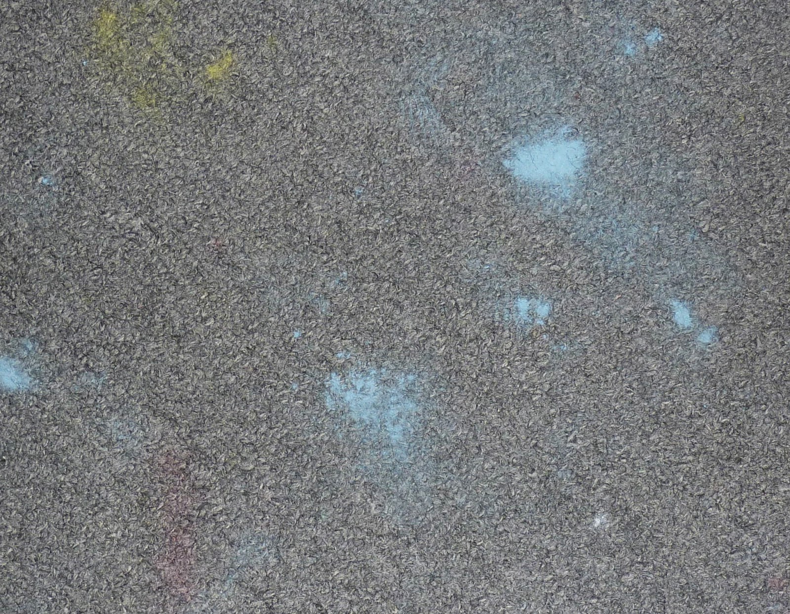
Two sets of Schminke pastels... Sky and Earth


 This painting is 8x10 on Uart 500 grit. I begin with a charcoal line drawing and a block in with 2 values of warm colors. I use hard pastels and rub in this layer with a piece of pipe insulation foam.


I start with the sky and work my way down to the foreground.  I use several of the blue Schminkes and a Terry Ludwig warm blue and a few Diane Townsend pale yellows. I don't blend with my fingers. The pastels are so soft that layering them lightly blends them . I pull the pale yellows over the blue sky to create the wispy clouds.
I also put in the distant land using a cool blue gray and turquoise. These are just marks since this land is far away. No details.


Next I put in some darks along the banks of the water. I use a rich dark green and purple. I pull the dark green down into the foreground area. See my posts last week on painting foregrounds.
The next step is to put in the water. I use the same colors that are in the sky....lighter near the horizon.


I go back to the distant land and put in some of the yellows and golds to suggest the distant grass. It is autumn so the grasses are all warm golds and peaches. I decide I needed another bit of water in the distance. I also start putting in some of the mid ground grasses with peach.


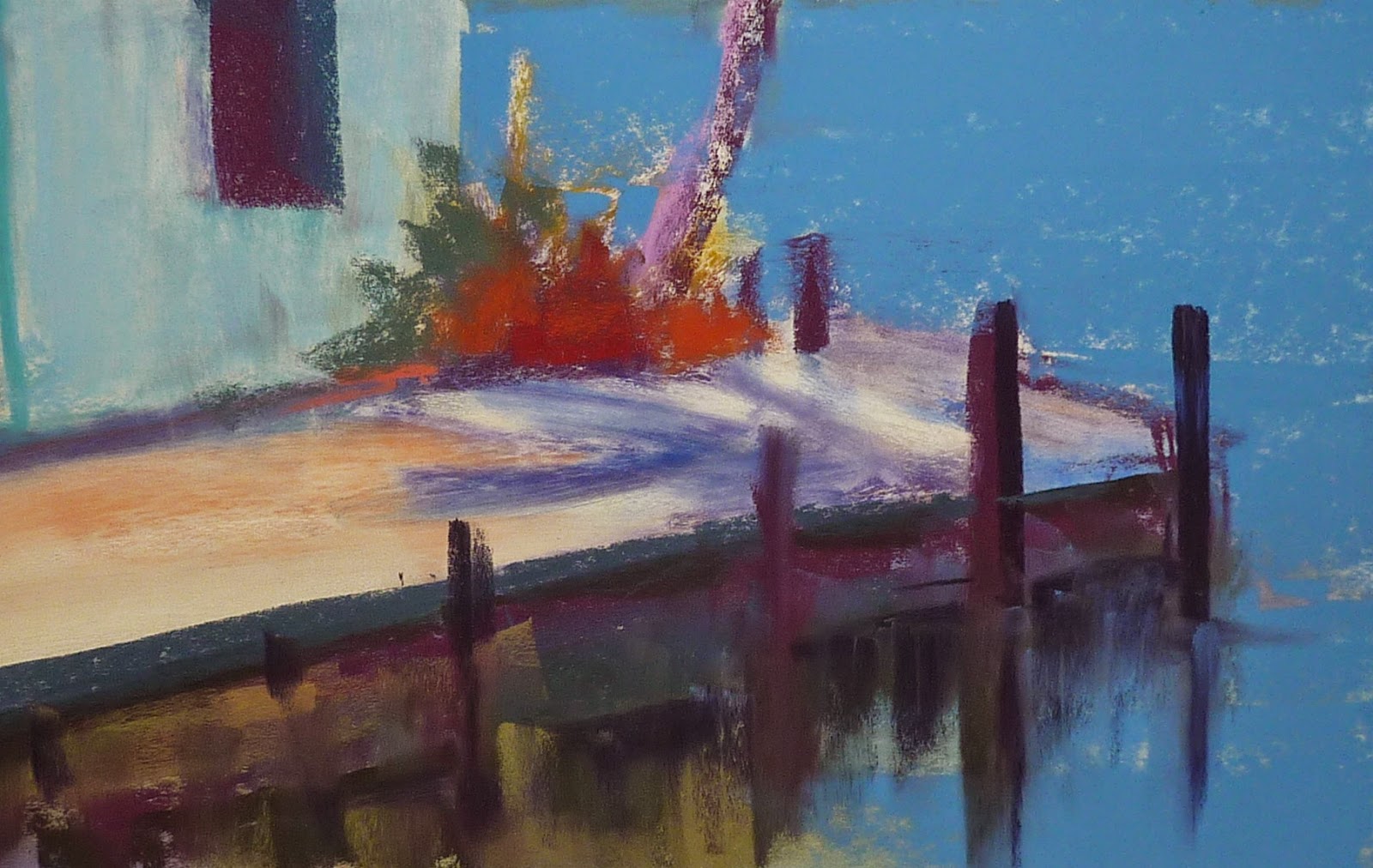
Now I lay in some of the rich rusty Schminke pastels in the foreground. They feel nice!  I am making my marks chunky and vertical.


I add some greens to the bushes and add some more chunky grasses to the foreground. I am having fun with these Schminkes!  After this step it was just a matter of refining the foreground with some smaller grass strokes using the sharp edge of the Schminke pastel.  I also added some yellow flowers by making some thick marks.  I also pulled some of the grass color into the water with my finger to make some reflections.  Finished!


If you like this painting and mini demo you may be interested in my pdf demo 'Painting an Autumn Marsh' available in my Etsy shop. I go into much greater detail with more photos. Marsh demo link

What I Love About Plein Air

$
0
0

'In My Cherry Grove'         8x10        plein air pastel           ©Karen Margulis
available for purchase $125
The Cherry Trees were calling to me. They needed to be painted. I could take a hundred pictures of them but nothing could capture the way I feel about them like a painting them from life.  I needed to get out of the studio and stand under the trees.  I needed to hear the birds singing up in the branches.  I needed to feel the warmth of the beautiful spring day, to smell the neighbor's freshly mowed grass.  I needed to see the pale pink petals float gently in the breeze, carpeting the ground around me.

These are all things that a photo just can't do. A photo is flat and quiet. It is a piece of paper.  Painting outside among the trees makes me feel alive. My hand moves across my paper quickly...choosing the pastels to capture the colors I see in front of me.

My plein air pantings are not perfect. But they are real.  I never touch them up or finish them in the studio.  I want to remember exactly how I felt the day I painted them. I will use them as studies for studio paintings. The plein air studies capture a moment in time. To change them would erase the emotions that went into the painting.

I don't get outside to paint as often as I'd like. But when I do I am recharged and renewed. 

My Gogh box
Here is my set up: a Gogh Box (www.stansperlak.com) on an Oben travel tripod. I am using a Great American plein air half stick set which fits inside the Gogh Box perfectly. I will take the foam out of the box so I can fit more pastels in the box. I need my Terry Ludwigs too.   I will blog about the little black thing in a future post!
My paper is Uart 600 that I toned a warm brown with oops sample paint from Home Depot.


Three Ways to Improve Your Sky and Cloud Paintings

$
0
0
'Speaking to the Sky'         8x10           pastel
available for purchase $125

Your Skies deserve the royal treatment.  They deserve more than a cursory treatment with a blue pastel.  Skies are important to a landscape painting. Even if they aren't the main focus of the painting, they provide the light and set the mood for the landscape.

I happen to love to paint the sky.  I am drawn to wide open spaces because I can see the sky. I am always looking for ways to improve my skies and clouds. I want my skies to be believable...to look like air...for my clouds to float and not look like potatoes or cotton balls!

I have collected some great tips and advice in the course of my studies.  There is obviously a lot more to learn about painting believable skies but currently here are three things I like to keep in mind when painting the sky:


1.  Be a good observer of the sky.  Go outside and make mental notes. Better yet go outside and paint sky studies. Notice the colors in the sky and clouds. Photos don't always capture the subtleties in the colors.  For example photos often show a blue sky oversaturated and polarized. As a result it is easy to paint a blue sky too dark if we rely solely on the photo reference. Taking the time to study the sky is well worth the effort.

2. Make your own grays for cloud shadows and dark stormy clouds. It is easy to reach for the gray and white pastels to paint clouds.  I prefer to use the more colorful grays (not the grays made from black and white) or better yet mix my own grays by layering colors until they make mud. More on this later this week.  Also I don't automatically reach for the pure white pastel for the light parts of a cloud.  I use pale values of colors such as pinks, yellows and peaches. I reserve the pure white for small areas on the clouds where I really want them to pop.

3. Make sure your sky and ground share a relationship. A stormy cloudy sky doesn't work with a sunlit ground plane.  They need to work together. They need to harmonize.  I often use colors in the sky that are in my ground. One of the first questions I ask myself when evaluating a painting is:  "Does the ground relate to the sky somehow?"

Today's painting is done on my homemade support using a pumice mixture on gatorboard. The pumice mix was toned orange before applying.  

A Simple Way to Add Drama to Your Cloud Paintings

$
0
0

'Traveling Clouds'     11x14        pastel          ©Karen Margulis
available for purchase $165 click here
I needed some drama.  My clouds were too boring. The painting began as a demo on painting clouds. My goal was to share ideas for painting a fair weather day....blue skies and happy puffy white clouds. My demos are usually designed to teach something not to make a great painting. So as demos go, my clouds were just fine.  But as paintings go....the clouds needed to be energized.

Before....boring clouds
When my class was over I got  to work. How could I give some life and drama into my soft looking clouds?  I began by taking a paint brush and softening everything in the sky. I didn't brush it all out but just removed some of the pastel.
 
Next I worked on the land. I usually finish the sky and then work my way down but this time I wanted to have the sky work with the lighting and colors on the ground.

Now on to the sky.  I used some of the same ground colors in the sky. I used some peaches and yellows. It was better but still not enough punch. I needed something else..... I looked around the studio and spied the box of Schminke pastels I left out from earlier in the week. Super soft and buttery yellows! That is what I needed!

After....closeup of interesting clouds
 What a simple solution!  Using these soft and rich pastels allowed me to put down some juicy bits of color to my clouds. These textured marks were a nice contrast to the smoother parts of the sky.  In addition to the pastels being so buttery, I made bolder marks. I painted the clouds with the energy I wanted to portray.

The next time you are looking for drama.....try some super soft pastels and don't be afraid to make some bold marks!

reference photo


If you would like more information on mark making with pastels and creating bold 'shouting' marks you might like to see my You Tube video on mark making.  Click here to view.


Improve your Paintings with this $1 Investment

$
0
0
'Silent Awe'              9x12              pastel           ©Karen Margulis
available for purchase $145
 Did you ever ask yourself why?  Why did you chose the subject to paint?  Why were you drawn to it? Did you have a reason for wanting to paint it?  Picking a subject because it seems easy isn't a good enough reason. Picking it because it is on top of the pile of reference photos isn't a good enough reason.

Having a passion for your subject leads to more passionate paintings.(tweet this) 

Being drawn to a subject isn't enough.  We need to know WHY we are excited about it before we can figure out how to express it in the painting.

My WHY BOARD with the 'why' for the sunset painting
We can think about why but it is better to verbalize it and even better to write it down!  So I came up with The WHY BOARD.  It is a simple 8x10 white board. I got it at the Dollar Tree for $1.  It is cheap but it does the job. It is very light weight, comes with a pen and an eraser and a magnet on the back. The pen even works!  A bargain price but priceless for the help it will give.

How to use the Why Board:

  • When planning your painting it always helps to start by asking yourself why you are drawn to your subject. Now instead of thinking it (and possibly forgetting) you jot it down on the board. I even wrote down a potential title for the painting. 
  • Prop up your Why Board near your easel. As you paint you should be stepping back. When you step back glance at your board. Are you still on track with your 'Why'?  Do the choices you are making fit your initial concept ? 
  • If you have gone off track you can at least decide if you like the new direction. If not you can evaluate and decide how to get the painting to better express your concept....your WHY.


Now simply erase the board when you are done and it is ready for the next painting!  I love the Dollar store!

Studio Tip...Get Ground Pastel Out of Your Carpet!

$
0
0
'Warm Wind'            5x7            pastel               ©Karen Margulis
click to purchase $45
 The blue pastels were fast and furious this week. We were painting blue skies and clouds.  Every once in awhile a pastel would take flight. Has this happened to you?  You are happily painting and all of the sudden the pastel just flies out of your fingers and lands on the floor....usually in pieces. A sad event and a messy one.

I have a new discovery that will take care of the pastel mess on the carpet.  And it only cost a dollar.  Yes I have been to the Dollar Tree again!  It is called LA's Totally Awesome Cleaner (as seen on TV) and I was skeptical. Would it live up to it's name?


Some beautiful blue pastel ground into the carpet
Awesome Cleaner to the Rescue! The results after only one treatment,
after the second treatment the stains were completely gone!
Yes It was Awesome!  It took care of the ground in blue pastel as well as some leftover red and yellow that I wasn't able to get completely out with other carpet cleaners. It bills itself as an all purpose concentrated cleaner, degreaser and spot remover. It is meant to be diluted but I sprayed it full strength on the pastel spots. It took two treatments...spray and wipe up with baby wipes.  The spots were gone!

I read about this cleaner on a facebook thread on cleaning up oil paint messes. This cleaner was recommended and I thought if it worked for dried oil paint it should work for pastel!  I even tried it on an old black acrylic paint stain on my carpet and it just melted the paint. The carpet was fine. Totally Awesome!

TIP: When cleaning up a pastel mess always vacuum with the hose to get up most of the dust. You want to get as much of the loose pigment up as you can otherwise you just turn it into more paint when you wet it. Suck up the dust first then treat the remaining stain. 

'Desert Patchwork'          5x7          pastel
click here to purchase $45


Why We Need to Seek Out Feedback

$
0
0

'In All Her Glory'               8x10            pastel              ©Karen Margulis
available for purchase $125 
Sometimes it is a simple bit of advice.  A few words. "Try this next time or look more carefully at that."  Something simple that you may have overlooked or maybe didn't even know. It doesn't matter how much experience we have. As artists, we are always learning and growing.  We need to continue studying and stretching ourselves. We need insightful feedback.


"A moment's insight is sometimes worth a life's experience."Oliver Wendell Holmes


 This is one of the reasons that I love taking workshops. I might just hear that one simple bit of advice that can make a big difference in my work. (I also love being around other artists who are all passionate about learning to paint better) 

I am taking a couple of workshops this year... Liz Haywood-Sullivan in May and Iceland with Stan Sperlak in June.  I can't wait to learn more and to get some feedback. Feedback is so important because we can't always see what we could be doing better.  It often takes another set of eyes.


Critique or feedback is one of the valuable benefits of a class or workshop. Having someone look at your work and honestly share their own insight is invaluable.  You don't always have to agree or you might not understand or be ready for the advice. This has happened to me often. I always take the feedback and file it away. Some I put it to practice right away and some advice might not be a fit for me....or might start to make sense at some point in the future.

I am fortunate to be able to take workshops and to have a great support system of local artist friends. It is worth the effort to seek out other artists in your area. Take a class or join a local art association. Often they offer critique sessions. Start your own critique group!  Or turn to the internet....when I was getting started with pastels I spent a lot of time in the pastel forum of wetcanvas.com.  I  posted my work for feedback and learned from other work posted. It is a great resource!

I understand the value of insightful feedback and I would love to offer another set of eyes for your work. Whether you are new to pastels or wanting to improve your work, consider my new online feedback sessions. Conducted by email, I will offer feedback on up to 3 paintings. Click here for more information or feel free to email me with additional questions. 

Monday Mini Pastel Demo...Old Florida Fishing Shack

$
0
0
'Days Gone By'           16x20          pastel             ©Karen Margulis
available for purchase $175
I started this painting a few years ago. I wasn't sure how to finish it and then lost interest in it. So on the shelf it went. I have a stack of unfinished paintings on a shelf still attached to foam core. Every once in awhile I pull one out and revisit it.  This is probably my oldest unfinished painting... started during my first year with pastels.  I was in my Florida phase. I only painted beaches, shells and shore birds. 

Since we are working on water in class this week I decided to revisit this Florida scene.  This old fishing shack was quite rustic and rickety but the view was amazing. I had started the painting with an alcohol wash. (see below) The reference photo had faded but I still remembered the vibrant colors of this wonderful place. The painting is 16x20 on white Wallis paper.


Where I left off 8 years ago.


I began by reinforcing all of the dark shapes with a deep blue, dark red and dark green. I put in my most intense color which was a bright coral.  Next I worked on the sky. I started at the top of the paper and put down some cool deep blue and gradually used warmer and lighter blues and yellows. I let the pastels blend themselves...no finger blending.


I continue with a cool green for the distant land and put in the first layer of water. I use a rich middle dark value blue. I will layer more blues in the water but I put in my darkest color first.


 I begin the reflections.  I pull the colors of the dock and pilings down into the water. I used vertical strokes and blend them downward with my fingers.  Next I add lighter bands of blue in the water. When I get to the area of reflection I choose a rich bright blue and make some current marks in horizontal strokes over my reflections. (see the finished painting for this)


 Before I finished the water though I worked on the palm trees. I added some brighter warmer greens and some oranges in the palm fronds. I used the sky color to create the fronds by negative painting.


The last thing I did was to paint the shadow and dock. It was an old uneven concrete dock.  I then finished the shack with some blues and peaches.  I stood back and decided that I needed a warmer color at the horizon so I scumbled some pastel peach over the yellow sky. 

I sure is fun to revist an old unfinished painting. It is the perfect opportunity to play without worrying about the results! 


What Can You Do with a Pearlescent Pastel?

$
0
0

'Jewel of the Tropics'               6x8             pastel           ©Karen Margulis
click here to purchase $50
I didn't expect it. But in the end I loved it.  That little piece of green pastel that somehow sneaks into my palette every once in awhile.  It is a deceiving little guy.  At a quick glance it looks like a nice mid value warm green. It is perfect for foliage.   As soon as it is applied to paper it's true nature is revealed.

It shimmers!  It is a like a gem. It is a pearlescent  pastel and it makes me smile!


a tiny piece of pearlescent pastel from Great American Artworks

As I layer this soft buttery piece of pastel it leaves behind a subtle shimmer.  The effect is more pronounced when the light hits the painting.  The camera seems to intensify the effect. It is actually more subtle in real life.

I love this little green pastel but it has to be used in small amounts. Like too much jewelry or cologne....a little goes a long way and too much can be overwhelming.  Here is a suggestion for using pearlescent pastels:

  • It is the element of surprise that makes a touch of shimmer special.  Rather than using a whole set of pearlescent colors in a single painting, break the pastels into smaller pieces. Now plant these pieces in your pastel box in the correct value and color area.  The next time you reach for a certain color and value you may end up with a little gem. It will add a nice touch of shimmer just where you need it!


Several pastel manufacturers make pearlescent or iridescent pastels including Sennelier, Diane Townsend and Great American Artworks. I have them all!  The green in the painting is a Great American. See the set on Dakotapastels.com. link here.

Dealing with Negative Critique

$
0
0

'Sanibel's Treasure'                  10x15         pastel         ©Karen Margulis
available for purchase $155
It's been on my mind lately. Maybe because of the post I wrote about getting feedback on our work. Then today a student asked why I don't paint the beach more often. Good question.  It used to be my most favorite subject to paint. When I first started with pastels most of my subjects were beach related...shells, shore birds and palm trees. I will still paint them occasionally but I am more interested in landscapes.... marshes, deserts and wildflowers and I am always most drawn to the close ups.  Why the shift?

It partly has to do with some feedback I received at a workshop early in my painting journey. During the critique I shared my 'beach' paintings along with the plein air landscapes done at the workshop.  The instructor suggested I go to the beach to relax (not paint the beach)  and to concentrate on intimate landscapes.  I rebelled at first and kept on painting the beach.   I was such a beginner with thin skin that the feedback hurt. After all I had worked hard at my beach paintings. I took this critique as negative.

But gradually it became clear to me that my passion was truly for the intimate landscape. It was if this instructor knew it even before I did!  It wasn't really negative feedback. I just wasn't ready to understand what the instructor meant.


'Pacific Shores'        5x7       pastel
click here to purchase $50
I now welcome all feedback. I may perceive it as negative or it may not be delivered gently but I always make sure I don't dismiss it too quickly.  I write it down. I try to see if there is a kernel of truth to it. I put my feelings aside.  If I don't quite agree or get what the instructor was saying, I move on.  Maybe someday I will get it or maybe it wasn't valid. The important thing is that I gave it a chance and I don't let it slow me down!

I don't avoid painting the beach anymore either.

If you'd like to see some of my old beach paintings visit my blog archives here. It is fun to revisit these older paintings! 

A Must Try Painting Exercise

$
0
0

'Spring Fantasy I'           6x6             pastel          ©Karen Margulis
available for purchase $45
I couldn't stop.  Even if I could I didn't have my paints. But the colors were unreal. I wanted to stop my car and soak it all in. Luckily though I was at a traffic light. So I painted it in my mind.  I tried to describe the colors I was seeing. The unusual corals of the trees with their fresh new growth.  The amazing hot pinks of the smaller trees in front.  The shapes and how they were arranged. I made mental notes. Then the light changed and I was on my way.

The image made an impression on me that I couldn't let go. I could return to the spot with my pastels. But what if I just tried to paint from my mind? After all I did make mental notes. What if I just tried to paint my impression of this scene?

What a great exercise it was. It was so liberating to be free from the influence of a reference photo. I was able to rely on my mental notes to recall the colors and shapes. It was up to me to arrange them into an interesting composition.  I could paint them however I wanted. I didn't have to match colors and shapes and arrangements to a photo. There was no real right or wrong. It was totally my own interpretation.

'Spring Fantasy II'        6x6          pastel
click here to purchase $45
If you haven't painted something from your imagination lately I encourage you to do it.  Go outside and  find something that captures your attention. Take some mental notes....colors, shapes, what it is that excites you. Now go back inside and paint it. Let yourself go. You can't get it wrong! It is your impression alone!

Why is this such a good exercise? 
I am a firm believer in using reference photos to jumpstart a painting. I never copy it. Sometimes it is challenging to move away from the photo...to make changes. Painting from your imagination show you that you can pull things from your experiences and insert them into a painting. This will make it easier to make changes to a reference photo! Have fun!

When it is OK to Make Mud

$
0
0
'Tormented Sky'         5x7           pastel             ©Karen Margulis
click here to purchase $45
 Making mud is easy.  It usually happens when we don't want it.  All of the sudden that fresh beautiful color turns dull and muddy....dirty looking color.  Yuck.  It is frustrating and we work hard to avoid it.

Sometimes it is good to make mud!

My favorite place to mix up some muddy color is in my clouds.  Whether they are stormy tormented clouds or just the shadows in white clouds, we need to use gray.  But I really don't like to use gray. I have discovered that gray can be beautiful. It depends on what colors go into the makeup of the gray. This is where making mud comes in.

There are grays made from mixing black and white. I call them B & W Grays.  They work to show the value changes in clouds but they aren't very exciting or interesting. I prefer Technicolor Grays!


Technicolor Grays are a mix of colors that when layered together turn gray (or muddy but this time we make them on purpose)  Technicolor grays are rich and interesting to look at.  You can make your grays more colorful a couple of ways:

1.  Take your B&W gray and layer some other colors on top. The colors you choose depends on the mood you are trying to create.  Keep the colors the same value of the gray. You don't need to blend the layers with your fingers...simply layering the colors will blend them together.

2. Make your own grays by layering three or more colors of the same value. Again...keep layering repeating the colors until they blend.  Whenever you mix the complements together they become grayed so any three colors are bound to create mud...I mean gray!  I love to layer the tertiary colors of orange, green and purple.

How do I choose the colors to go into my technicolor gray mix?  I like to look at the ground....what colors in the ground could I use in the makeup of the clouds? This helps my painting have color harmony and good relationships between the ground and sky.


So go ahead and make some mud!  Sometimes it is a very good thing!

Pastel Clean-up Made Easy...a Tip for Plein air and More!

$
0
0
'Dogwood and Violets'          6x8        pastel     plein air        ©Karen Margulis
click here to purchase $45
 Did you know that Babys 'R' Us has art supplies?  Artists can find things to use for art in just about any store.  I am always on the hunt for things that could make my painting experience easy.  I love going up and down the aisle in Home Depot and now the Dollar Tree looking for things that I can use for art. I found the best little gadget in of all places....the baby store!

I put it to the test today out in my yard. I have two private students here from out of town and one of the things they wanted to do was some plein air painting. We really didn't have to go far between my Cherry tree and azaleas and the neighbor's Dogwoods.  I loved using  my new find. It made clean up easy and convenient.

'Spring Fling'         6x8        pastel        plein air
click here to purchase $45

Here it is in action.....it is a neoprene baby wipe holder with a velcro strap made by Infantino.  It is meant for a baby stroller but it is perfect to attach to a tripod or easel. No more fumbling in a backpack with pastel covered fingers searching for the pack of wipes. No more running out of those small travel size wipes especially on long painting trips.  Just fill it with a soft pack of your favorite wipes. You can throw it in your backpack or bag  or even loop the velcro strap around the backpack straps. It is lightweight,waterproof and made clean up so easy!  Thanks Babys 'R' Us!


Back to Basics with Pastels

$
0
0

'A Cool Respite'          9x12          pastel        ©Karen Margulis
available here by paypal  $125
Sometimes I like  to go back to basics.  It is fun and exciting to try new techniques and processes but it is always nice to know I can return to tried and true method of making a painting come to life.

I call it my B2B Method ....Back to Basics.  It allows me to take a busy landscape reference (photo or plein air) and simplify it.  It allows me to paint quickly and efficiently.  It allows me to thoroughly enjoy the painting process without stressing over 'getting it wrong'.

reference photo and value thumbnail
I use the B2B method to teach artists new to pastels but it works for anyone wishing to simplify their paintings. The keys to success are to do a 4 value black and white thumbnail and to choose a working palette of pastels before starting to paint.  I have posted information on doing value thumbnails and you can read more here:
Five Steps to a Good Thumbnail
Tips for Avoiding Spotty Paintings

I am currently working on a digital lesson/demo on the B2B method so stay tuned and practice your thumbnails!!

TIP:  If you find you don't have as much time to paint as you'd like try keeping a small sketchbook with you to be used for doing simple value thumbnails. The more you do the easier it will be to see things in big simple masses of dark and light. These thumbnails count towards the much needed 'miles of canvas'!

Monday Mini Pastel Demo:Mountain Meadow with Alcohol Wash

$
0
0

'Pink Haze'            8x10          pastel         ©Karen Margulis
click here to purchase $125
You have to have some dirt!  Nothing can grow without the dirt.  I love starting a pastel landscape with a value alcohol wash because it lays down some dirt.  I can build upon the value masses and add the greens and the flowers. It gives them a base to grown on! 

 I began this painting with a dark blue Nupastel. I massed in the big simple shapes of darks, lights and middle values and washed them in with some rubbing alcohol and a brush. The painting went through a color transformation near the end because I decided to add some pink instead of orange.  Follow along and see the progression of the painting!  It is 8x10 on Uart 600 grit.


 My reference photo (very very green) and the value alcohol wash. I'm ready for pastel!


I begin my reinforcing all of the dark shapes using several dark value pastels. A bit lighter and cooler in the distant trees.


I complete the sky using a few blues and pale yellow pastels lightly layered. I break up the tree with some sky holes.


Now I add some greens to the big tree. A lightly applied mix of warm/neutral greens. I love my Terry Ludwig greens!


Next I add the mountain using a mix of blue and blue-gray pastels. I make 'mountain holes' in the tree.


I need some more colorful dirt for my greens so I choose several values of orange. (secret of green)


I begin to layer some green in the grasses using lighter, cooler greens in the distance.


I add some chunkier greens in the foreground and a lighter green on the mowed path.


Here is where I decided to make a color change. I like the peach....but I just used this same color palette in yesterday's painting. To mix it up I decided to go with pink. I layer some pinks in the grasses and add some pink to the sky.


Finishing touches: I spray the tree and foreground with workable fixative so I can get some texture. I add more greens and pinks in the tree and meadow. I put in some hints of pink flowers and grasses in the foreground. Finished!


If you would like to try the value underpainting I have a pdf demo available showing this technique using turpenoid.  You can see details in my Etsy shop here.

A Magic Trick for Painting Reflections with Pastels

$
0
0
'Evening Song'             18x24              pastel              ©Karen Margulis
available $350 click here to purchase
A little magic makes painting fun!  Painting really is magic if you think about it. I am always amazed at how we can create a three dimensional reality on a flat pieces of paper with a handful of chalks.  Everything we do to create this reality is an illusion....creating depth, making water look wet, making something look hot or cold....it goes on and on.  Any little tool I can use to help me create this illusion is always welcome.  Here is one you might like to try:

It's an eraser.  But not just any eraser....it's a Magic Rub eraser by Sanford.   Just what we need ......a little magic!


The Magic Rub erase in action

To create believable reflections in the water I want to make them softer than the object that is being reflected.  I also want to make them look like they are in the water and not just shapes on the ground.  To do this I take the colors I am using to block in the shapes ABOVE the water and paint them IN the water using vertical strokes. (the water will be painted with horizontal strokes)

I often use my fingers to drag the color down into the water, pulling them vertically.  For larger areas of reflections such as in today's BIG 18x24 demo, I used the Magic Rub eraser to drag the reflections into the water and softening them. I press down hard on the eraser allowing it to pick up pastel and pulling it into the water.  It works great!  Next I put in the water using very light horizontal strokes.

I love magic!

Why You Should Use Your Own Reference Photos

$
0
0

'Maybe Tomorrow'                 18x24             pastel           ©Karen Margulis
available for purchase $350
They came to this spot every evening at precisely the same time. They had been coming for 30 years. They used to walk hand in hand now they arrive every night on a golf cart. They park and they wait. They wouldn't miss it for anything. Even if the sky was dark and gray, heavy with clouds they still came.  "Sometimes the most dreary of days ends in a beautiful sky when the sun sinks behind the trees" he told us.

So they came and they waited.  We decided to come one evening. We had been told this was the best spot on the island for the sunset. Even though it was gray and dreary we thought it might be worth a try. That's when we met them. And they told us that in their travels around the world nothing could match the sunset from this magical spot....home for them.

We didn't get a sunset that evening but we did make a memory. We met people who appreciated the quiet beauty of day's end even without a spectacular sunset. This painting is my tribute to that evening.

close up detail....a variety of marks
I have a photo of this evening....the non sunset. The photo reminds me of the hour we spent standing at the edge of the river, batting away the mosquitos as we waited along with the regulars and a friendly tabby cat.  When I use this photo as a painting reference  it allows my painting to have a story. It means something to me. It evokes strong feelings and memories.....feelings I can express in the painting. Only I can tell this story.

When you use photos that you didn't take....borrowed from image libraries or magazines or friends....you don't know the story behind the photo. You can copy it maybe even interpret it in your own way but you can never feel it the way you would if it was a photo of your very own memory.

Your paintings deserve their own story. Make a commitment to use your own photos.

Today's painting was the end of session 18x24 demo I did for my Wednesday morning pastel class. Thank you to a great group of artists!  (Uart 600)


Choosing Underpainting Colors for a Large Painting

$
0
0
'Listen to the Marsh Music'            18x24           pastel         ©Karen Margulis
purchase with Paypal $350 click here
 It all began with blue violet. I was planning another large demo and choosing my palette.  I would be using a full sheet of Uart 600 paper 18x24.  That is big for this 5x7 painter.  I love Uart but I knew I had a limited time for the demo so I decided to do a dry wash of color for my first layer. This way I could paint quickly with a minimal number of layers.  I wouldn't have to worry about the light paper tone peeking through and being a distraction.

As I started to fill my tray with potential colors for the painting I decided to consult my Analogous Color Wheel to help me choose the underpainting colors.  The color wheel suggested Blue Violet as the compliment of my dominant hues. Ahhhh perfect. I love blue violet and I might not have thought to use it for the underpainting!

detail of distant marsh with discord color
The analogous color wheel also helped me choose some of my spice colors. I especially love the suggested discord of red violet...so I used some hot pink!  Choosing my colors in advance with the help of the color wheel allowed me to paint quickly and more intuitively.  It was so much fun to share the creation of this painting with my class.


my palette


My reference photo and small color study

Keeping Plein Air Painting Simple

$
0
0


'A Breath Of Fresh Air'            5x7         plein air pastel        ©Karen Margulis
Available for purchase $45
You don't need the kitchen sink!  I have figured out that the more stuff I pack for a plein air outing the less enjoyable it is. The best and most productive experiences happen when I keep my supply list and packing simple.

Did you  know there is a Pastel Supply Bell Curve?

It applies to regular pastel supplies and plein air supplies and often occurs at the same rate.  We start out with only a few pastels and some paper....this collection quickly grows as we discover new brands and colors we must have. Then comes a box or two or three until we figure out what we like.  Then an easel and if we take classes or do plein air we need some kind of cart to haul it in or just the right bag to put it all in. I can't even count the number of carts and bags I have gone through. (I think I am on my last and best!)

This accumulation of supplies continues until it reaches a peak.  We eventually get to a point where we are tired of hauling around all of the stuff. We want to downsize and simplify. We figure out that we don't need every single pastel or supply that we own to carry to class or out in the field. We can paint with less and we are just as happy!

I am currently at the end of the curve. I have pared down my plein air supplies to the bare minimum. And I feel so free!  It is all about adjusting the mindset and goals for painting outside. Once I decided that plein air was about doing quick studies I was able to let go of a lot of unnecessary stuff. 

A quick & easy set up for plein air
Here is a peek at my current plein air set up.  I have my Gogh Box on a tripod and I am only using the Great American Artworks Plein air half stick set and a few Nupastels. I have one backpack to put it all in.

 I am going to do a detailed post next week on my actual supply list but I wanted to get you thinking about where you are on the supply curve. Are you still collecting or are you ready to downsize?  Stay tuned for a lot more!


'Spring Fever'   5x7     pastel        $45


'Spring Tango'         5x7          $45

All of today's paintings were done on location at the Taylor Brawner House in Smryna Georgia. I have my work on exhibit along with 13 other talented artists through this weekend.  

The Importance of Mystery in a Painting

$
0
0
'Emergence'         12x16          pastel over watercolor       ©Karen Margulis
available for purchase $165

"A painting requires a little mystery, some vagueness, some fantasy. When you always make your meaning perfectly plain you end up boring people." Edgar Degas

I love a good mystery story. Something that pulls me in and makes me think. I like it when a writer can give me just enough information to keep me hooked. I want to keep reading.  I'd like to be a mystery painter!  I'd like to tell a good mystery story with my painting.  It is my goal to put in just enough detail to tell the story but not to give away the ending right away!  I want the viewer to linger and to discover the bits and pieces that tell the story of the painting.

This quote from Edgar Degas speaks to me. It is something I have been working on in my paintings. How do I  introduce mystery into my work?  Wet underpaintings help.

Today's painting was done with a watercolor underpainting and tried to leave some areas to the imagination. Here are some close-ups:


Not every petal is painted and I only used a thin veil of pastel over the watercolor

Very soft edges hint at a flower. Soft edges add mystery

I tried to be  loose and free with my strokes. Bolder more opaque pastel contrasts with the thin pastel over watercolor


Viewing all 2266 articles
Browse latest View live