Quantcast
Channel: Painting My World
Viewing all 2266 articles
Browse latest View live

Monday Pastel Demo....Painting Lupines on a Reclaimed Surface

$
0
0
'Summer Days in Maine'            8x10         pastel on board      ©Karen Margulis
available for purchase $145 click here 
Which comes first....the paper or the subject?  Usually I recommend choosing the surface after deciding on the subject and concept for the painting. That way the paper type can be a better match for the concept.  The surface does have a big impact on the way the painting looks.

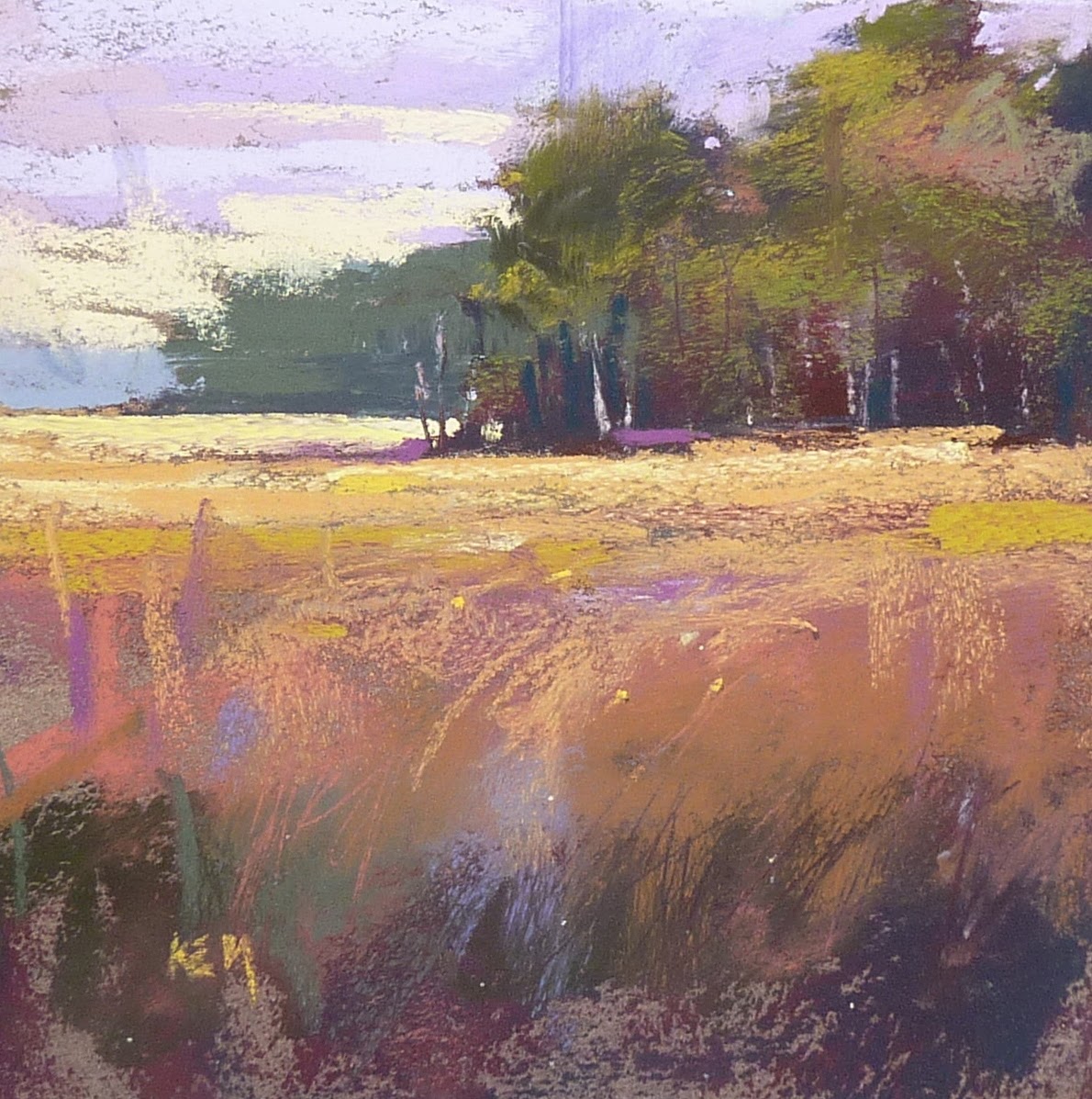
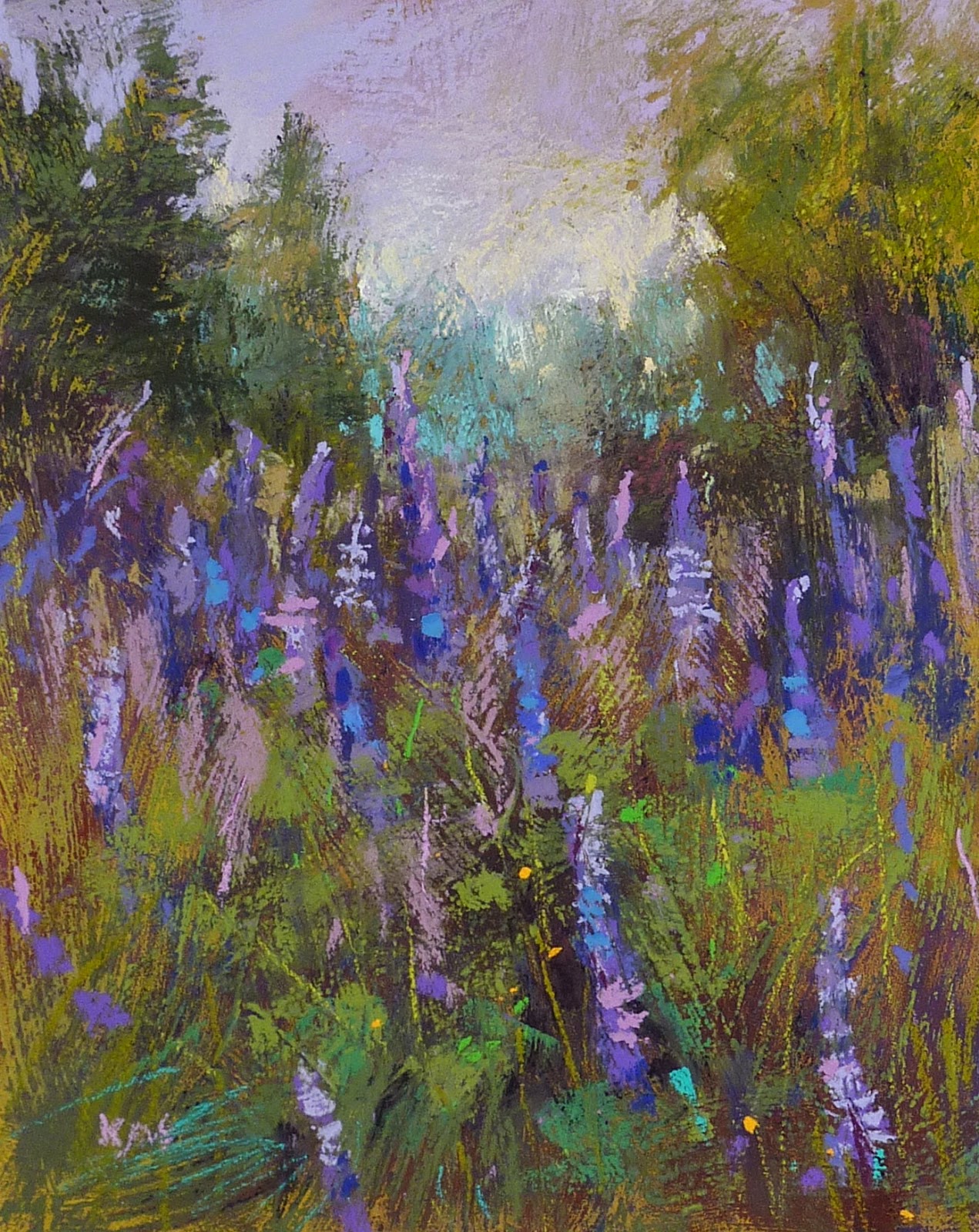
Today I did it backwards. I am trying to use up some older prepared surfaces so I chose from the top of the pile. I got an 8x10 piece of pastelbord that I had covered with a yellow tones pumice and gesso mix. It was a wonderful textured surface and I need a subject to fit!  I went with purple flowers....Maine Lupines inspired by a summer trip to Maine.


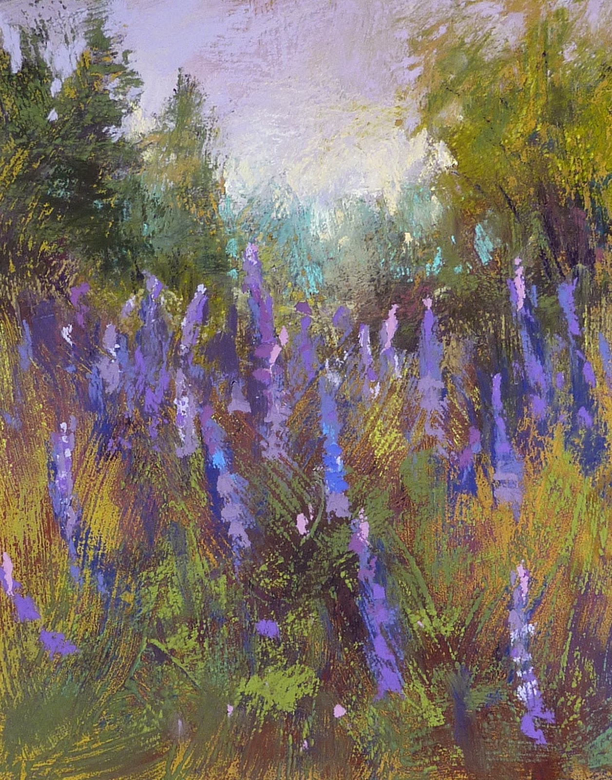
I begin by blocking in the dark values using several colors all the same dark value. Look at all the textures from the brushstrokes of the ground!


Next step is to paint the sky. I decided to go with a few pale lavenders for the sky and some pale yellows for the horizon. After I block in foliage I will go back and put in skyholes.


I work on the trees next using a cool blue green for the distant trees.  I add some dark purples to the grasses and rub it in. I want to cover some of the yellow board so the top layers of grass will show up better.


I layer some greens in the grassy area. It skips over the texture leaving the suggestion of grass.


Now it is finally time for the flowers. These Lupines are a mix of purples and deep blue. I begin with a dark blue-purple.


 I work on the Lupines using very soft Schminke and Great American purples. I am trying for a variety of shapes and sizes and interesting placement of each Lupine stalk. I want them to dance!


For the finishing touches I add some brighter greens for the stems and suggest a few leaves. I decide I need to reintroduce some of the yellow so I put in a few bright yellow flower dots. Finished! I enjoy how the texture of the board helps me be less fussy with all of the foliage! It does a lot of the work for me!


If you enjoyed this condensed demo you might like to try one of my pdf demo downloads. These demos are filled with photos and detailed commentary on each step of the painting. You can see the demos in my etsy shop here.


My Favorite Underpainting Technique

$
0
0
'Save the Bees'           8x10            pastel          ©Karen Margulis
click here to purchase $145
Never has watching paint dry been more fun. There is nothing wishy washy about it.  It's bold. It's rich. It is usually quite magical to watch.  When I want to start a painting with a bang this is the underpainitng technique I turn to.....Oil Stain Underpaintings!

It is simple to do. All you need is a few tubes of oil paints, stiff cheap brush and some odorless mineral spirits (OMS). You also need to use a surface that can get wet. I used Uart for today's paintings.  It is called oil stain because you are basically staining the paper with the thinned oil paint. If the paint is applied too thickly it will fill the tooth of the paper and you won't be able to add much pastel.

detail of painting. Notice the drips of the underpainting
Here are a few tips for Oil Stain Underpaintings
  • Use a limited palette of paint colors. You are less likely to mix muddy color with only a few colors. I use red, blue and yellow.
  • Avoid using black or white paint. You want nice thin and transparent color. Adding white will make it opaque and chalky. Black can be dull.
  • Make sure your paint is thinned with the OMS (I use Gamsol)  I like for the paint to be the consistency of tea.  If you can see your brushstrokes in the paint then it is too thick.
  • If the paint is thin enough, the underpainting should dry in under an hour.
  • Begin with the darkest paint. I like to mix red and blue for a nice dark purple.
  • As the paint dries and the OMS evaporates, you will hopefully see interesting weblike drips occur.
  • When the underpainting is dry,  it is time to add pastel. I use a very light touch and build up my layers... very slowly. I will leave areas of the underpainting untouched if I like the way it is working.


several underpaintings done at the same time

I don't often do oil stain underpaintings because there is a bit of clean up involved. When I do, I often do serval underpaintings at once. Not only does this save clean up time....it is always good to practice underpainting techniques. The more you do....the better they will be.


The Secret to Choosing Underpainting Colors

$
0
0
'Sunflowers 2'           5x7            pastel  (complementary underpainting)           ©Karen Margulis
available $50 here
It's like choosing the right wine.  Some wines go better with a dish than others. How do you know? How do you decide?  You can take someone else's advice but then you are taking a chance. Wouldn't it be better if you just knew...if you had experience with the wine and the dish you would be able to make an informed decision. Knowing what something tastes like is the key.  And that is the secret to underpaintings.  Really!

The more underpaintings you do and the more color combinations and paper colors you try...the more intuitive your choices will be.  Are you ready to be an Underpainting Connoisseur?  


You have to be motivated and willing to put in some time at the easel. You have to be ready to try new techniques and try different colors.  One of the very best exercises I ever did to expand my understanding of the possibilities of underpaintings is Richard McKinley's Underpainting Exercise. You can find it in his book 'Pastel Pointers' or on his blog here. I highly recommend doing this exercise.

I just did it for the second time along with my class of hard working artists. We chose simple subjects and painted small (5x7) After four hours we had finished 8 paintings based on the exercise. We did 4 wet underpaintings and chose 4 different paper colors. We used the same color palette for all of the paintings. (see my results below)

At the end of the session we discussed which underpainting/color choice we liked best. The answer was surprising!  I will share the answer with you tomorrow. Which version do you like best? Answer in the comments or on my facebook page.

value sensitive underpainting with alcohol wash

oil stain underpainting


watercolor underpainting with warm and cool

black paper

white paper

cool tone paper

warm tone paper


An Easy Way to Create Texture with Pastels

$
0
0
'Beyond the Tall Grass'             18x24           pastel           ©Karen Margulis
available for purchase $350
Imagine you are an insect.  You are clinging to a blade of tall grass peeking through many layers of grasses into the distant marsh. You are surrounded by a tangle of weeds and grasses of all sorts. It is rich and colorful. The view beyond the tall grass is expansive but you are content to sway in the breeze and enjoy the view.

That was my concept for this painting. I needed to find a way to create the tangle of grasses with pastels. It called for some texture. Yes I could suggest texture through the linear marks of my pastel strokes. But I wanted physical texture...impasto. I wanted a thick build up of pastel.  It was time to experiment.

4x4 plein air study
I wasn't satisfied with my initial attempt at the grasses. They were not dimensional enough.

  • I decided I would use clear gesso and a stiff brush to paint over the grassy foreground. (see photo below)
  • I let it dry and then went back over the area with the side of my pastel letting it glide over the nooks and crannies left by the brushmarks and gesso. 
  • I repeated this several times until I got the textural quality I wanted.
This worked well for me but on the same day I was working on this painting, Richard McKinley's Pastel Pointer blog addressed this very topic of creating impasto texture with pastels. I will be trying his techniques soon!  Here is a link to Richard's post on impasto.


applying clear gesso to the foreground 

close up of the texture in the foreground
I used clear gesso which has a bit of grittiness to it. You could also experiment with pastel grounds or for even more fun try any of the acrylic grounds by Golden. There is no limit to the fun you can have!

A Peek at my Article in Pastel Journal

$
0
0
'Down in the Meadow'           9x12           pastel  
purchase painting $165
 Finding your truth is a wonderful thing. Being recognized and having a chance to share it is even better. I am very honored to be able to share my wildflower paintings and my thoughts on painting them in this month's Pastel Journal magazine.  I just got my copy in the mail and I am on cloud 9!  Here is a quote from the article about the painting above 'Down in the Meadow'
"Down in the Meadow was inspired by a roadside spot in the North Carolina mountains located on a busy road surrounded by buildings, "Margulis says. "I found that id I crouched low and looked up I could avoid the visual clutter, transforming the scene into a more intimate landscape"

My painting 'Summer Reprise' made the cover!


I hope you will enjoy your copy of the magazine which is filled with great articles.  I share my feature with two great artists, Donna Biggee and Joel Spector.  My friend and fantastic artist Barbara Jaenicke has a great skill builder article in the issue. If you are not a subscriber you can purchase a copy online in the Northlight Shop HERE

'Summer Joy'        5x7       pastel       $50

I have made a digital downloadable demo available in pdf format on one of the techniques I use to paint daisies in a meadow.  I welcome you to have a look in my Etsy shop for more information.

Book Club for Artists...How to be a Successful Creative Person

$
0
0
'Water's Edge'            9x12           pastel          ©Karen Margulis
purchase painting $145
It is strange how ideas evolve.  Take this blog post for example.  Sometimes I have an idea for a topic and sometimes I just have a painting to share. I need to think of some interesting content. I usually just let my mind wander and something will pop up.  Today I decided to peruse my art books. A book jumped out at me because the title fit my painting. But as I pulled out the book and flipped through it I was filled with ideas!

The book is'Standing at Water's Edge, Moving Past Fears, Blocks and Pitfalls to Discover the Power of Creative Immersion' by Anne Paris PhD.  The title says it all. It is a book all creatives can use. I haven't read it yet. It joins a big pile of art books I haven't had the chance to read.  But as I flipped through the book I knew that not only did I want to read it, I wanted to share it with other artists.....which led to my idea.

detail of painting

A Book Club for Artists! 
 Book clubs help bring people together. They encourage learning, discussion, friendship and support.  All of the things that artists need.  We often lead a solitary life in our creative pursuits.  We need the support of fellow artists.  It is nice to get together to paint or take classes but sometimes we just need to talk...about art or about life. We understand one another.

detail of painting

I imagine a book club just for artists. Conducted like regular book clubs only using art related books. We would meet every other month and share our thoughts about our book choice. It would be an opportunity to have a relaxed get together with other artists without painting or dragging supplies around. Sometimes we need that!

detail of painting

I would like to start a Book Club for Artists. My goal is to have the first get together in July. I have some ideas to make it fun but would love your help.

  • Are you in a book club for artists?
  •  Do you have any suggestions to share?  
  • If you are an Atlanta area artist let me know if you are interested.
  • Do you have any art related books to recommend?

Why I Love a Wet Drippy Underpainting

$
0
0
'Ending the Day with a Bang'                 8x10           pastel        ©Karen Margulis
purchase painting $125
 The memory is burned into my mind. It was the most spectacular sunset I have ever witnessed.  The photos I took didn't do it justice but that never stops me from taking photos.  When a photo turns out well I rarely use it as a reference. It's stands alone as a photo.  But the bad photos.....they are the ones with painting possibilities.  I look at a bad photo and see the potential for interpretation. That's the fun part of painting.

My terrible photo

This was a bad photo. It's blurry and the colors are completely washed out. Good thing I was there and remembered what it looked and felt like.  Now the fun begins. How to best express this scene. I liked the big shapes of the silhouetted trees so I decided to begin with an oil stain underpainting... Nice and wet and drippy!  The perfect kind of underpainting when you don't have a good reference or don't want to copy your photo.

A wet underpainting allows us to respond with pastel in a more spontaneous way. We don't have to paint in the lines.

The oil stain underpainting

 The finished oil stain underpainting gave me big simple shapes and intense colors. It also gave me some interesting drips. I liked it. I knew I wouldn't have to do much with the pastel to keep this expressive mood that the underpainting created.  It gave me the freedom to respond in a loose and expressive way....or as Richard McKinley says....The underpainting became my dance partner.  I had fun dancing with this painting today.


Monday Pastel Demo...Queen Anne's Lace

$
0
0
'It's a Blue Sky Day'          8x10          pastel          ©Karen Margulis
Purchase painting $125
 I am on an Underpainting Kick.  I go through that. Sometimes I don't want to bother with underpaintings and other time it's all I want to do.  Maybe it has something to do with the workshop I taught last week on underpaintings. I am in that mode. So for today's Monday Demo I am sharing a Queen Anne's Lace painting done with an Oil Stain Underpainting.


An Oil Stain is easy. Just thin oil paint with turpenoid to the consistency of tea and paint!  In this photo I have begun reinforcing my dark areas with dark value pastels.  I always begin the painting by reinforcing the darks.


Next I work on the lights....the sky. I add a few pale blues and pinks to the sky area.


I decide the sky needed to be less active since the flowers will be so busy so I gently blend the sky with my fingers.


Next I work on the distant trees using cool greens and blues. I use a very light touch!


Time to work on the meadow so I add some pinks and purples which will be the clover.


Next I layer some green pastels over the underpainitng in the meadow. Cool in the back to warm in the front.


I now block in the flowers with a gray purple. I arrange them so that they are moving or dancing in the wind.


I gradually lighten the Queen Anne's Lace by using pale greens, pinks and yellows. And finally white.


I put in some of the clover shapes and add a suggestion of stems to the flowers. I add some warmer greens and put in some grasses and and call it finished! (see photo at top)
Be sure to click on the photo at the top to enlarge it so you can see the detail of the underpainitng.


Upside Down Painting...Yes It Really Works!

$
0
0

'Nantucket Nostalgia'          16x20          pastel        ©Karen Margulis
purchase painting $225
I like things simple.  Simple landscapes with big simple shapes.  But every once in awhile I am drawn to something that isn't really simple. Sometimes they are downright complicated. I would love to paint these complicated scenes but I am usually intimidated.  Usually when I dive into it I can usually work it out and simplify things but it takes me awhile to work up the courage.

I need to remind myself of the exercise of Upside Down Painting.  It really works!

my very busy photo turned upside down

You may have done some version of upside down painting at some point. Maybe you make it a regular practice. I have done it myself as an exercise a few times but forgot how effective it really is. It really does help you get an accurate drawing and painting of a complex scene.  Here is why:

  • Turning your reference photo upside down causes your brain to disconnect which helps you see the scene as a collection of shapes, colors and values rather than things. When you look at something and try to draw it...your brain wants to label it and give you the shortcut of symbol for that thing. The symbol isn't usually as interesting as the actual thing!  We need to disconnect the thinking brain so we can SEE better.
  • Make sure you don't try to figure out and label what you are looking at in your upside down photo. Describe things by shape, value and color as you block them in. For example: You aren't painting white flowers...you are painting a whitish shape with some blue middle values on one side.
  • Keep the photo upside down for as long as you can...the longer the better the results. For this painting I blocked in the whole painting with one layer of pastel before I turned the photo and painting right side up.


my block in done upside down!
I was skeptical that it would work but I was determined to give it a try. My block in done with the photo upside down  didn't look promising. But when I turned it right side up I was pleasantly surprised! The painting actually looked like a truck with flowers.  I only needed to make a few small corrections and then develop the painting to my satisfaction.

I will remember to use this exercise more often!  If you have something  complex you have been wanting to paint but putting off.....turn it upside down and get started!

Choosing the Right Paper for a Pastel Painting

$
0
0

'Bulldog Canyon'        5x7       plein air pastel          ©Karen Margulis

Choosing paper is like choosing your painting spot in a class. If you have ever attended a painting class or workshop you know what I am talking about.  So often we get set in our ways once we pick a spot or favorite paper.  Have you ever noticed how a group of artist in a class will go to the same spot week after week?  It's comfortable. It fits.  We don't like to change seats!  I remember when my teacher Marsha Savage made us change our painting spots each week. We rebelled and went back to our regular spots!

So how is this like choosing pastel paper?  I find the same thing happens. We discover a paper we like and we are often reluctant to try other papers. I think it is important that we do spend enough time with a paper to get to know how it performs. But is it also important not to get into a paper rut.

Paper does make a difference in a painting. Different papers lead to unique results. Take the tow plein air paintings in today's post. They were painted within 30 minutes of each other but they appear very different. It has a lot to do with the paper. The top painting is on Pastelmat. I find this paper to give me very smooth marks. I tend to paint with chunkier bolder strokes on Pastelmat.  The paper below is Uart 240 grade which has been toned a medium brown. This is a toothy surface and you can see how this created a rougher appearance to my pastel application.

Paper choice matters!

'Morning in the Canyon'        5x7       pastel          $50

So my advice is to avoid a paper rut by trying samples of the many papers we have available. When you find one you like buy more and get to know it. But then change your spot....add a different paper to your routine and see how you can get it to work for you. Sometimes it is just a matter of discovering the right pastel brand or underpainting technique. It is all a part of your pastel journey and through play you are adding to your miles of paper!

Three Things to Try When Your Painting isn't Cooperating

$
0
0
'Knee Deep in Poppies'           8x10           pastel          ©Karen Margulis
purchase painting $125
 Sometimes things don't go as planned. Paintings are often this way.  You start out with a plan or a concept for the painting. Sometimes the painting has a mind of it's own and quickly changes course.  This can be a good thing if you catch it in time and readjust your sails.  Go with the flow and see what happens.

Sometimes the chosen course is not a good one. The concept just doesn't work. What can we do with a painting gone astray? I usually do one of three things.

The painting began with an oil stain underpainting with my concept an intimate crop
of a meadow filled with poppies. I didn't like it. 


The idea I wanted for the painting was to do an intimate crop of a poppy field. It wasn't working. It seemed like a jumble of colors with no focus. I tried scraping and dusting and adding more grasses but the more I added the worse it became. (That is often the case) So I did some of my favorite salvage tricks and ended up with a painting that had a different concept but which pleased me more.


1. The first thing I did was wipe the painting down. I just took my finger and blended everything. I didn't want to remove a lot of pastel but I wanted to calm some of the busyness I had created.  Now I could look at the big shapes and figure out how to make it more interesting.


2. The second thing I did was spray the painting with workable fixative.   I had filled up a lot of the tooth of the paper already so in order to give me more tooth to work with I decided to spray it. In this case I was not careful with my spray application on purpose. I wanted drips and dribbles.
Now I am left with basically a toned surface with hints of poppies. I decided it need to have some depth and air. So I put in some distant trees and sky. Ahhhh much better! (see photo at top for the finished painting)

3. Usually wiping down a painting or spraying it with fixative is enough to give me a chance to reassess my concept and come up with a new plan. What is the third thing I try? Some may say that is to Throw the painting in the trash.  That works. Remove the failed painting and move on. I am usually too stubborn to do that. I don't like a painting to get the best of me but it is a good option if it allows you to get back to the easel with a fresh start!

Reflections on Winning an Award

$
0
0

'The Winter Walk'           6x6          pastel          ©Karen Margulis
sold
 Winter Storms have a silver lining.  I was stranded in two winter storms this year but they have inspired many paintings. One of them just took Second Place in the Southeastern Pastel Society's 16th International Show. I am still on cloud 9. It is an honor enough just to have a painting accepted into a show. To win an award is an unexpected but welcome bonus! (see the winning painting below)
It is wonderful to be included in this exhibition and to have our judge Liz Haywood-Sullivan recognize my painting and giving it such a place of honor is such a great feeling. I am grateful.

'North Garden in Winter'       8x10       pastel    Sold
So where do I go from here? Back to the easel of course but what lessons can I take from this experience? Liz did a walk through of the exhibit so I will share some of her insights in tomorrow's post.  But I am now reflecting on what inspired me to paint this winter scene and what it tells me.

It occurs to me that I was very moved by the beauty of the snow and winter despite the bitter cold. And oddly it was the figures in the snow that captivated me the most. I say this because I don't usually feel drawn to putting people in my paintings. But I was fascinated by the movement of people in the snow.  I painted a series of these winter scenes with figures and most of them have sold. So I learned that others enjoyed them as well. Perhaps my passion came through.

That is what it is all about. Finding a subject that speaks to you....something that you just can't wait to paint. I painted these winter scenes with joy and it is so wonderful to know that the paintings speak to others.  I'll have to see where this leads me.

'City Sidewalks II'       6x6           $45

'Treasures of the Marsh' is my other painting in the exhibition
I have chosen to reinvest my award money in my art education by taking a mentoring workshop with Richard McKinley in Abiquiu New Mexico this Fall. I had been on the waiting list but learned I got in this week!

Plein Air with Pastels Made Easy

$
0
0
'Sunset on the Bay'            2.5 x 3.5      pastel       ©Karen Margulis
sold

'Beach Dreams'           2.5 x 3.5      pastel            ©Karen Margulis
sold

There are no more excuses. I can no longer say I don't have time to paint en plein air.  Usually that is my excuse.  I don't have time to drag out my supplies and set up to paint. Whether I am traveling or home I now can easily paint on the go and get the benefit of painting from life.
How is this possible?  This past winter I took a cruise during which I painted 50 paintings with about half of them plein air studies. This was possible because I allowed myself to paint small....very small. I brought along a stack of pastel paper scraps measuring 2.5x3.5 inches each.  Not only is this a portable size and very manageable.....the small studies have many other benefits.

'Tropical Dreams I'       2.5x3.5    sold


  • Painting very small allows for faster painting. It is very easy to capture the light of the moment. No more changing a painting over and over as the light changes....just start a new one!
  • Painting several small paintings as the conditions change gives you so much more information to draw on back in the studio than one larger study. I painted the changing clouds one morning and made 6 small studies each completely different in the time I normally would take for one larger painting.
  • Painting small and quick forces you to paint what is most important to you....that is all you have time and space for. Looking back at these minis shows me what I was most drawn to in the scene.
  • Painting as small as 2.5x3.5 doesn't require an easel or a lot of supplies....set up and clean up is a breeze....no more excuses!

'Bathing Beauties'        2.5x3.5    $15 buy here 
My lunchbox sized plein air pastel kit. I love it!
I just added 10 new mini pastel originals to my Etsy shop. They are all available for $15 each. Have a look in my shop here.  Purchase a mini original and I'll include my demo pdf on painting minis!

If you would like to learn more about painting minis and see my step by step demo have a look at my latest pdf download in my Etsy shop here

Three Tips for Framing Pastels for an Exhibition

$
0
0
'Meadow Dance'          11x14            pastel       ©Karen Margulis
purchase painting $250
Framing pastel paintings is not my favorite thing to do. In fact on the list of things I do as an artist it would probably rank second to last. (last is accounting and record keeping)  I'd rather be painting.  But every once in awhile I need to frame a painting and it is usually approached with dread.

I have new insight and appreciation for framing after this week and my experience at the Southeastern Pastel Society Exhibition.  At the opening reception our judge Liz Haywood-Sullivan did a walk-through of the exhibit. She covered a lot of valuable information and insight into her judging process. It is always helpful to know what a judge may be looking for in a winning painting. (Even though different judges have their own criteria any insight is appreciated) Liz was very generous and thoughtful with her remarks which added a wonderful dimension to the works in the exhibit.

One of the criteria Liz considers in judging a show is the presentation and framing of the painting. I didn't write down her exact words so I am summarizing what I heard in my own words. 

One thing that stood out to me is that the presentation and care in framing is given 10% weight in the evaluation Liz gives each painting.  It is more important than many artists realize! A painting may not receive an award or lesser award due to presentation. Based on some of the thoughts Liz shared I am offering three tips to consider when framing a painting for a show.


My 2nd place painting was framed by Mayra Loeber at Thompson's Framing
 TIP 1: Choose the right frame.

  •  Frames can enhance a painting or they can take away from the painting. It is important to take the time to choose a frame that complements the painting. You don't want a frame that fights the painting. Ideally you shouldn't even notice the frame. If it is a poor quality frame or  says 'cheap' it might call attention to itself. This takes away from the painting.


  • Many artists have their 'show' frames that are used over and over for shows. It is important that the frame work with each new painting and be in perfect condition (more on this below) 


  • If you aren't confident in your eye for choosing the right frame work with a framer who you trust. For my winter scene I worked with a framer with a lot of experience because I was having trouble finding the right frame. The dark frames were too dark. Silvers and gold didn't look right. When Mayra put the very deep frame on the painting I knew it was want I wanted...the effect of a window looking out into the snow.


This frame is from King of Frames with no mat and TruVue Museum Glass
 TIP 2: Make sure your frame is in excellent condition.

Liz feels that the care the artist takes in the framing and presentation of the work reflects the respect they have for the exhibition. If the frame is in poor condition or the mat is filthy it shows that the artist didn't take the time and didn't care enough to put in the effort. The painting might be wonderful but a frames and mats with issues reflect poorly on the artist.

  • Take the time to make sure the frame is in excellent condition. Dings and scratched glass matter!  (Liz does make allowances for things that obviously happened during shipping that were out of the artist's control)


This painting was shipped to an IAPS Exhibition and back with no issues. I used a frame by King of Frames
with Tru Vue Museum glass.  I used an Airfloat box to ship the painting.
 TIP 3: Be careful with Mats if you are shipping your work to a show.

  • More and more artists are now framing pastels without mats. I prefer no mats for my paintings. I like the look of mat-less pastels but I also like not worrying about pastel dust on the mat. No matter how careful you are a painting gets a lot of handling in a show. Every time it is moved around there is a risk of pastel dust becoming dislodged and falling onto the mat. 
  • Be sure you have proper spacers or an area for the dust to fall. Especially if you use heavy layers of pastel which has more risk of fallout. Work with a good framer or learn from the best!
  • If you are shipping the painting seriously consider going mat-less.

Why I Love Taking Art Workshops

$
0
0
'Softly Comes the Morning'        8x10          pastel             ©Karen Margulis
sold
I guess I am just a perpetual student. I love to learn new things. I am happiest with my nose in a book or listening to a good lecture and taking notes. So it is exciting to be packing up my supplies for my upcoming workshop with Liz Haywood-Sullivan.

One of the things I love about painting is that artists are never done learning. It is not something we ever really totally master. We may develop technical skills but there is always room for learning and growth. I choose my workshops carefully and make sure I don't take too many too closely spaced. Time is needed to digest what is learned. Too much information from too many sources can be confusing. But chosen wisely a workshop can have many benefits.

All my gear! Packing is different for a studio workshop when I have my car than flying to a plein air workshop.

  •  A workshop exposes us to new ideas and techniques which can lead to new discoveries even for the most experienced artist.
  • We often learn just as much from the other artists in the workshop. I always learn tips from my fellow artists...not to mention meeting new friends who are as passionate about painting as I am.
  • It's good for your brain!  It is important to go back to learning mode every once in awhile. Hearing things you know explained in a different way can lead to breakthroughs and aha moments and we are never too experienced to have those!
  • Workshops can be a time of forced immersion in art. Sometimes life gets in the way and we don't get to paint as much as we want. A workshop gives your days of uninterrupted painting time. It can really jumpstart a good routine.
  • Workshops help me learn how to be a better teacher. It is humbling to be a struggling student...going back to that place helps me understand my students and what they are feeling in my classes.
I will report on my workshop experience this week!  I can't wait!


How to Paint the Beach...New Pastel Demo PDF

$
0
0

'Tropical Dreams'          8x10          pastel           ©Karen Margulis
purchase painting $155
It was 17 degrees below zero when I saw the billboard. It was an ad for a Caribbean cruise.  Now this was a well placed billboard!  I could definitely see the allure of a Caribbean beach. After this harsh winter many of us are having dreams of spending some time by the sea.

It is time to paint the beach!  Even if you don't have a beach trip in your future (or maybe you are fortunate to live by the water) learning techniques for painting the sea and sand and sky can come in handy. You can even apply these ideas to painting other landscapes that include these elements.

I like the challenge of painting a seascape or beach scene because it has it all....water, sky, sand and foliage. Now that is a landscape challenge!  I decided to take the challenge for my next downloadable demo/lesson. I am releasing it just in time for late spring and summer vacations.


screen shot of my latest demo download

The latest demo is available in pdf format so you can view it on a computer or tablet or print it out and make a booklet.  This demo has 44 full color photos of each step of my painting and 23 pages which include text on each step. These demos are what I would share if I was painting in front of you with even more information because I can take my time and write down all the details of each step. For this painting I have used a Dry Underpainting technique. I share tips on painting clouds, sky, sand and foliage. 

The demo is available in my Etsy shop . Click here for details. I have 8 demos available and they can all be viewed in my etsy shop here. 


A few sample photos of my painting in progress

Workshop Report Day 1...Liz Haywood-Sullivan

$
0
0

'California Cloud Study'. 2.5 x3.5. Pastel

It's hard work being a student! I love it though. I left the first day of the workshop with my notebook full of notes and fired up enough to go back to my hotel room and paint! This is a three day workshop on painting skies, clouds and water. Liz said she could take six weeks to cover it all so this is a condensed version!

Today we focused on skies with clouds. Liz began the day with a talk about her 'Good Bones' approach to a painting. She stressed the importance of understanding the basics of painting and good drawing. The Good Bones approach allows you to plan the painting and takes you step by step through the process of thumbnails, value sketches and doing an alcohol wash underpainting. These are my paintings from today (below)

At the end of the day we gathered for critique. Liz stressed that critique is an opportunity to learn from one another and not to see who did the best painting. We are all there to learn....not to compare ourselves to one another. It was fun to see everyone's work. I always love seeing how different we all paint similar subjects!

Liz was hard on me which I welcomed! I am in the workshop to stretch myself and learn. She suggested I avoid using colors that are too white (pasty looking) in the land. I needed to use more richly pigmented pastels. Also my sky in the beach painting is too light. So I decided to come back to the room after dinner and paint another version of the first painting. I left all of my supplies at the workshop location but I had my trusty mini kit. I like the new version better.

TIP: Liz suggested that we save our workshop pieces as they are. If we want to make corrections we should paint it again...otherwise if we keep working on the workshop painting, the lessons may be lost. I will redo both of my paintings when I get home.


Liz Haywood-Sullivan Workshop Report Day 2

$
0
0

'LowCountry Life'. 12x18. Pastel

The paintings were wonderful! Everyone kicked it up a notch and did some beautiful work. I have to thank Liz for her excellent instruction and demo. She broke down the steps of painting water into an easy to understand process that she calls the Layers of Transparency. I appreciate how she responded to the needs of the class by calling attention to various tips and mini lessons throughout the day as we painted. At the end of day critique it was obvious that the lessons were making an impression!

We had to choose references that had water with ripples or movement. This helped with getting the idea of painting water from the bottom up which is also how I paint wildflowers! We began with wet under paintings (alcohol or water washes) then added the ripples or current lines then added the sparkles or whitewater. Here is my first painting.

'Down in the Marsh'. 12x18. Pastel

I did three paintings today. I tend to paint fast so sometimes it is challenging in a workshop because I feel like I should be slowing down. When I do I often overwork or second guess my intuition. Today I just let myself go and paint at my own usual pace. At critique there were a few other artists who also had their paintings come together quickly. I appreciated hearing Liz say that a good painting doesn't have to take a long time. I would much rather learn from doing several paintings than trying to work on just one and overworking it because there is time left in the class.

Tomorrow is the last day of the workshop and we will combine sky with reflections in the water.... Putting what we have learned together! I wish this was a week long workshop! Liz has so much to share!


Liz Haywood-Sullivan Workshop Report ... Day Three

$
0
0

'A Change of Seasons'          18x18             pastel            ©Karen Margulis
purchase painting $250
 If only this could have lasted a week! Today was the last day of our workshop on Sky and Water with Liz Haywood-Sullivan. Liz packed a lot into three days and I can only imagine how much thicker my notebook would be in a longer workshop!  The workshop experience was all I expected and more. It was fun to meet new artist friends and learn from them. I picked up a few great tips from my fellow artists that I'll be sharing here. Sometimes that alone is worth the price of admission but in this case, I gained so much from Liz's thorough demos and critiques.

I have a notebook full of helpful information but what stands out for me is how pleasantly surprised I was  by the grid. I was dreading the grid. Let me explain.....

My reference photo with my crop marks
I took a 4 hour class at IAPS several years ago with Liz and all I remembered was that we had to grid our cloud photo before painting. Those of you who have seen me paint know that I am not a grid person. I use teeny tiny awful photos so that I won't want to copy them. I couldn't imagine having to grid my photos.  I have had a change of heart.....sort of.  After this week's workshop I can see the value of Liz's method and understand it much better.

And we didn't need a ruler!  All we did was put crop marks in quarters on our photo and on our paper. The crop marks are in place to help us find our way through the reference and to simplify it into simple shapes. (see photo below)

The crop marks help us size up our drawing to our paper and get the shapes in the right location and proportion. The nice thing for me is that you can just eyeball the crop marks. They really do help! It is so easy to loose your way in a painting....where does the water end and the land begin? How tall are the mountains? and so on.  The crop marks helped me make sense of my marsh especially in the distance with the ribbons of land and water.

Liz's sketchbook with her thumbnail and value sketch using crop marks
Will I always use crop marks and waypoints from now on? It will depend on my subject and mood. If I have a complicated subject AND I am happy with the composition of the reference photo I will use the crop marks.  If I am just in the mood to interpret a photo loosely and don't care if I change elements around...I won't be using crop marks. They are just another tool in the toolbox which is a wonderful thing about taking workshops!

More tomorrow!

Try This After Taking an Art Workshop...Word Clouds

$
0
0

'Under a Big Sky'             10x13            pastel              ©Karen Margulis
purchase painting on etsy $145
It makes good sense.  You have gone through the time and expense of taking a painting workshop. There is something you need to do before you slip back into the real world. The truth of the matter is the workshop isn't over....your work has just begun.  Even if it was a challenge or frustrating or didn't seem helpful there will be information that will resonate sometimes even years later.  Taking time to organize your notes while it is fresh will help cement the lessons you have learned.

I have a great idea to try after a workshop....Make a WORD CLOUD with your notes. Here is my word cloud from the Liz Haywood-Sullivan workshop.


A Word Cloud is a great way to summarize your notes and experiences from the workshop. I can look at my word cloud and the words will remind me of something that was said or made an impression on me during the workshop.

I made the word cloud by going through my notes and handouts and writing down any word that stood out and summarized a portion of my notes. This exercise helped me review my notes. Too often I get home from a workshop and get busy with other things. I always intend to reread my notes but sometimes it doesn't happen.  Making a word cloud was a quick and easy way to review the workshop before life got in the way! I plan to go back through my other workshop notes and make word clouds for each of them.

Of course I had to have a fancy word cloud so I googled word clouds and found several websites that allow you to make one. I used WordItOut to make my cloud. To save it and post it I simply took a screen shot and saved it in my photos.

If you's like to play with Word Clouds here is a link to 9 word cloud generators. Have fun!
Viewing all 2266 articles
Browse latest View live