Quantcast
Channel: Painting My World
Viewing all 2266 articles
Browse latest View live

How to Add a Figure to a Pastel Landscape Painting part 2

$
0
0


'Making Tracks'               6x6                  pastel             ©Karen Margulis
click here to purchase $50
I want to tell a story with my paintings. Adding a figure to my landscapes sometimes helps complete the story. But I don't like the figure to overwhelm and take away from the landscape. It's a fine line because we are naturally drawn to figures. They do become important. 

I try to find the right balance by merely suggesting the figure. They are usually small and they are simply shapes that suggest a figure. In yesterday's post I demonstrated how I add a larger figure. You can read it here. Today I am sharing how I add smaller figures to a landscape. 


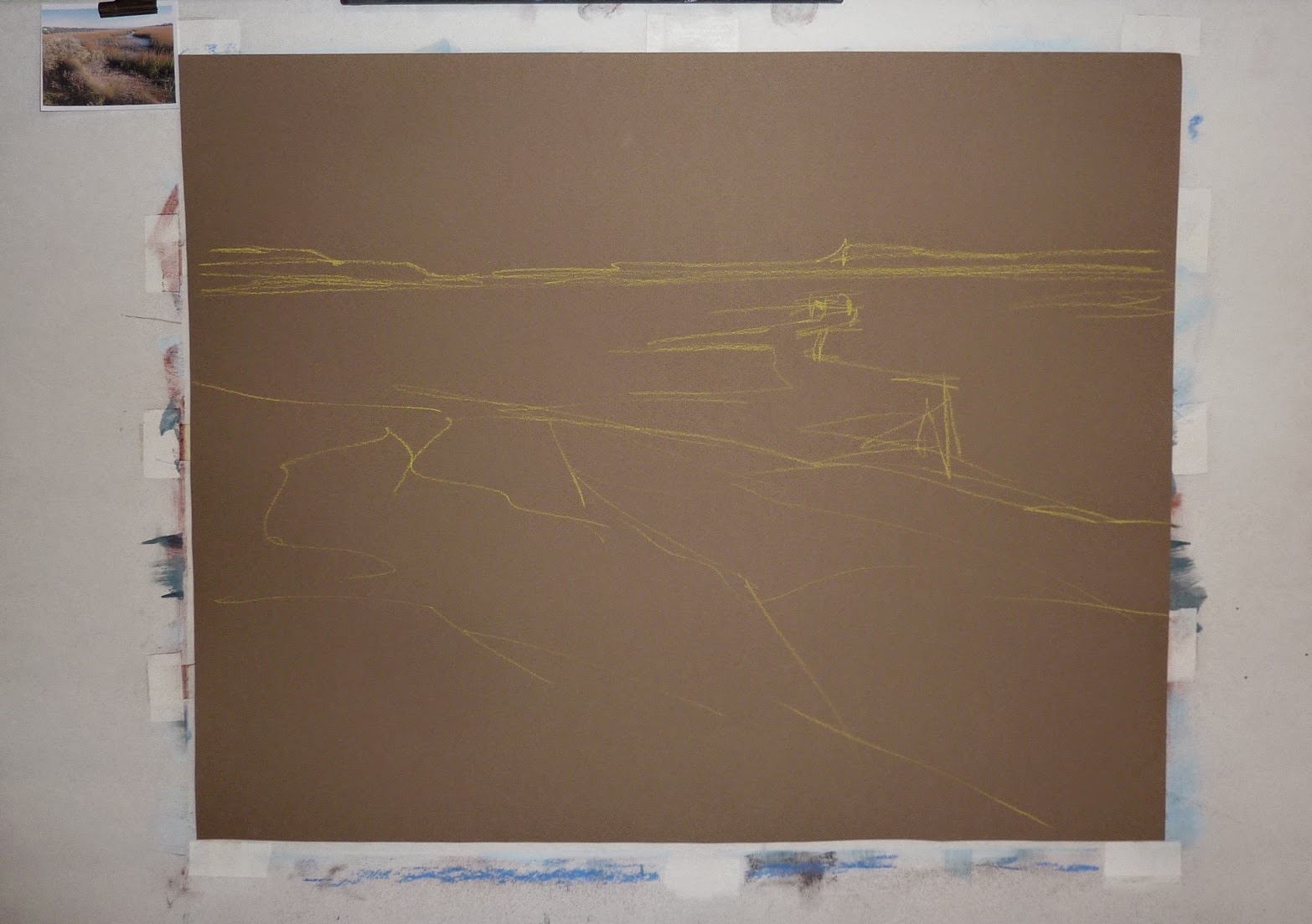
I begin with a rough sketch. I am using my recycled mat board. I like the purples and oranges of the original painting and the texture of the underpainting! I make a fat mark where I will place my figure (a cross country skier)


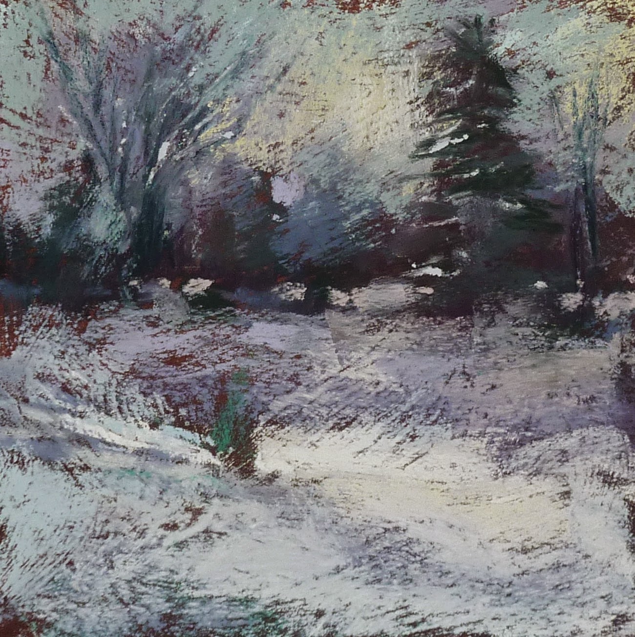
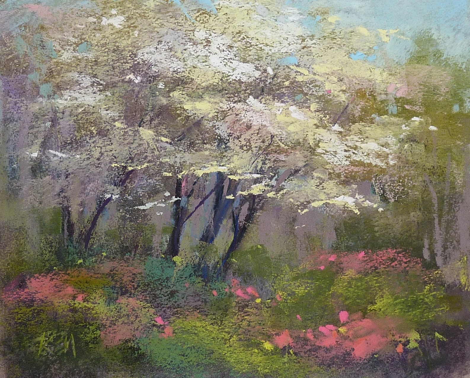
I develop the entire painting before I do anything to the figure. I know where he is going but I finished the surrounding landscape up to the mark where he will be. I know I will be able to paint him on top of the background because he is so small (about one inch)


When I am ready to add the figure I make some marks with my darkest value. I typically use a dark blue or purple. I try to get the gesture of the figure with these dark marks. I add a lighter value to his back to begin creating the form.


Next I add another shade of blue for the pants and a small dot of red for the hat. I also decide to add a tiny dot of brown/tan for his face.


I continue with a tiny for of red for his mitten, a brown line for the skis and a thin blue line for the ski pole. I use the snow color to refine the shape of the figure.
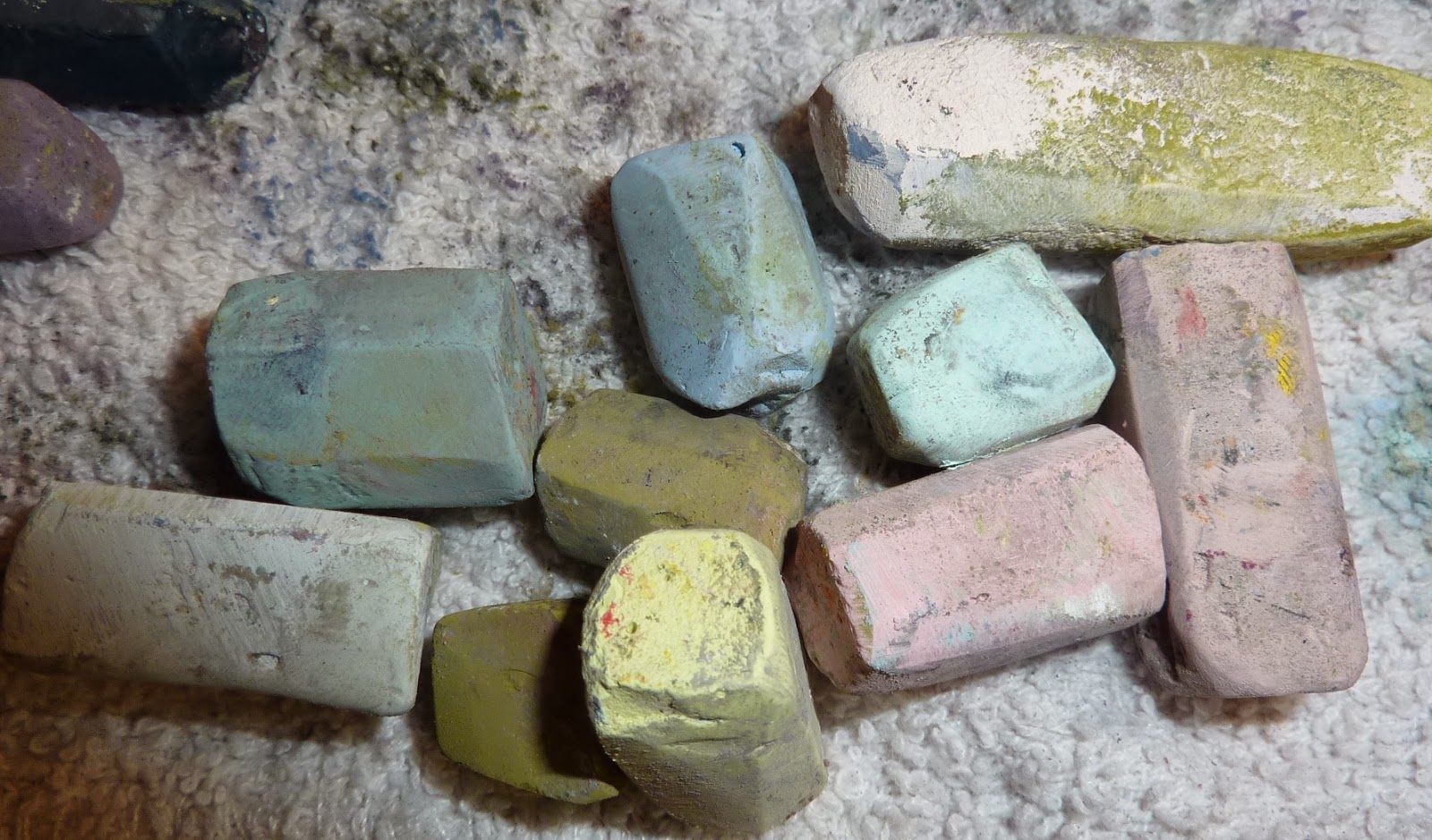
All of these tiny marks are made with the edges of soft pastels. I used Terry Ludwig pastels for this figure.


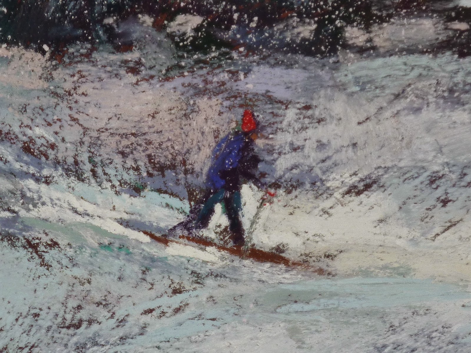
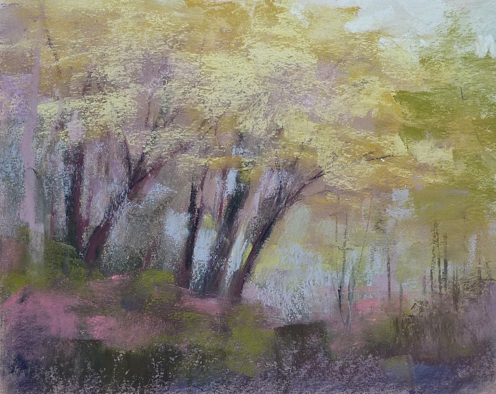
I add a little shaved snow to complete the painting and I am finished! 


Phoenix Workshop Day One

$
0
0
It was a great day to be inside painting! We woke up to a rainy day in Phoenix and I was glad it wasn't a plein air workshop! I was thrilled that 21 fantastic painters from the Arizona Pastel Painters Association came to paint! The theme for this two day workshop is 'How to Loosen Up and Add Spice to Your Paintings' . And everyone did an amazing job with many finishing two paintings!
I opened the workshop with some of my favorite 'Loose' tips and a demo using my simple approach to a pastel. After lunch we did alcohol wash underpaintings. The wildflower meadow in today's post was my afternoon demo.
One more day and I have a lot more planned! It is so much fun to share with such an enthusiastic and hardworking group of artists!


Why You Should Get to Know Your Paper

$
0
0
'Under the Desert Sun'            18x24             pastel             ©Karen Margulis
painting available for purchase $250
I just returned home from a fantastic visit to Phoenix, Arizona.  I was there to do a demo and teach a workshop for the Arizona Pastel Painters Association. I loved every minute of my visit. What a fantastic group of artists! It was a pleasure to share with them.

The theme for the workshop was 'How to Loosen Up and Add Spice to Your Paintings'. It was all about simplifying our subjects and learning ways to interpret our reference photos rather than copy them. It was so exciting to see everyone (21 artists) go outside of their comfort zones and try new techniques and exercises. Their work was impressive. We could have easily held a nice show of the finished work!

It is always wonderful to share but so often teachers receive back even more from their students. And so was the case in Phoenix. Not only did I pick up so great tips from my conversations with the group... I learned a valuable lesson about paper.

Know your Paper!


Getting set up for my demo
Get to know your preferred paper before you try another type or brand. It is great to experiment but jumping around from paper to paper doesn't allow you the chance to know how each paper really performs. You need to use a paper over and over until you know what to expect. You want to know without a doubt how your pastels will work and how to get the effects you want. 

When you are familiar and comfortable with a paper then you will better understand how the paper choice influences the outcome of your painting. The same way of working doesn't always get the expected results on an unfamiliar paper. Paper really does matter!

I know my paper. My go-to paper is Uart 500 and I know how it performs for me. I am comfortable with it and know what to expect when I use it. It never surprises me. Except for at my demo in Phoenix! 

I decided to buy Uart Board for the demos thinking it would be easier to carry and put up on the easel. Not such a good idea. I rarely use mounted Uart and I didn't expect that the mounted Uart acts differently than unmounted Uart paper.  Somehow the texture of the conservation board comes through and creates a totally different feel to the paper. My pastels didn't go on smoothly and there was a lot of texture peeking through. You can enlarge these photos to see the texture. 

'Along the Chama'               18x24           pastel             $250
I didn't  mind the texture. In fact I kind of enjoyed it but it meant I needed to work a bit differently to get the painting the way I wanted.  It will require some more experience until we become better friends.

So often we don't give much thought to the paper we use. Maybe we choose the paper on the top of the pile or use a paper because we don't like it and have lots of it and we want to use it up!   But paper does matter. It will effect how the painting looks. Make it a priority to get to know your paper. I know I will!


I'd love to come teach a workshop in your area! Let me know if you are interested in learning more! click here to send me an email.

Why It is OK to Paint Something More than Once

$
0
0
'Summer Comes Gently'              9x12              pastel              ©Karen Margulis
purchase painting on Etsy $145
I don't ever worry about running out of things to paint. Inspiration can be found everywhere. In fact it is often difficult to settle down and pick something from the 33,000 photos in my photo files. Even though I have plenty of choices  I find I am drawn to some of the same images again and again. Some images just seem to speak more loudly than others. I listen!

I remind myself that is is OK to paint something more than once. In fact it is a good thing.


'Mountain Treasure'      pastel       8x10            $145
 Often we resist the urge to paint from the same reference more than once. Maybe we feel we need to try new subjects. After all once we have 'done' it what is left to learn?  There is plenty to learn!

  • Painting something more than once helps us become intimate with our subject. The more comfortable we are the more we are able to take risks.
  • Familiarity leads to more expression. Once we know our subject we have more success with making changes to our references. We can be more intuitive because we are already familiar with the scene.
  • Painting something more than once allows us to explore other solutions. We can try new techniques, change paper size and/or orientation, change the point of view. The sky is the limit!
  • We learn more because we aren't starting from scratch. We don't need to reinvent the wheel....only improve it!
I was asked recently if I had painted a meadow of poppies before. That led me to search thorough my paintings and quickly found these four poppy meadows. So the answer is Yes!  But each time I revisit this favorite motif I challenge myself to create something new. I enjoy the freedom that this old friend gives me to explore and discover new interpretations.


'Meadow Song'             9x12            pastel           $145

'Big Meadow'          8x10        pastel        $145

While we are on the subject of painting my favorite motifs,  I am working on preparations for my Wildflower demo for the upcoming IAPS convention. I do have some new openings for my  demo so if you are already registered you can add sessions now. Be sure to check the IAPS website to see all of the openings. You can add classes online by going to your registration record:

HOW TO GO BACK INTO YOUR REGISTRATION RECORD
Open the IAPS website at www.iapspastel.organd click on IAPS CONVENTIONS - 2015 CONVENTION  in the left sidebar, or click on the yellow and red convention logo in the lower left corner of the home page - either will take you to the convention pages.  Click on REGISTER and then scroll all the way down to the bottom of that page - you may need to use the slide bar on the right side to get right to the bottom of the page.

Click on LOGIN TO EXISTING REGISTRATION, enter your email address and your password and you will go to your registration record.

Where to Find a Treasure of Pastel Tips

$
0
0
'Nantucket Moors'              8x10             pastel             ©Karen Margulis
purchase this painting here $145
I am always on the hunt for tips to help me create better paintings. When I come across a good idea I usually give it a try and share it on my blog. For the last few years my blog has been devoted to sharing the art tips that have helped me. This blog has become a treasure trove of pastel and general art tips.

It is all here...posts that date back to 2006! But I recently discovered that many of my blog readers don't realize they can search the blog for the topic they are interested in.  Many of you receive the blog by email. It is convenient to read each day's post in an email but then you are missing out on the other features of the actual blog.

On the actual blog page I have links to classes and workshops. I have a studio tour and links to my You-Tube videos and pdf demos.  You can also scroll through all of the recent posts. But my favorite feature is the search box located at the top of the sidebar on the right. Simply put in a search word and you will be shown all of the posts in my blog that include that word. I did a search for the word 'Green' and uncovered several posts on painting with green. Here are the results. Lots of good information! Give the search box a try!

If you are reading this post via email click on this link to go directly to the blog to see what you are missing.  www.karenmargulis.com


Terry Ludwig's set of 90 greens

Reading all of those posts on green inspired me to paint something using only green.  I used only my set of Terry Ludwig 90 greens plus a pale TL green/yellow that was not in the set. I also used a piece of dark green Canson Mi-Teintes paper. Lots of green!  It was a fun challenge!

today's reference photo

A Studio Tool to Make Your Life Easier

$
0
0
'Beyond the Trees'          6x6          pastel             ©Karen Margulis
purchase this painting here $65
 I don't know why I waited so long! It is a good day in the studio and it has nothing to do with painting! I got a new vacuum cleaner and my life just became easier!  I know that sounds strange but I spend the most time painting and vacuuming comes in second!  Yes I vacuum a lot! I have a Labrador Retriever and 6 cats. If that wasn't enough I have a big studio with carpet that needs vacuuming everyday.

It's funny how you don't know how much you need something until you get it. I liked my old vacuum....or so I thought. It worked fine and had a retractable cord. But is was heavy and I had to lug it up and down the stairs every day. I was over it. I was in  Costco today and they had a good rebate on the Shark Rotator vacuum. I was tempted but when I saw three people with the vacuum in their cart I decided to get one. Read more about it here: Shark Rotator Professional Lift-Away

Heidi approves the new vacuum cleaner. She is a fur machine!
 After vacuuming my whole house from top to bottom I can say that I am thrilled! This vacuum is lightweight. I can carry it up the stairs with one hand! Not only that, the canister comes off to make it a portable unit. No more dragging and balancing the old vacuum on the staircase when I need to vacuum the stairs. The hose is long and is very easy to pull out and use....no bending over. The cord isn't retractable but it is very long....I was able to vacuum the whole studio without changing plugs. The vacuum comes with all kinds of attachments that I have to read about and figure out but even without them I know that my life just got a lot easier. (and it is a pretty little vacuum too)

I know! Sometimes it is the simple things that make me happy! But if I can make clean-up easier I have more time to paint and that is a good thing!


'The Stand'          6x6           pastel           $65
 Today's paintings are recent 6x6 pastels done from plein air studies. I used Pastelmat that I toned dark purple.

Why We all Need a Gutter

$
0
0
'Silver Ribbons'          12x18              pastel            ©Karen Margulis
purchase painting here $165
 I can't paint without my gutter. I may have a great new vacuum cleaner but my gutter saves my floor and my pastels. Gutters come in all shapes and materials. Pastel artists get creative with their gutters! If you use pastels than you probably have your own version of  dust collector. (the thing we put under our painting board to collect falling dust) I had an artist friend call them gutters and that word has stuck.

Yes pastels do create some dust.  I have never used a vacuum system or air purifier but I do vacuum and dust at least weekly. Frankly I get more dust upstairs where I don't paint than in my studio where I paint every day!  Dust isn't really a big issue. Sanded papers grab pastel so well that there is very little flying dust. Here is what I do to control the bit of dust that is produced:

My pastel gutter is coated foamcore board

  • I prefer to paint with my board/paper on an easel that is not tilted back or forward. This allows the dust to fall straight down. It is collected in the gutter.
  • Occasionally I will tap the top of the board to dislodge any loose dust.
  • I NEVER EVER blow on a painting to dislodge dust. This only puts the dust in the air where we might breathe it in....or where it will settle on the floor or furniture.
  • I put a dust collector (gutter) under my painting board.
  • My favorite gutter is made of a piece of coated foamcore board from an old advertising sign. I cut it into 4 x 24 or 36 inch strips. I score it lengthwise on the back which forms a nice dust collector. The coated surface makes it easy to wipe clean.
In the past I have used tinfoil, paper towels and  butcher paper but my foam core gutters have been the most durable. I wouldn't be able to paint without them!  

It's your turn!  I know you have great ideas for gutters. What do you use to collect your pastel dust? Share in the comment section or feel free to email me your ideas and photos. I will compile them into another post so we can share the great ideas I know you have! kemstudios@yahoo.com

Today's painting: 12x18 on uart 500 with a dry wash underpainting in cool colors.

My Favorite Tip to Prevent Overworking a Pastel Painting

$
0
0


'The Proposal'               11x14                 pastel              ©Karen Margulis
I had one of those great Aha Moments last week. It is something very simple and I don't know why it wasn't obvious to me before. There is an easy way to help avoid the dreaded Overworked Pastel Painting. It is something I do all of the time but I just put it all together!

An overworked painting happens for many reasons but one of the most common reasons is the result of adding too many layers of pastel. Our wonderful sanded papers accept so many layers of pastel so we are tempted to keep on layering the color. But the more layers we add the more we risk filling the tooth of the paper. As the tooth is filled the layers begin to physically blend. This often leads to dull muddy looking color.

I find that fewer layers result in fresher and more vibrant colors. Limiting my layers, having economy with my marks...saying it and leaving it alone. These are all things I try to do with each painting. Here is a way to make this easier to achieve:

The block in layer on Uart paper

The block in layer now rubbed in for the dry wash

Start with a toned piece of paper or some kind of underpainting!

Think about it....if you start with white or very light colored paper such as Uart this light color will tend to peek through your pastel layers. This is great if you are painting snow or sand or something very light. But if you are trying to get nice cohesive darks or solid areas of color these little white specks can drive you crazy. It leads to a heavier hand or adding more and more layers until the offensive spots are covered. By the time they are covered....the painting may just have too many layers and can start to look overworked.

Solution: Start with colored supports. I choose colors that I know will work well with my painting. I loved Wallis Belgian Mist because the nice middle value gray-brown was a wonderful unifier of any painting when bits of paper peeked through.

What if you love white or light papers? Consider toning it. One of my favorite techniques is the dry wash with a light layer of pastel that I rub into the paper with pipe insulation foam. It allows me to tone my paper and set up my value map all at the same time! Now I don't have to add layer upon layer to cover up the paper!


A Painting Makeover: Winter turns into Summer!

$
0
0

'A Good Year for the Queen'            8x10            pastel            ©Karen Margulis
click here to purchase $145
It's playtime in my studio today! I have a big to-do list but nothing pressing at the moment so it was time to paint for fun. It is a time to experiment and make discoveries. I will share all of the fun in upcoming posts. One of the projects today was a painting makeover. I love taking a painting that just didn't click and having fun with it.

Here is the painting that I decided to make over:

The original painting was a winter landscape 
It was an 8x10 demo I did for a private class. The student wanted to paint a snow scene. The painting served it's purpose to explain some snow techniques but I wasn't excited about it. I am finished with snow and ready for spring and summer!  Why not use the 'bones' of this painting and turn it into a summer landscape?

the photo that inspired the revised painting
Last summer was kind to Queen Anne's Lace. It was everywhere and it was thick! I had a photo that would work for my new landscape. 
  • To start the transformation I brushed off as much snow as I could. I then sprayed the painting with some workable fixative to seal the ghost image.
  • I kept the major shapes of the trees and developed them a bit more. I added the distant blue mountain shape.
  • Next I put in some nice rich darks that would form the pathway under the grasses.
  • Time for the grass. I begin with a cooler and lighter green in the distance. I used a variety of greens in the mid and foreground to represent the variety of grasses.
  • Next came the flowers. I wanted the Queen Annes Lace to drift lazily towards the trees. I varied the size of the flowers to create this effect....big to small.
  • Some of the flowers were in shadows so they are blue.
  • I choose a few flowers to highlight and make more important.


a close up showing the textured surface
Painting tips: This painting is on a piece of Multimedia Artboard that I prepped with clear gesso leaving a nice random texture. It was originally toned orange. 

A Quick Pastel Demo: Wild Roses in the Moors

$
0
0
'The Wild Roses are Calling'              8x10              pastel               ©Karen Margulis
purchase this painting on Etsy $145
I have a great idea for the prevention overworked paintings . Turn off the lights!  It really works. Today the power went out. Just as I was making my final marks on this painting boom...out went the lights. They didn't even flicker. I knew it wasn't coming back on anytime soon. I had to leave my painting in the dark.

Two hours later the power was back on. It was long enough for me to get away from my painting and come back to to with fresh eyes. I realized that I was done. If I fiddled anymore and added more flowers and grasses it would have been overdone! I may have cursed the power company but my painting was saved!

I did manage to take some progress shots before the power went out. Enjoy seeing the painting unfold!


I began the painting on Multimedia Artboard with a coating of clear gesso for extra texture. I chose to do a watercolor underpainting using Cretacolor Aqua Briques (review coming soon) Click on the image to enlarge and see the texture.


Here is my reference photo. It is Nantucket Island. I recall the heady smell of the beach roses and the gentle sea breeze.


Once the underpainting was dry I started adding pastel. I began by revisiting the dark areas. I arranged the darks to create a subtle pathway for the eye. It will get covered by grasses and bushes but I need to put it in so it will be there in a subtle way.


It is hard to see in this photo but I next painted the sky. I used some pale pinks and yellows to create a soft overcast sky. The pinks in the sky will be harmonious with the flowers that will come.


I now work my way forward. I use blues and cool greens for the distant bushes and land mass.


Before I go any further with the greens I lay down some pinks. I don't want to paint every single flower. I want to suggest the masses of flowers and only paint a few blooms. These swaths of pink will peek out from under the green grasses.


Back to the green! I work on the distant greens. I use a variety of cool and neutral greens in the distance.


I come forward and use some warmer greens. I then use a quick spray of workable fixative to give me even more texture. I add darker warm green to begin the rose bushes.


To give the bushes form I add lighter and slightly warmer greens on the tops of the bushes. I now have a very green painting. It is time to add the roses. I uses 4 different values of pink to paint the roses. I begin with the darkest pink and make a few heavy but small marks. The brighter pinks come next. Every rose is placed with thought. I don't want to add too many. I arrange them so that the eye will be led into the distance. Next I add a few grasses. This is when the power went out. I'm glad it did because I might have gotten carried away with flowers and grasses!


Which Underpainting Technique is Better...Wet or Dry?

$
0
0
'Be Kind to Bees I'              5x7               pastel                 ©Karen Margulis
painting available on Etsy $65

'Be Kind to Bees II'              5x7          pastel         purchase $65

Wet or Dry? This is the question of the day! I have been asked this question many times and realized I have never really answered it on the blog. I am talking about underpaintings for pastel. There are so many wonderful options for starting a pastel painting. Some of these involve wetting the pastel or using a wet medium such as watercolor. The other option is to do a dry underpainting or wash...simply apply an initial layer of pastel and rub it in with fingers or tools.

So which underpainting type is better? It really is a matter of personal preference but I do have some thoughts to share on the subject.

  • I do both wet and dry and truly like them equally! Each type will produce different results so my choice depends on the concept for my painting (or my mood!)
  • DRY WASH: I choose this underpainting when I don't want to wait for anything to dry. I also use it to set up a value map so it serves a purpose. It is great for my quicker studies and plein air paintings.It is my go-to technique and I use it for the majority of my paintings.
  • WET UNDERPAINTINGS: I choose wet when I want to be playful. When I want something interesting and fun to respond I turn to wet washes or wet media such as watercolor or oil stains. Certain subjects work well with wet underpaintings. I have discovered this through trial and error but all of my experiments give me a better understanding of the potential for each wet technique.


  • TIP: Try them all! Experiment with the many options for both wet and dry underpaintings so you can make more informed intuitive choices.


  • For today's paintings I took the same subject and tried both a dry wash and a watercolor underpainting. Each underpainting led to very different finishes even though I used a similar color palette. I covered up more of the watercolor than I wanted but I was in playful mode so I sprayed it with alcohol. Wet = Playful  Dry = Purposeful

    Dry Wash underpainting with pastel rubbed in with a piece of pipe foam
    which set up a value map. Rubbing it in let me decide where I wanted to make more clarity.

    Wet underpainting with watercolor on Multimedia Artboard

    Wet again with a sprite of alcohol then scratched with a stick to
    create more texture in the grasses. It was a playful and fun approach.

    reference photo

    Trying New Art Supplies and I am in Love!

    $
    0
    0
    'Roadside Meadow'               9x12               watercolor           ©Karen Margulis
    painting available here $75
    I didn't intend to buy any supplies. But I am glad I did! A couple of weeks ago I attended an art materials expo and bought a few things that I thought looked interesting. I have been itching to give them a try.  I had a bit of playtime in the studio this week so I decided to try the Cretacolor Aquarelle Blocks. I bought the set of 20 blocks.  They are solid blocks of watercolor pigment and can be used for drawing and painting.

    I was intrigued when I tested them at the expo. I liked the large 1x2 inch blocks which can be used to draw or can be used like classic watercolors. I imagined the underpainting possibilities! The pigments were rich and vibrant. (and lightfast)

    My plan was to use them for watercolor underpaintings for pastel. I took out a pad of watercolor paper so I could explore them. Were they ever fun to use! I didn't want to stop. I was reminded of advice from Richard McKinley when I struggled with watercolor underpaintings.....just paint lots of underpaintings without adding pastel. Get to know what the watercolor can do. Great advice and these blocks made practice fun. I think I'll leave them as watercolors and do some more! 

    Next I will try them as drawing tools. I am interested in using them to block in a painting and them wet the color with a brush. I'll report back!


    I love this set of Cretacolor Aqua Briques

    'Summer Profusion'       9x12           watercolor      $75


    'Happy'             9x12           watercolor   $75

    Thank you for all of your suggestions for pastel gutters. I will be posting your ideas soon!


    The Power Of Mark Making in Pastel

    $
    0
    0
    'Made with Care'              8x10              pastel            ©Karen Margulis
    purchase painting on Etsy $145
    I don't know what I love the most about pastels. Is it the vibrancy and the huge and tempting array of colors? Or is it their immediacy and very tactile nature?  Holding a stick of pure pigment in my hand is the ultimate way to paint. Once I got past the learning curve I was able to make a wide variety of marks with the fattest stick of pastel.

    That's what I really love. The ability to paint and draw with color. I love the control I can get from a pastel.....from a wide bold swath of color to a delicate painterly line. It's very satisfying. The more I paint, the easier it is to get the marks I want. There is a lot to be said for practice! Not only do we improve our ability to make marks we also develop our own unique calligraphy!

    TRY THIS: Paint a bird nest!  The bird nest is the perfect subject for exploring the mark-making possibilities of pastels. Try to paint a nest with a variety of marks....wide side strokes, delicate linear marks, blended marks.....How else can you paint a nest?  What happens when you use hard pastels vs soft ones? Round vs square? Have fun exploring!

    My next mini workshop will be held on March 25 in my Marietta studio. We will be exploring the topic of mark making. It will be a lot of fun. Contact me if you are interested kemstudios@yahoo.com

    How Many Leaves Does the Tree Need?

    $
    0
    0
    'Forest Walk'              8x10               pastel                ©Karen Margulis
    purchase this painting $100 click here
    What happens when a painting just isn't working?  We typically ask the question "What does this painting need?" Often this is followed by a flurry of painting.....adding another color here or maybe some more detail there. The more we add,  the more  the whole painting changes. The more the painting changes the more we have to 'fix' it. The result might be a great painting but often it ends in an overworked overly fussy painting.

    Sometimes it isn't a matter of adding something.....it is better to take things away!

    Today I revisited an old painting. It was done about 8 years ago on Pastebord. It was hidden in a pile of older work and recently resurfaced. I took a long look at it and decided it needed something...it needed LESS stuff!

    the original painting done 8 years ago.
    If I recall correctly this is a piece of white pastelbord with a watercolor underpainting. It was a very busy interior forest scene and I had trouble simplifying all of the trees. I remember adding lots of leaf shapes. I couldn't stop. In the end I felt like I got carried away and the result was a very busy and spotty painting. How could I simplify it? I wasn't sure then which is how it ended up in the 'pile'.


    Today I decided to tackle it. I started by taking away some of the busy stuff by brushing off most of the leaf shapes with a stiff brush. I then sprayed the painting with some workable fixative to restore some of the tooth.
    Next it was time to slowly rebuild the painting....keeping things simple.

    Brushed off and fixed...ready for a new finish

    • I liked the colors and general spacing and composition of the trees. I liked the dappled light and shadows on the path. I liked the light coming in from the background. I want to keep these things without putting in too many details.
    • I began by putting in larger shapes of foliage...I began with the sunlit yellow greens in the background. 8 years ago I wasn't looking for big shapes. I went for the details first. I painted leaves and not big shapes. This led to the spottiness. Now I look for the big simple shapes first and then put in a few leaves. I build the foundation and then I can decorate!
    • This time I make use of Negative Space to create foliage. 8 years ago I painted each leaf as a positive shape. I have learned that it is often more effective to have a big shape of foliage color and carve into it with sky holes. This results in the suggestion of leaves...it leaves more to the imagination.
    • The original path is also too busy. It is also much too purple. I decide to simplify the path and make the color more believable. I used a darker value of path color for the shadows instead of purple. I scumble a veil of blue over the shadows to account for the influence of the sky.
    • To finish the painting I add a FEW small leaf marks. I make myself stop before I get carried away and overwork the painting. 
    • I soften the outer edges of the tree trunks so they don't pull the eye off the painting. I add a few blue spice marks and call it finished.
    When I pulled out this older painting I saw things that I did that I thought I liked but as I have developed and learned more I realize that I work in a different way now. It was fun to go back and rework the painting trying to keep it true to my original vision.

    Why Your Wipes Should be 10 Feet Behind You

    $
    0
    0
    'To Infinity and Beyond'              18x24                 pastel           ©Karen Margulis
    painting available here $350
    It certainly would be more convenient. I have a shelf next to my easel. I keep things I might need on the shelf so they are in easy reach. While I am in the painting zone I don't want to stop and hunt for a needed supply. I keep a brush, ruler, charcoal, clips, fixative, banker's clip, magic rub eraser on the shelf. These are all things I might use in the heat of a painting frenzy.

    I don't keep my baby wipes on the shelf. I keep these on a table about 10 feet away. I am a better painter because my wipes are not within reaching distance!

    Yes I considered moving them to the shelf. But then I would not be forced to take breaks from my painting. The mini break that I take to walk over to grab a wipe is the perfect amount of time. It prevents me from fiddling. If I just had to reach for the wipes on the shelf I wouldn't get that break. Coming back to the painting with fresh eyes allows me to assess my progress. It prevents the mindless mark-making that we often fall into when painting.

    Especially towards the end of a painting I remind myself that every mark must have a purpose. Stepping back allows me to evaluate the painting's progress.

    Why use baby wipes? I tend to use a lot of wipes. I like the pop up hand and face wipes sold in my local grocery store. I don't wear gloves so my fingers need cleaning from time to time. I like clean fingers so that if I do touch the painting the color stays clean. (dirty gloves can also make a painting muddy if  the painting is touched) Clean fingers = clean paintings.

    By the way this little trick works for anything you use frequently while painting....water, cup of coffee, glass of wine! Keep them 10 feet away! Take a mini break from your painting!

    Painting notes: 18x24 Uart 500. I did a dry wash with warm and cool colors.

    What Can You Do With Your Pastel Bits?

    $
    0
    0

    'The Morning Gathering'         12x18            pastel             ©Karen Margulis
    painting available $175
     It is an inevitable result of painting. Pastels wear down. They break. We are left with bits and pieces of once favorite colors. My big studio box is filled with these tiny pieces. I can't bear to part with them. But they are really too small to use. Or are they?

    Don't throw them out! Bits and Pieces of pastel can be used. We can always crush them and make new pastels. I have not done this but it is on my list of things to try. I use my pastel bits in two ways. I save them for my tiny travel kits.  I also put them in my 'spice jars'.

    My collection of pastel spices
    Every painting needs some spice. I consider spices the small finishing touches. Those bits of eye candy that help lead the viewer through the painting. Little spots of color that the viewer can savor. Spices can also be small areas of texture from a heavier application of pastel. Little bits and pieces of pastel are the perfect size to make these small spicy marks.

    When my pastels get too small to hold comfortably I put them in little containers. I like to use plastic baby food containers. They are small, can stack and allow quick and easy access to the pastels. Any color can be used as spices. It depends on the painting. If you are organized you can keep colors separated. I am not that organized so I tend to have a mix of colors in my spice containers. I choose the spice color by scanning my containers and choosing the color that I think will work.

    My color choices are mostly intuitive but if I am not sure of the right spice color I will use a color wheel. See my post on choosing spice colors here.

    My big studio box is overdue for a good cleaning. I will take out all of the bits of pastel and replenish my spice jars!

    Painting notes: 12x18 on mounted Uart paper which is what created the texture.

    A Must Have Pastel Set! Terry Ludwig Shades of Nature Review

    $
    0
    0

    'Shades of Nature'             16x20             pastel            ©Karen Margulis
    sold
    I opened the box with eager anticipation. All new Terry Ludwig pastels had arrived. As soon as Terry Ludwig announced the new 'Shades of Nature' set I knew I had to try them. They looked like perfect colors for my marshes and meadows. I could't wait to get painting. Below is my painting using only this new set plus 3 blue TL pastels for the sky. What do I think about this set?  I'll sum it up... Put them on your must have list!

    Terry Ludwig's new set of 30 'Shades of Nature' pastels purchase here
    Terry has created this set of new colors using the foundation of deep ochre. They are lovely muted colors that are perfect for the landscape. They are available only at TerryLudwig.com and are not in any other set. 

    I wanted to give them a try so I chose a early autumn marsh landscape that seemed to have the same color palette as the set. I challenged myself to use ONLY this set for the painting. I did have to add three blue pastels for the sky and water. These colors were perfect for the dried grasses and muted fall flowers of the marsh!


    I selected a piece of brown Canson Mi-Teintes paper. I did a quick drawing and blocked in the first layer. I was concerned that the darkest color in the set wouldn't be dark enough. But what happened was a wonderful lesson in simultaneous contrast. The darkest pastel wasn't very dark but in relation to all of the other colors I used it was the darkest so it LOOKED dark enough.


    I rubbed in the first layer with the palm of my hand and finished the sky and water. I moved on to the marsh and began layering the wonderful oranges and golds.  I used some workable fixative to darken the foreground and to set up this area for some texture.

    I repeated this process a few more times until I had achieved the level of detail I wanted. I love Terry Ludwig pastels. They are just the right size and shape. I can create broad strokes or fine lines. They have just the right amount of softness without being crumbly. The colors in this set are muted but so rich. They went on the Canson paper with ease. I'm in love!


    I only used the Shades of Nature set plus three blue TL pastels for the sky.
    click the photo to enlarge and see the details.

    When a Painting is a Struggle...Some Advice

    $
    0
    0

    'It's a Sign of Spring'              8x10              pastel               ©Karen Margulis
    purchase painting here $145
    I should have known better. The painting began with a fight. I was using an old piece of Pastelmat paper that had some indentations. As soon as I put down my first layer I could see the marks. Interesting marks but they had nothing to do with my concept for the painting.  I kept going. It was a struggle and it went downhill quickly.

    My underpainting layer. You can see the indentation marks on the paper
     I began with an idea for the painting. I wanted to paint the dirt road leading back into the distant trees. It was an early spring landscape but my concept was about the road and not really the hints of spring in my reference photo.  Ultimately  that was the cause of my struggle.

    My reference photo and initial drawing. It is all about the road!
    The road wouldn't cooperate. It wasn't in a good place. I tried to move it. I didn't like my foliage shapes. They kept growing. I kept cutting them back. I threw everything I had at the painting. It got too busy and the road disappeared. I wiped it off and tried again. The bushes grew again. I was very very close to giving up. I didn't want the painting to win. But that was exactly my problem. I was fighting the painting.

    My painting wanted to go in a different direction. I wasn't listening. I was frustrated and I wasn't having fun. And then I had a thought. What if I listened to the painting and let it go where it wanted? This time I let the bushes grow. The painting became about them...the little hint of Spring became a full blown stand of Forsythia in bloom. That is what it wanted to be all along.

    "I begin with an idea, but as I work, the picture takes over. Then there is the struggle between the idea I preconceived... and the picture that fights for its own life."George Baselitz

    The next time you are in a struggle with a painting. Listen carefully to what it may be telling you. You never know what might happen if you pay attention!

    A New Camera for a New Adventure

    $
    0
    0
    'Welcoming Spring'           8x10            pastel             ©Karen Margulis
    available here $100
    It was time. I admit am a camera nut.  I have a few cameras and all serve their purpose. But it was time to replace my small Canon Elph. I have had it for years and it served me well. The screen has several big dead spots and it was just not responding as fast as it used to. I like to have a small point and shoot to throw in my purse or backpack so I considered just replacing it with an updated model.

    Then I started to do some research. I really want to do more with video. I want to VLOG! Video plus blog equals a vlog. I have a YouTube channel and I have posted some rough videos done on my computer webcam. I needed to step up my game and do a better job so I decided to find a camera that would be small enough for travel but take great videos for my vlogs.


    I settled on a Canon Powershot G7X. I am a Canon girl so it made sense. I know the dial and functions even though I can't see them without my glasses. It has a nice flip up screen for selfies and videos. I have a lot of reading to do to get the most out of all of the camera's features. I did manage to get the camera to connect to my computer and upload photos through wifi and I took a quick video and managed to upload it....so good progress!  I will report back and give a more complete review soon.

    Look for my first Vlog soon. Help me make my blogs as helpful as possible. Share your ideas for subjects you'd like me to talk about!


    Painting a Dogwood Tree in Three Easy Steps

    $
    0
    0
    'The Queen of Spring'           8x10            pastel              ©Karen Margulis
    painting available here $100

    My dogwood trees won't bloom. They are about five years old and every spring I hope they will but so far nothing but nice green leaves.  I will have to be satisfied with painting dogwoods in bloom. Flowering trees can be a challenge to paint. They are like giant bouquets of flowers.....plenty of details to get caught up in. It is so easy to get carried away and end up with a tree covered in dots and blobs of color.

    I have simplified my dogwood trees into three easy steps.

    1.  Paint the trunks. Dogwoods have trunks with character. The are lyrical and irregular. I use a dark blue or purple pastel and draw some lyrical painterly lines for the trunks. I make sure they get thinner as they get taller.

    2. Block in the MASS OF FOLIAGE. I treat the flowers as a mass. I don't paint individual blooms. I put down the darkest colors I see in the mass. The flowers are typically a creamy white to pink. They may appear pure white especially against the dark backdrop of the woods....but the flowers are not really pure white.

    I didn't use pure white for my flowers. I started with violets and dull greens of a medium value. As I developed the masses I used lighter values such as pale yellows and pinks. I also develop the background at the same time using the background colors to carve away at the flower masses making sky holes.

    3. Refine the Tree. I continue to add lighter and lighter values to the flower masses. I am still keeping the large masses intact. I am careful to leave some of the dark showing. I am trying to create the form of the trees. I also work on the foreground bushes and add a few hits of azaleas.

    Since I am working on Canson paper and I don't have a lot of tooth, I decide to use some workable fixative so I could build more layers. I finish the tree with some dancing flower shapes...these are my brightest and heaviest marks. I place them carefully so that they move they eye around the painting. I don't paint every flower. I want to leave something to the viewer's imagination.

    The pastels I used for the dogwood blossoms

    My initial block in...keeping shapes simple

    Beginning to add the lighter values and creating volume in the tree
     Besides painting dogwoods I spent the day at the computer making my first installment of my video blog or vlog. I plan to share it tomorrow so don't miss my premiere!
    Viewing all 2266 articles
    Browse latest View live