Quantcast
Channel: Painting My World
Viewing all 2266 articles
Browse latest View live

New Video Blog Demo of a Quick Daily Painting

$
0
0
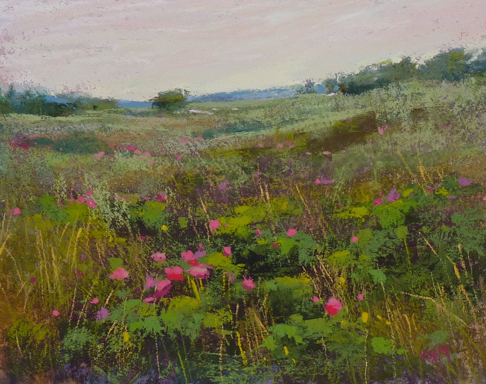
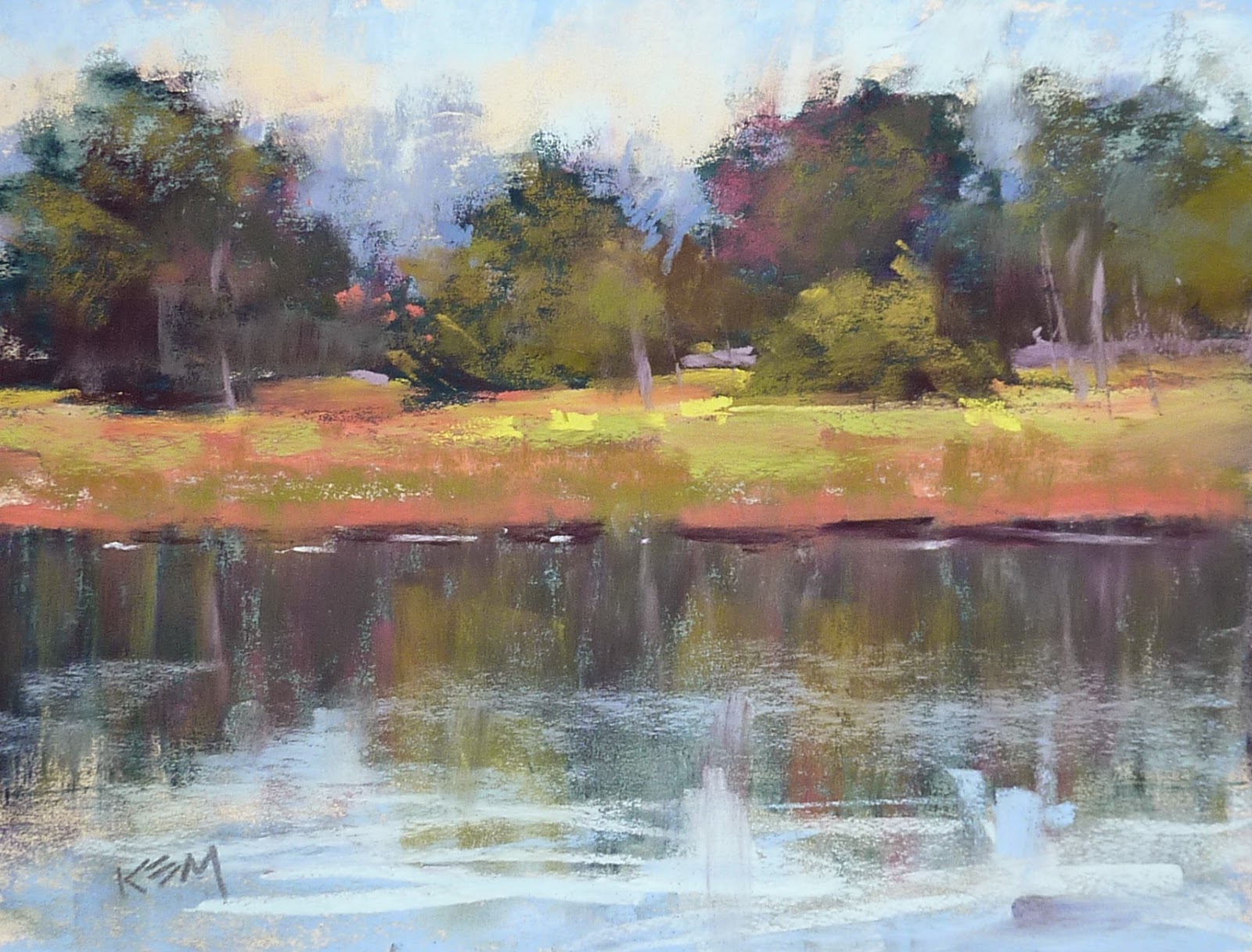
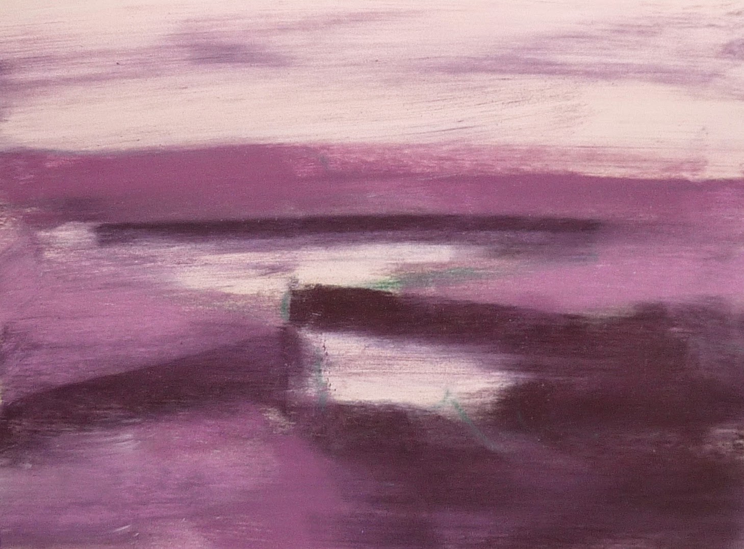
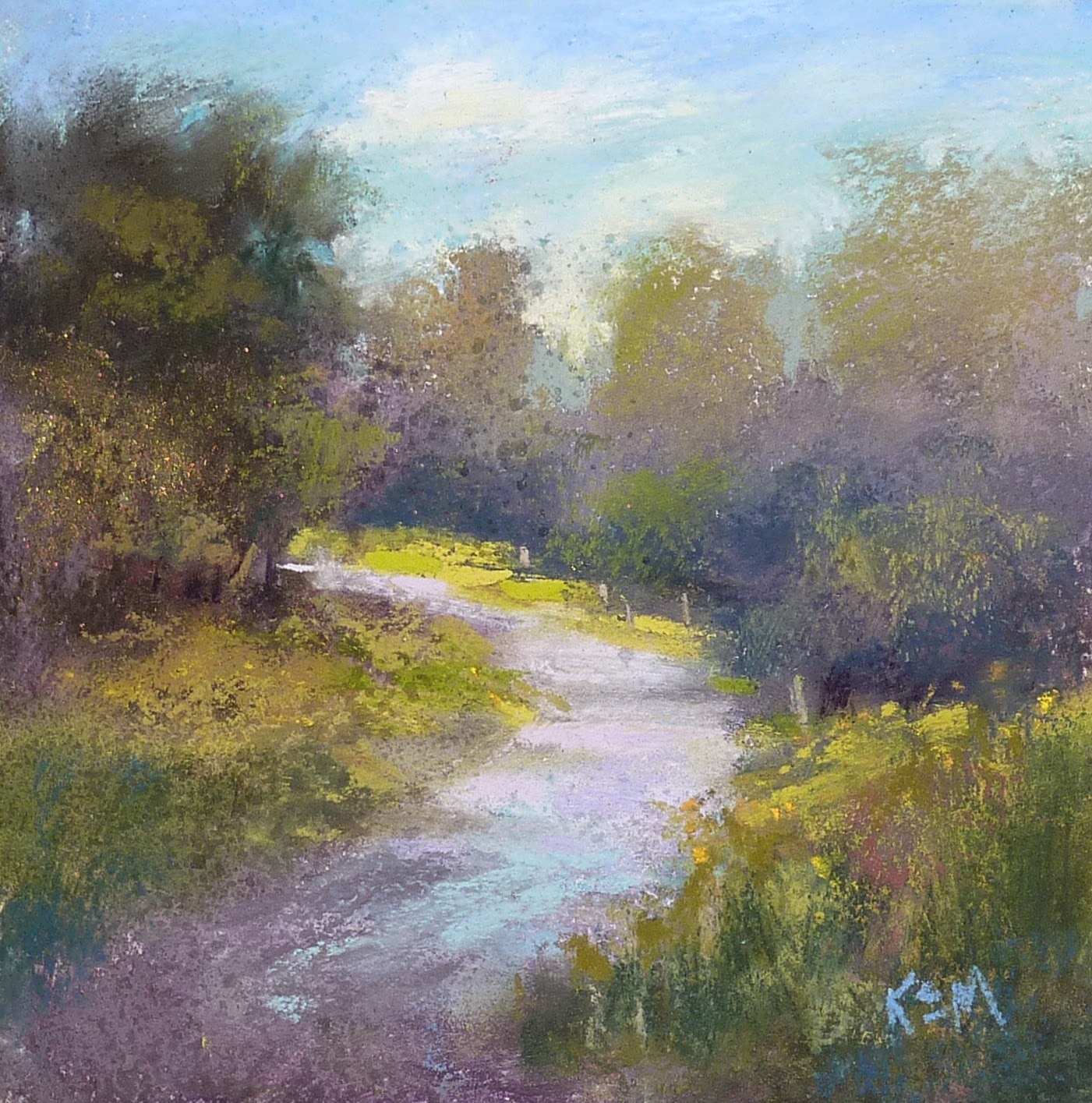
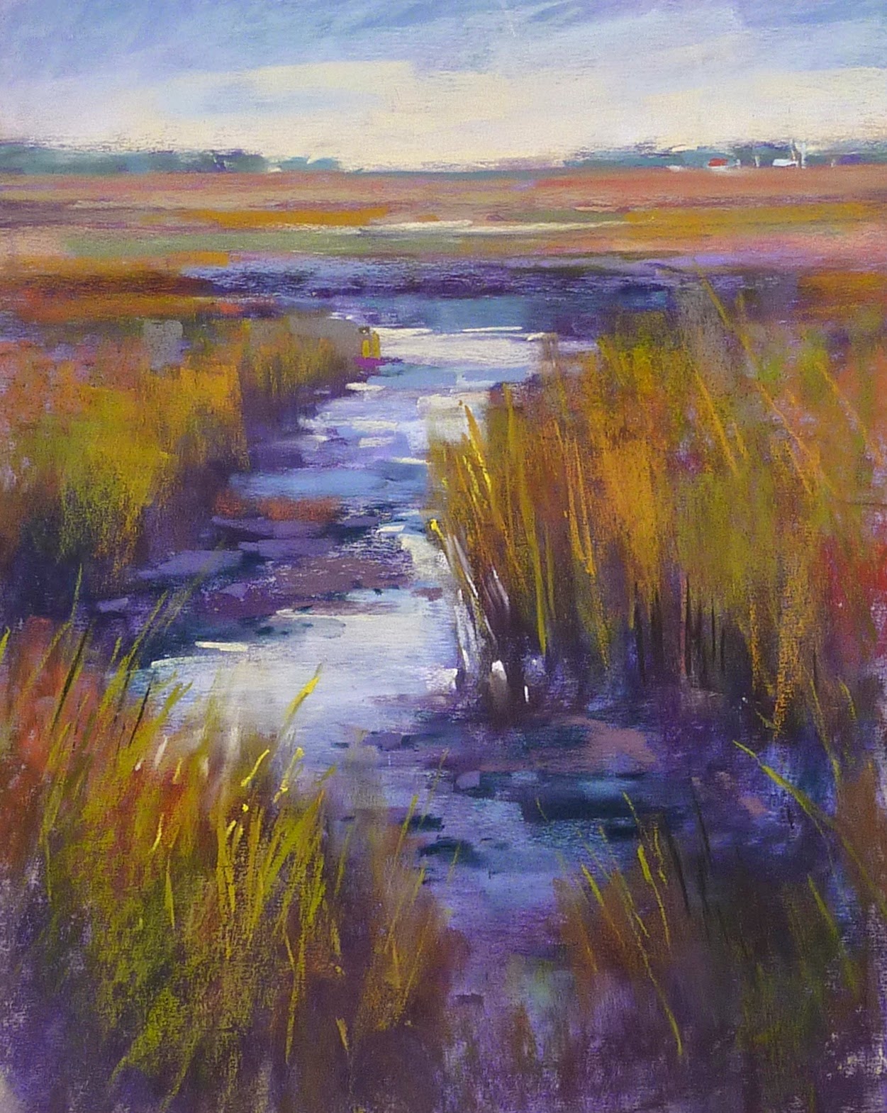
'Happy Meadow'           5x7             pastel             ©Karen Margulis
click here to purchase $45
 If a picture is worth a 1000 words what is a video worth? If blogs are great for sharing words and pictures imagine the possibilities for sharing through video! I am excited to share my entry into the world of video and YouTube with my first video blog episode. Here is the back story.

My daughter is an avid fan of certain channels on YouTube. She follows these 'vloggers' every day just as we read our favorite blogs everyday. She encouraged me to start my own YouTube channel and share my art life through video. At first I resisted. I have enough to do. I don't have the right equipment. I have no idea how to take and edit a video. Would anyone really want to watch?

I tested the waters a bit last year with a few simple videos on YouTube. The quality wasn't very good and the learning curve seemed steep so I let it slide. But then I needed a new camera for my upcoming art adventures. I thought it would be a good idea to get a camera that would be good for travel but would also take decent (and would be easy) to take videos....just in case.

my new camera
I got my new camera. I mulled over taking a video. And then it occurred to me. I can learn how to make and edit a video. It's just like painting. We need to learn the basics and then practice.....a lot. Things may be rough in the beginning but with practice they will improve. I have to take the plunge and just do it!

Video will be the perfect complement to this blog. We are artists....visual people. I can show so much more with video!

So I am pleased to share my first episode of my new video blog 'An Artist's Life'. I plan to add a weekly installment and I will share it here. I encourage you to subscribe to my YouTube channel so you won't miss an episode!

(if you are reading this post by email the link to YouTube may not work. Go directly to the blog at www.karenmargulis.com for the link or copy and paste this address in your search bar https://youtu.be/m8VRQm-jzNE)


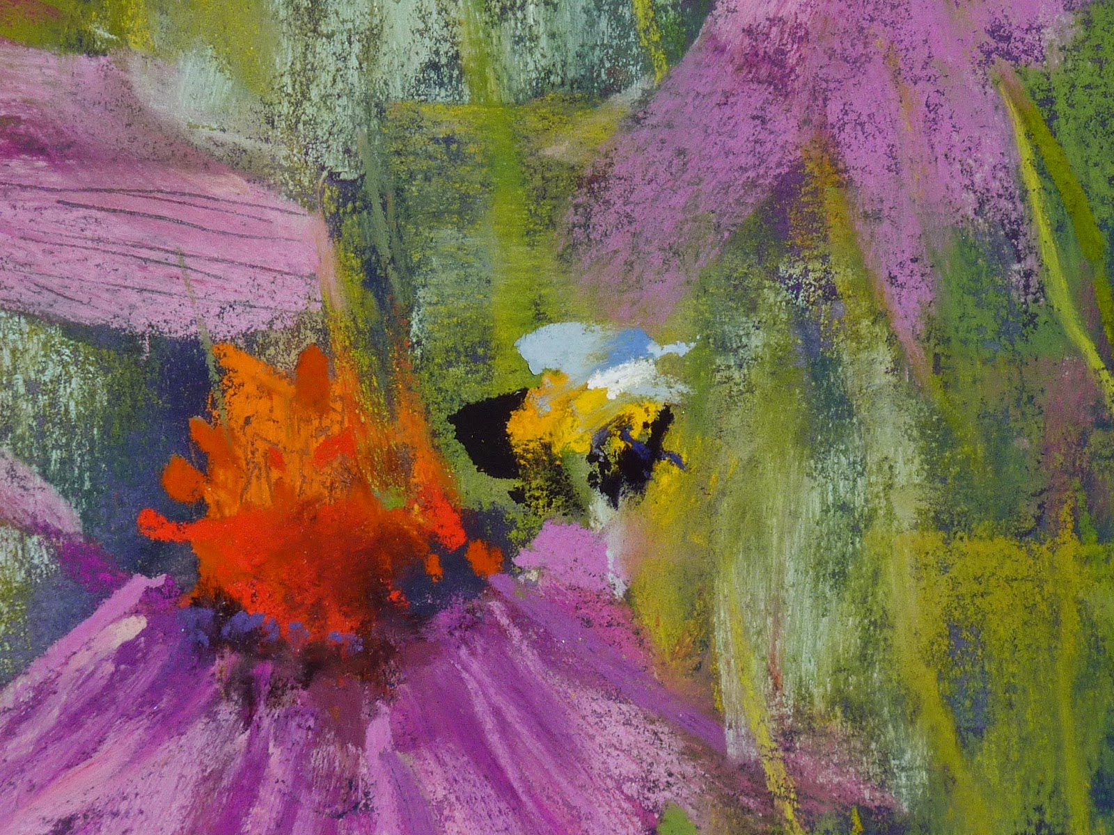
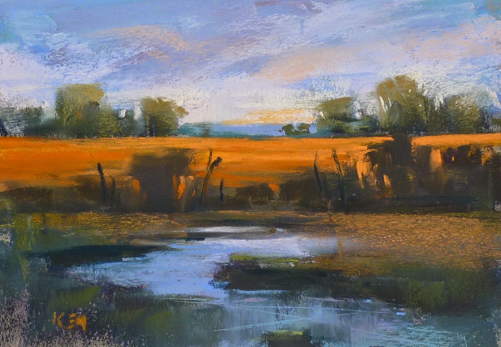
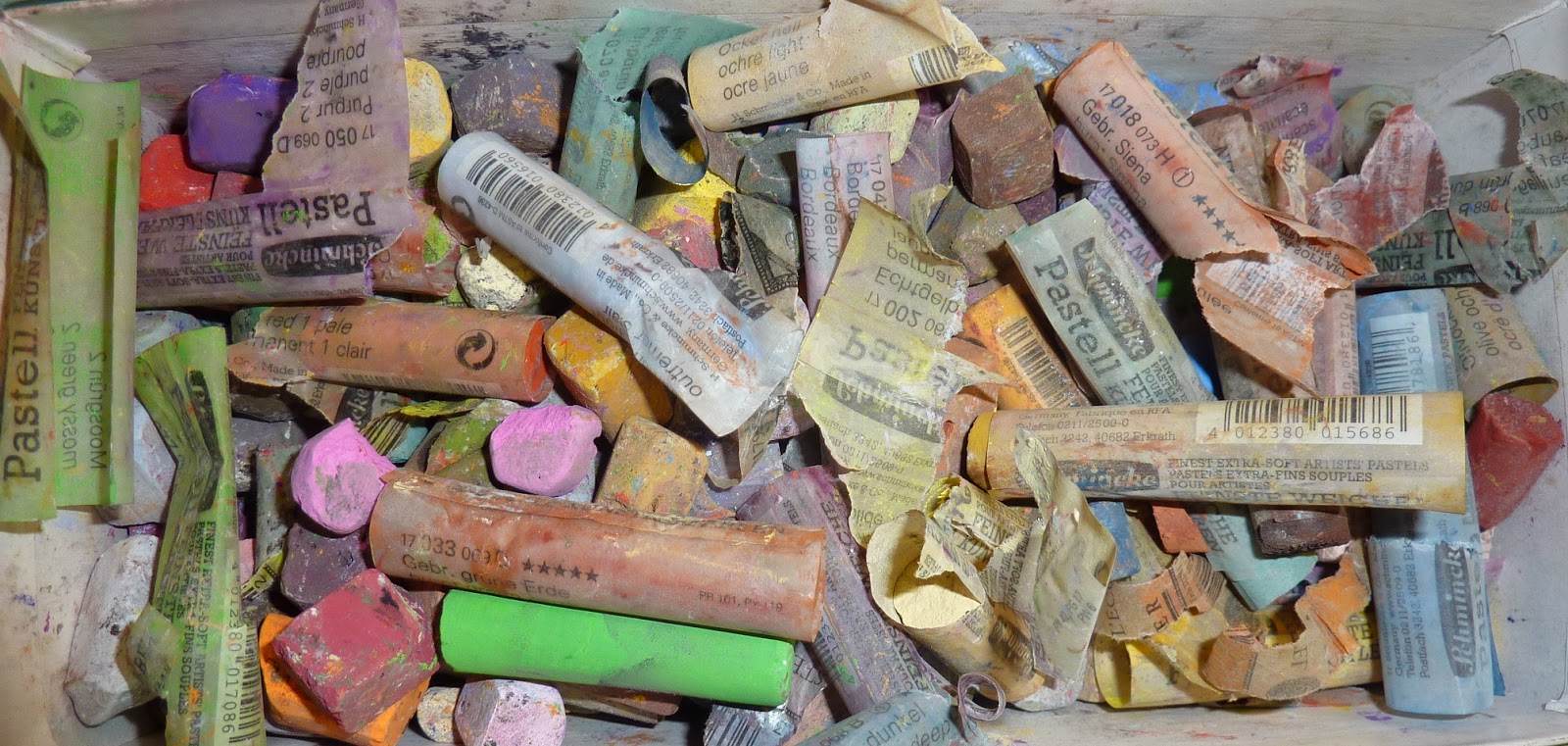
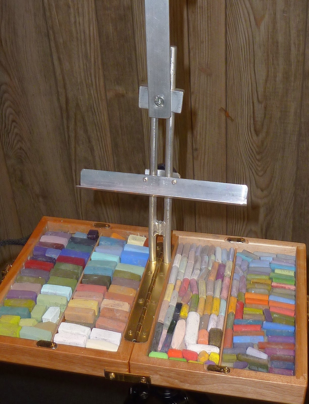
I used my Great American Artworks Richard McKinley set for this painting 
Now that you have watched the video here are a few more tips for small daily painting:

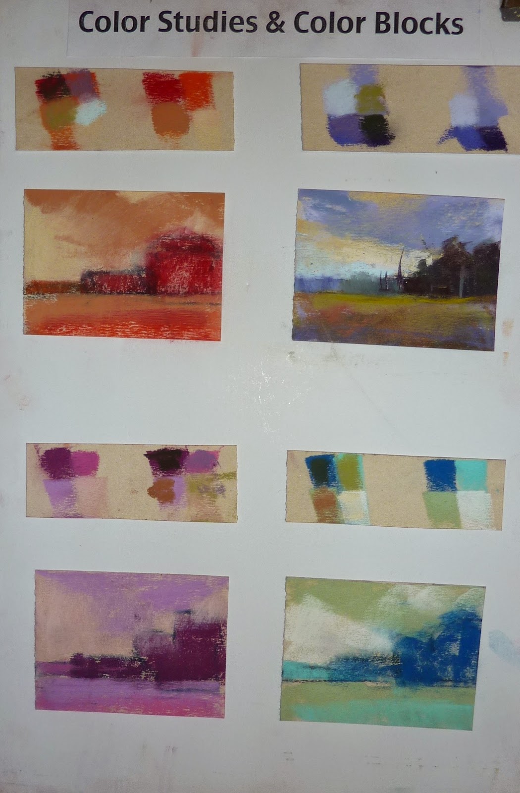
  • keep them small 6x8 and 5x7 are ideal
  • keep them quick. Set a timer for 15-10 minutes
  • keep supplies set up even if it is just a small set that is easy to access
  • simplify! start with a few big simple shapes
  • create a roadmap of values....decide what is mostly dark, light and mid value.
  • choose the area of interest and put the most clarity in this area
  • leave some mystery....don't put in every detail. the time limit helps.
  • when the timer goes off STOP. Paint another one but don't fiddle with the painting 
  • evaluate the painting and decide on 3 marks to finish. place those mark and call it done!

Want to Loosen Up? Here is Something to Try

$
0
0


'All Is Quiet in the Meadow'              11x14              pastel                 ©Karen Margulis
painting is available $165 sold
I want my marks to dance. I don't want them to be tight. I don't want them to be perfect. I want them to be expressive. I need to put the right color and value in the right place but I want each mark to look fresh. Planning is important. Knowing what you want to say and how you will say it helps. A plan gives you the freedom to explore your mark-making. So make a plan.

Then what? I have an idea for you to try. Paint on a larger piece of paper. Bigger paper means the chance for bigger marks. Bigger paper gives you freedom to move. Bigger paper lets you put your whole arm and body into your marks. It allows you to dance with your painting!

When I paint on a bigger surface I find my marks begin to unfold and loosen up. A flower on a small piece of paper may be a controlled dot. On a larger paper it becomes a bold mark.  


'The Beach Roses are Calling'         8x10         pastel       $145
In my pastel class today we explored mark making with pastels. My demo painting is at the top. It is 11x14. It is roughly based on the 8x10 painting above. I found I had more freedom with my marks in the larger painting. I had more room to be expressive. Now I want to try this scene even larger!

TRY IT: Paint something you have done before but this time make it at least twice as large. If you paint large already....got even larger. When I want to play with large paintings but want to conserve my sanded paper I will use Canson.
If you already paint large try to paint smaller but be conscious of your marks. How large can you make your marks on a smaller piece of paper. Let your marks dance!


My students got a treat today! Thank you Terry Ludwig for the very special heart pastels for my class!

THANK YOU!!! I want to thank everyone who watched my first video blog yesterday. I appreciate the support. Your comments were wonderful and I am encouraged to make the next episode. I am going to try for one vlog each week to start. I will share the next one here.
If you haven't seen the video here is the link.https://youtu.be/m8VRQm-jzNE Please subscribe to my YouTube channel so you won't miss an new video!

How to Finish a Painting with Purpose

$
0
0


'We Stop for Poppies'               18x24                pastel              ©Karen Margulis
available here $350
Knowing when a painting is done can be a challenge.  Overworking can sneak up on us. Especially when we are enjoying the painting process and not really paying attention to what we are doing. A good rule of thumb is to stop before you think you are finished. But then what?

I stop when I find myself mindlessly making marks. It is time to step back and evaluate the painting. I used to make mental notes about what I thought I needed to do to finish the painting. But if I was interrupted I would forget the list of finishing touches. Or sometimes I would get so involved with finishing an area I would loose sight of the other items I wanted to address.

I don't rely on mental notes.....I make real notes on my mini dry erase board.

Below is today's painting when I stopped to evaluate it. I decided on some areas of concern and I wrote down my solutions on the dry erase board.

stopped for evaluation part 1

My WHAT board helps me decide what I need to do to finish the painting

stopped for evaluation 2

I tackled these items one at a time. I changed the shape of the distant trees. I darkened the foreground grasses. I added some seed pods and another purple vertical flower to make a more pleasing arrangement of flowers. I changed the mountain color to a blue purple instead of green to push it back further.

I was pleased with the flowers but still didn't like the trees. The right side was too solid. I used sky color to break up the tree shape and added one more red spot of color. Now I was finished!

Painting notes: 18x24 on Ersta sanded paper with an alcohol wash underpainting

How to Introduce Mystery into Your Paintings

$
0
0
'Buzzing in the Garden'             9x12                pastel                ©Karen Margulis
sold
Things started dripping. I could see stems and petals emerge from the paint.  As the paint dried a wet brush created even more interesting lines and spots. It was mysterious and exciting. I could imagine a wonderous tangle of flowers and grass and maybe a few bumblebees. The watercolor underpainting was doing its job. It was setting the stage for my impression of some flowers in a garden.

The watercolor underpainting on Uart 500
"A painting requires a little mystery, some vagueness, some fantasy. When you always make your meaning perfectly plain you end up boring people." Edgar Degas


 I agree wholeheartedly with Degas. I didn't want to paint perfect flowers and bees. I didn't want to copy my reference photo. I wanted to leave something for the imagination. The watercolor underpainting got me started in the right direction. The tangle of drips suggested the flowers and stems. The looseness of the watercolor encouraged me to keep my pastel marks expressive.

I tried to say as much as possible with few strokes. Keeping the mystery. Keeping things vague. My little bumblebees emerged from just 4 or 5 strokes of pastel. Up close they are a collection of marks. The colors and shapes suggest a bee and so they become bees.


Watercolor underpaintings are the perfect way to start a pastel painting with a little mystery! They drip and bloom and can't be totally controlled and predictable. The mystery begins as soon as the paint is applied!

Painting Large and Quick....My Top Tips

$
0
0
'Blue Marsh'              18x24            pastel             ©Karen Margulis
painting is available click here $350
 I love doing my daily quick studies. But they are usually small....5x7 or 8x10. Every once in awhile I make time do do a much larger quick painting. It is a great exercise for getting away from fussy detail. Painting large and fast has helped me become more expressive in any size painting I tackle.
Here are some tips that have been helpful to me.

  • Set a timer. The goal is to paint and respond quickly. 30-45 minutes is ideal. I prefer 18x24. It is not too large to handle easily but large enough to get your whole body involved in the painting.
  • Make a Plan! The key to painting a large painting quickly is to know what you plan to do. take time before picking up a pastel to plan the composition, value structure and colors. Know what your gal or concept is.
  • Do an underpainting of some kind. If you have your big shapes blocked in and a layer of color on the surface the painting will go faster. I usually do a 4 value block in and rub in the first layer for a dry wash.
  • Play music that makes you move! It really does help!
  • Paint with your arm not just your hand. Move your body and arm. You will make bolder and larger marks. You can't get too fussy when you are dancing with your pastels!
  • Have fun. It's not about creating a masterpiece....it is about creating a study and exploring a new way of making marks!

At the evaluation stage....can you spot the changes I made?

possible block in colors....I chose the blues!
Painting notes: Uart 500 paper with Terry Ludwig pastels.

Video Demo Painting and Uart Pastel Paper Review

$
0
0


'River Reflections'               6x8                pastel               ©Karen Margulis
painting available on Etsy $75
Paper choice does matter! Choosing the right paper for our paintings can be a challenge. We have so many choices. Do we want sanded? Unsanded? What brand? What color?  I love paper so I have tried them all. I'll get the conversation going with a demo and review of my current favorite pastel paper on this week's video blog. Can you guess what my favorite paper is?


 If you can't see the video Click here for the link 

Below are some additional photos and resources. If you have any questions about Uart that I didn't cover in the video ask them in the comments below!

Visit Uart's website for more information including a FAQ page.


I did an alcohol wash underpainting on Uart 600 grade

I did a paper test on each grade of Uart paper. Click on each photo to see the details


800 is the smoothest grade. It is good for detail work

240 is the roughest grade. You can see the texture in my strokes
If you liked the video please share! I'd love for you to subscribe to my YouTube channel. You can keep up with the latest videos as well as watch them when you have the time! Visit my YouTube page and click on the subscribe button. Thanks for your support!

Choosing the Right Pastel for Distant Mountains

$
0
0
'Blue Ridge Memories'              8x10           pastel             ©Karen Margulis
purchase this painting here $145
I am enjoying this blue pastel.  I don't remember what set it came from. I found it in my overflow box of blue pastels. I was looking for a distant blue mountain color. I do know it is a Terry Ludwig pastel.  I might try to find out the exact color number. But most likely I won't. I will just enjoy it until is is gone and then find another great distant blue. It keeps me on my toes. It keeps my palette from being too much the same for every painting.

I had a question this week about how I choose my distant mountain colors.
 It is simple. I know that most of the time, as objects recede they get lighter, cooler, more blue, duller, less contrast. For MOST distant mountains I look for blues that are grayed down, lighter, and cooler. There are always exceptions...sometimes they are brighter or darker or maybe even warmer depending on light and conditions. A variety of blues are needed!  I'd like to share a previous blog post I wrote about this topic. (read it below)

'Heavenly Path'          5x7         pastel           $50
I have been on a hunt.  Trying to find the perfect blue pastel. I have been looking for what I call 'Distant Mountain Blue'.  That beautiful blue of distant mountain ranges.  I have lots of blue pastels. Lots. But I always think there has to be the perfect 'distant blue' So I keep looking. And trying blues.


Really it isn't something I do for any other color. In fact I never keep track of color names and numbers.  I don't even make color charts with new pastels.  When I get new pastels the first thing I do is take the labels off, break them and put them in my box.  At that point on they become anonymous.

And that is fine with me. Sometimes students will be reluctant to take their new pastels out of their boxes and take off the labels. The big question... How will I replace a color when it is used up?  I don't worry about replacing the exact stick of pastel.  I just try to find one that closely matches the color, value and temperature of the stick I need to replace. And that works for me.

Except when it came to the illusive blue pastel. I wanted the perfect color and if I ever found it I planned to keep the wrapper!  But guess what?  After spending a month in the Southwest looking at those wonderful distant blue mountains and trying to paint them. I realized that one stick of blue can't possibly work for all the variations of blue I saw. It really is necessary to have a few different blues to truly capture the many variations. 

So my big blue collection with no names or numbers is really all I need!

The Importance of Play in Painting

$
0
0
'Spring Play'              8x10               pastel             ©Karen Margulis
purchase painting here $100

 I didn't want to go out today. I was behind in several projects. I just wanted to stay home and work. But I had put off errands long enough. It was a beautiful spring day but I quickly went about my errands and headed back home....to work.

As I drove home I passed a playground full of children. Surrounded by the beautiful blooming trees of spring these children played without a care in the world.  I had a deep thought. Children play. It is their work. The learn and grow through play. We give them toys. We encourage them to play. When does it stop? When do we become too old to have toys and play?  I felt sad that adults don't get to play as much as children.

Then it hit me....We can play as much as we want if we make it a part of our lives. I am lucky to be an artist. I get to play every day. I have a lot of toys too (pastels, boxes and all kinds of art stuff) But too often we make art seem like work. We try too hard. We put pressure on ourselves to succeed. Sometimes it stops being fun.

'A Breath of Fresh Air'        5x7    plein air pastel        $45

I decided that I would take time today to play. The projects could wait for a few hours. I took out a plein air study of a dogwood tree that I had painted last spring. I used it as a reference and painted it larger. I used a homemade support that I had toned teal blue.

I had fun just playing with the colors and textures in the painting. It was fun to be a kid again and just play. Play leads to growth. It sure is more fun than work!

My toned surface with the plein air study on the easel
 Have you just painted for the pure joy of it lately?  What are some of the fun discoveries you made?


Pastel Paper for Quick Studies

$
0
0


'Autumn Glory'         5x7            pastel               ©Karen Margulis
painting available $50
It's time to get outside and paint! I admit that I hibernate in the studio in the winter. But when the weather gets nice I want to be outside. I have a planned a full schedule of plein air trips and workshops and I am taking time this week to get my gear tuned up and ready!

I have a new plein air set up which I will share in an upcoming post. I need to load my new box with pastels. I also need to get my paper ready. While Uart paper is my favorite paper for studio work, I have a need for a different paper for the way I work outside. I need a sanded paper that is a middle value gray. Why you ask?

Dakota Pastel Premium Sanded Paper
When I am painting on location I prefer to work fast and small. I do several quick studies rather than working on one larger painting. I am taking notes. I need to find a way to paint more efficiently so I can simply respond to my scene. If I can work on a toned surface I don't have to worry about doing an underpainting. A medium value gray tone works well to unite my painting.

In the past I have relied on Wallis Belgian Mist paper. Due to the current unavailability of this paper I have been looking for a substitute. I have toned my Uart medium gray with success but when I saw Dakota Pastels offers a new sanded paper by Handbook Paper Co.  I wanted to give it a test run.

I tried the gray paper called Italian Clay. It is a medium fine 320 grit. I was pleased with it on the first try. As with any new paper I will need to work on it more so I can learn what to expect. But this first try has me thinking I will be able to use it for my quick plein air studies. I will report back after I put all of the grades and colors through their paces. Here is some information about the paper from Dakota. 

PASTEL PREMIER
Sanded Pastel Paper from Handbook Paper Co.
Origin: USA
Colors: 2
Weight: 145lb / 310gsm
Premium Qualities:
100% cotton
Acid-Free & Archival
Superior Durability
Multiple Layers of Pastel
Made in USA
Introducing a new Archival Quality paper for the pastel artist - Pastel Premier! Made in the USA, Pastel Premier is produced on 100% cotton, acid-free paper. Made exclusively for Pastel Premier, the unique surface is created by double priming the 100% cotton base paper, then coating with an aluminum oxide abrasive. This produces an ideal, evenly coated surface for pastel painting. A final seal layer is applied to the primed and abrasive coated sheet to make the surface extremely durable and able to withstand almost any measure of scrubbing and reworking. The paper works with a wide range of wet media (water, alcohol, mineral spirits, etc)
for under-painting. 
Pastel Premier is available in three surfaces: Medium Fine, Fine and Extra Fine. The Medium Fine (320 grit used to make the Italian Clay) and Fine (400 grit used to make White) have a very similar aggressive gritty feel to the surface. The Extra Fine is a 600 grit surface that is much smoother and available in White only.
The Medium Fine and Fine surfaces accept as many as 25 layers of pastel. The Extra Fine is a less aggressive surface for lighter work and more detail.
Pastel Premier comes in White (slightly warm) and Italian Clay (warmish neutral gray).
Pastel Premier is available in Pochettes (packets of unbound sheets), Sheets and Rolls:
Pochettes: 9" x 12" (8 sheets) & 12" x 16" (6 sheets)
Sheets: 20" x 26"& 

Do You Have a Box of Pastel Goodies?

$
0
0

'Wild Maine'           8x10             pastel           ©Karen Margulis
click here to purchase $145
The painting needed something. It started as an alcohol wash on a piece of the new Pastel Premier paper. Today I tried the white fine grade piece. I wanted to see how the paper would take a wet underpainting. (it did fantastic) After the underpainting was dry I went about building the trees and the meadow. I put in the flowers and the big areas of grass. It was OK but it lacked something.


But what did it need? To answer my question I went back to my concept. My WHY. Why did I choose this subject to paint? What was it that I liked? It was the tangle of stuff. I loved how the purple flowers and grasses were intertwined. I loved the seemingly random sprinkle of white flowers. How could I get this effect?

I needed my box of goodies!


 I have a box of random Schminke pastels. I love them but they are almost too soft for me sometimes. So I save them for a special occasion. Like today. My painting needed something. It needed some bold and vibrant marks. The super soft and rich Schminkes would be perfect for these finishing touches. I love my box of goodies!


Note: Whenever I get the chance to see Schminkes in person I always choose a few colors. I look for colors that would make good accents, highlights or spices. I keep them in a separate box since I am so rough on my pastels. I don't want to crush these soft pastels!

Five Tips for Painting Commissions

$
0
0
'Meadow Study #3'               5x7               pastel              ©Karen Margulis
painting available click here $50
 It seems as though everyone has a commission nightmare story. Hearing them is enough to keep many artists from doing commissions. I have had some close calls but no real nightmares. Many of them could have been prevented. I have learned through experience. I have truly been enriched by each commission painting I have completed.

Along the way I have developed ground rules for doing a commission. The rules have helped make the process rewarding and positive.

Tip #1   Paint what you love and what you love to paint. I have gotten some strange requests. Some things were not in my comfort zone. Some of them I tried but made it clear to the client that I would try but not promise. Now I only accept commissions for a subject that I LOVE to paint. I do my best work when I am enjoying the subject. (and if the commission falls through I have a paining that I actually enjoy)

'Meadow Study #1'        5x7          $50
TIP #2  Work with clients that give you freedom to use your artist license. My favorite client is someone who tells me they love my work and use my best judgement in interpreting the subject. The freedom to create something without being tied to strict directions makes the commission fun.

'Meadow Study #3'          5x7           $50
TIP #3  Be clear with your expectations and requirements. I don't use a contract or even require an advance payment. I  have never had any problems. Perhaps I have just been lucky. But I only paint what I like and make sure it won't be so specific that I can't find another home for the painting.  If you have a contract or certain requirements make sure everyone understands them before you begin painting.

'Meadow Study #4'          5x7           $50
Tip #4 Take the time to do small studies for larger commissions. It is well worth the time and materials to do a small color study to show the client. This way composition and color can be addressed and everyone can agree. It is easier to make corrections and changes in the study phase than on a large painting.

The four paintings in today's post are small quick studies I did for a potential commission. The client sent me photos of the space where the painting will go. That gave me a better understanding of what might work. She gave me a rough idea of her wants....the four studies now give her a visual aid to help her decide on the details of the larger painting.

Tip #5  Make sure the client gives you the correct painting size. It happens a lot. Especially for larger paintings. A client will tell me the size they need for the space and ask for a painting that size. They don't remember to take into consideration the final size after framing. I know now to ask them if they have a frame size in mind so we can choose the best actual painting size for the space.

Painting commissions has opened up a new world of painting opportunities. I have worked with wonderful people who truly enjoy my work. I love doing commissions as long as they follow my five tips!

Get in the Studio and Paint!

$
0
0
'Marsh Study'             5x7             pastel              ©Karen Margulis    
available here $50
It can be a challenge to find time to paint. Maybe you work full time. Maybe you are busy with taking care of family. There are plenty of things that demand our attention and painting can't always be at the top of the list.  But what happens when you do get some illusive free time? It can be hard to get back into the art groove.

I received  a great question from a reader and would like to share my thoughts with you. She asked:

" I was wondering if you could give me any advice for structuring my painting days... The problem is I go days without painting because I work full time but then when I get some days off I have no idea where to begin..."

'Back to New Mexico'            5x7            pastel              ©Karen Margulis   $50

The simple answer is to get into the studio and paint. But it isn't quite so simple. Having free time to paint can almost be paralyzing. So much to do and so little time to do it all!  So what happens? We putter around the studio. We organize. We look through reference materials. We end up wasting a lot of our precious time.  We need to find a way to break this cycle and get back into the painting zone quickly. Here are some things that have helped me:

  • Take time to get organized. If you spend a free day organizing and prepping  you won't have to do these things on your next painting day. When I worked full time I would stock up on precut papers. I would cut paper to smaller sizes and attach a reference photo so when it was time to paint I had several subjects ready to go.
  • On painting days begin the session with a small quick study. I like to do 10 minute studies (like the paintings in this post) They are warm ups and often doing one or two gets my creative juices flowing. I am then ready to settle down and paint something larger or more involved.
  • If you really don't get big blocks of free time make the most of short breaks and paint something small. Again having your supplies set up and ready makes a huge difference. While a big studio is nice, a small spot where you can keep some painting supplies handy is all you really need for small studies.


These are the block-in stages for today's paintings. Big simple shapes!

Spring Studio Event ...Paintings need a home!

$
0
0
'Nesting I'            11x14             pastel             ©Karen Margulis
Purchase here $165
Spring has arrived! I spent a wonderful day painting outside! I tested my new plein air set up and made this week's video. (to be released tomorrow!) It felt so good to be outside in the warmth of the sun.  I also had a productive weekend doing some spring cleaning. I tackled my winter clothes and now I am moving onto the very messy studio. 

I need your help! I have some wonderful paintings that still have not found their homes. I need to make room for new work so I am having a Spring Studio Event! I have a selection of work available at a savings of 20%. Please visit my Etsy shop and the Spring Event section. If you find something you like just use coupon code SPRINGEVENT at checkout. 

These nest paintings and more are included in this event through Sunday April 12th. Visit my Etsy shop to see them all! Click here to visit shop.

Nesting II'         10x12          $145

'Nesting III'        10x12         $145


'Nesting IV'       11x14        $165

'Nesting V'          8x10           $145

Video Demo: A Quick Plein Air Painting of a Spring Flowering Tree

$
0
0
'Spring is in the Air'              5x7               plein air   pastel               ©Karen Margulis
click here to purchase $50
It was a beautiful Spring day in Atlanta. The perfect opportunity to try out my new plein air set up and shoot this week's video.  I packed my new baby Heilman box (the double sketchbook), my tripod and some paper and my husband and I headed to the river.

Michael volunteered to be the cameraman. That was great for me because I needed to get familiar with my new set-up. We decided to go the a park alongside the Chatahoochee River.  I did a warm up painting and we decided the light would be better if I faced the opposite direction. I really wanted to find some blooming trees so we moved to another spot.

The best spot happened to be right where we parked. There was a wonderful row of blooming redbud trees. Sure they were alongside a busy road. Yes there were houses and 'stuff' behind the trees. But it was a great exercise in simplifying and editing!


That was fun!
I thank you in advance for watching. In Wednesday's blog post I will answer any questions you have about the demo. Ask questions in the comment section.

3 Tips for Painting on Canson Paper

$
0
0
'River of Peace'               9x12            pastel               ©Karen Margulis
available for purchase $145
 It's the paper we love to hate. It is often the paper we use when we first discover pastels. Canson Mi-Teintes paper. It is inexpensive and readily available. We often choose it over sanded paper because of these reasons. It is the 'training' paper of choice. But when we discover sanded paper it is often hard to go back to Canson.

I happen to love Canson Mi-Teintes paper. It wasn't always the case. I struggled with it. It seemed as though my colors weren't as fresh. I filled the tooth too quickly and my paintings quickly turned muddy and dull. I stopped using it and turned to sanded papers.

Curiosity and seeing other wonderful work done on Canson encouraged me to give it another try. This time I was ready for it. I had learned more about pastels and refined my touch. That was the key! Now I understood how to get the effects I wanted. I loved the soft feel to the paper. It is now one of my favorite papers.

Give it another try! Here are 3 tips to get you started:


 1. Choose the correct side.  Canson has a smooth side and a bumpy side. The official correct side is the bumpy side. Most pastelists prefer the other side which is smooth. If you like a regular texture throughout your painting then you want the bumpy side. If you don't want any texture choose the smooth side. TIP: Hold the paper under a light to better see the little dimples of the bumpy side then tape it down right away! (before you forget which side you want)

2. Work with a LIGHT TOUCH. Canson paper does not have much tooth or grabbing power. It is easy to get too much pastel on the paper. When that happens you are finished! The more you try to add the muddier the painting will be.  If you start the painting with a very light touch and whisper your pastel strokes you will be able to build more layers. Let the tone of the paper show through. If you can't see the paper in your beginning layers your touch is heavy. For more layering... whisper don't shout.

The heavily applied pastel looks thick and muddy. The lightly applied pastel looks light and airy.
3. Use Softer pastels. You can certainly use hard pastels such as NuPastels and Rembrandts on Canson but they don't give you the same look as the softer pastels. I have more success with softer pastels such as Terry Ludwig pastels.  Diane Townsend pastels work especially well since the pumice in them opens up the paper.  

A light touch with softer pastels on the smooth side of the paper is my recipe for success.

Bonus tip: Try lightly sanding the surface of the paper to rough it up some and provide more tooth.

Here is some information about Canson Mi-Teintes from the Canson website:
Canson® Mi-Teintes® is a pulp-dyed colour paper that has won worldwide recognition for its qualities. An authentic art paper: it is gelatine stock-sized which limits the absorption of pigments in order to show colours at their best.
It has the highest cotton content (more than 50%) on the market, combining mechanical resistance and a sensuous feel. In addition to its qualities as a drawing medium, Canson® Mi-Teintes® complies with the ISO 9706 standard on permanence, a guarantee of excellent conservation.
Furthermore it has the advantage of having a different texture on either side: a honeycombed side characteristic of Canson® Mi-Teintes®; and fine grain on the other.
It boasts the richest range of colours on the market, with 50 light-resistant tones.

A Compact Plein Air Set Up for Pastel

$
0
0
'The Path on the Left'            6x6             plein air pastel           ©Karen Margulis
purchase this painting here $65
 It has to be compact and light. Everything has to fit in my backpack. Over the years I have continuously downsized my plein air set up. I remember the days of dragging a rolling cart filled to the top with painting supplies. Set up took forever. I could never find what I wanted in the cart full of unnecessary stuff.  It was discouraging and plein air wasn't something I enjoyed.

Until I downsized! Now I have several different downsized plein air set-ups. I keep them always ready. The type of painting situation helps me decide which set up to bring.  Today I will share my Compact Travel Light Set Up.

'Blue Ridge Memories'         6x6       $65
Travel Light Kit: Heilman double sketchbook pastel box, Heilman easel attachment,  Oben AT3400 tripod


Everything fits in my Orvis backpack with room to spare. I will always carry this on the plane. I have room for extra travel needs such as my toiletries and iPad mini.  I use an Oben AT3400 tripod which folds up to 16". It will fit in the backpack but sometimes I put it in my checked bag if I want extra room in the backpack.


Heidi checks out my set-up. Here you can see the inside of the Orvis backpack. I love this pack because it sits so well without flopping over. I used it to weigh down my tripod using a mini bungee cord. It also has plenty of outside pockets.


This is all of my gear. I am using a Heilman double sketchbook pastel box. I put the metal ease attachment into a small stuff sack to keep it protected. I have my backing board with bankers clips. This is actually a hard plastic board which will hold paper. It is called an Artworks Book from Easel Butler.  I have a pouch for baby wipes, a zippered pouch for miscellaneous supplies such as tape, watercolor set, alcohol, fixative. I also have 2 black portfolio folders by Itoya. I use these to store my paper and the finished paintings.


Here is the Heilman box open. I have an assortment of Terry Ludwig pastels on the left and Girault pastels on the right. I do vary the selection depending on my location.  I don't preselect my pastels before I start painting since my palette is already limited!


Here is the entire set up. I was asked about the stability of this set up. I did notice some shaking but I am a fairly aggressive plein air painter so I did hold onto the board to steady it some. If I was a kind and gentle painter it wouldn't be as noticeable. It really didn't bother me. I am trading size and weight for complete stability and to me it is well worth it!

Next week I am taking this set up with me to teach a plein air workshop in Dripping Springs Texas. This will be the ultimate test so I will report back with my thoughts.

If you'd like to see this set up in action watch my plein air demo video on YouTube click HERE

Resources:

Heilman Designs
Easel Butler Artworks Book
Itoya Original Art Portfolios
Orvis

Make Corrections to a Pastel with this Simple Tip

$
0
0
'The Way to the Beach'             9x12            pastel               ©Karen Margulis
painting available  $145
It really isn't that hard to do. Pastels are very forgiving. I like that. I can be fearless when I paint because I know I can always change things that aren't working. There are ways to fix the problem areas. A stiff paintbrush does a good job of brushing them out.  Brushing off the pastel isn't usually enough to get all the way back to clean paper but it is often enough to remove enough pastel for corrections. Making the corrections is the hard part. Especially if you don't remember what pastel sticks you used in the painting. You can easily make things worse!

Here is an simple tip for successful corrections: Keep all of the pastels you are using for the painting where you can see them! Don't put them back until you are finished with the painting.


Today's painting reminded me of the usefullness of this tip. I wanted to paint the road that runs in front of the beach house my friends and I rent on Pawleys Island South Carolina. I decided I wanted the telephone poles in the painting. So I put them in.

The first finish. The pole on the right has to go.

When I uploaded the photo and looked at it on my computer monitor (a great way to see problems) I decided I didn't like the big pole on the right. The wire was also in the wrong spot. They needed to go. So back to the easel I went with a stiff paint brush in hand.

The pole on the right is on it's way out!

I brushed out the pole and the wire. I was able to get most of the marks removed. There was a slight ghost image of the pole but I knew I could cover it up. Fortunately I always keep the pastels I am using for a painting out in a tray. This is my working palette. It was very simple to find the pastels I had used for the areas behind the pole. All it took were a few marks with the right pastel and the pole was history. This fix would not have been as easy if I had to hunt for the correct color and value.


Bonus Tip: If you want to remove even more pastel .... down to the original paper try to use some canned air that is used to clean electronics. You can get precision removal with the thin straw that comes with the can!

Lighten the Load on your Next Workshop or Trip

$
0
0
'Time for Bluebonnets'            8x10          pastel           ©Karen Margulis
purchase here $125
It is almost here. I will be heading for Dripping Springs Texas next week to teach a workshop. I will be hosted by Marsha Young at her wonderful Butterfly Gallery in Dripping Springs. We will have one studio day and two plein air days. Marsha has found some wonderful spots to paint including a B&B and a winery. My fingers are crossed that the weather will cooperate and that we will see some bluebonnets.

Packing for a workshop is part of the fun. I love to pack. To me it is an art form of it's own. I love bags and suitcases and have more than any one person could ever need.  My family calls me a bag lady and I suppose that is true. But there is one thing that I have learned to embrace.....

I don't need to bring every bag on a trip! I need to pack light.

The block in for today's painting

I can enjoy the experience so much more if I don't have to lug around and keep up with multiple bags of stuff. I have downsized the painting supplies I bring and downsized the clothes and other misc. stuff I bring. It feels great!

I'll discuss packing art supplies in another post. Today I'd like to share some of the wonderful packing tips for clothes and other travel necessities that I have found online. I put them all together on a Pinterest board. Visit the board to check out the tips. It isn't too early to start planning to lighten the load on your next trip or workshop! Click here to visit the Packing Tips board. 

Simplifying a Marsh...Painting Tip

$
0
0
'Into the Marsh'               11x14    pastel          ©Karen Margulis
Painting available here $165
My goal is to keep it simple. I love painting the marsh because it is such a challenge to simplify and I love the challenge.  Marshes are essentially a sea of grass. Miles and miles of grass. It is easy to get lost in rendering every blade of grass. I speak often about leaving a little mystery in a painting.  If I paint every blade of grass where is the mystery?

Here is a tip for painting marsh grasses:  Think of the marsh grasses as big shapes of grass color. Not individual blades.  Keep these shapes big, simple and intact until the very end of the painting. Then a few well chosen blades can be pulled out of the shapes.

my black and white thumbnail

I begin the painting with avery simple value study. I only use four values to define the big simple shapes I see. As I layer the pastel I keep these shapes intact. I may change colors but I keep the values the same as my study for as long as I can.

It is only at the end of the painting process do I add a few blades of grass. I think about the best placement of these pieces of grass. They act like lines. Lines pull our eyes in a certain direction. I want to be sure the lines I create with my grass lead the viewer's eye where I want them to go.


 I paint individual blade of grass in a few ways. One way it to carve them out of a block or big shape of grass. In the photo above I used the color of the water to negatively paint some grass. Paint the color behind the grass to do the carving.


Another way to paint grass is to add them on top of the big shape. I try to make my lines painterly or lyrical. I want them to look natural and not stiff. I allow the thin edge of a pastel to dance and create a lyrical line.

TRY THIS: The challenge at this point is to have restraint. It is all too easy to get carried away. Allow yourself to put in only three pieces of grass at a time. Step back and evaluate. If more is needed, paint only three more before stopping and so on. Stopping to evaluate will hopefully prevent you from overdoing the grass!

Finish a Painting with Care with this Quick Idea

$
0
0

'Old Friends'               18x24            pastel               ©Karen Margulis
painting available $500
 I am really starting to like this idea. I shared it in a recent post and I am using it more frequently. I plan to use it for every painting. It is a simple idea really. But it solves the common problem of overworking a painting and knowing just when to stop.

I like to stop painting before I think I am done. I paint until I feel like I am almost done. When I am not sure what else I need to do that is the perfect time to stop. Many times if we keep going at this point we are making marks that might not add anything to the painting.

YOU HAVE PERMISSION TO STOP!

Then what? I usually walk away or do something else and come back to the painting with a fresh eye. Then I can decide what if anything needs to be done to finish the painting. I then WRITE these things down. I use a small dry erase board but post it notes or a sketchbook all work. If I don't write them down I will not only forget what I wanted to do I will often be sidetracked and do more than I NEED to do.....overworking the painting.

Here is an example:


The painting above is almost finished. I liked the colors and the freshness of the marks. I wanted to keep that feeling but on closer observation I saw some issues to address. I wrote them down on my dry erase board below.


On my dry erase board you can see I had written down the concept I had for the painting. This helps me decide if I was successful. I decided that I was and I still liked my working title of 'Old Friends'. Here are the things I decided to address:

  • I wanted more texture in the grass
  • I needed a few spices in the grass and spices in the trees. I wanted to make sure the eye moved around the painting.
  • I needed to break up the solid area in the bottom left section of the trees.
  • I want to put a nice royal blue accent in the trees just because!
When I had a chance to return to the painting I was able to remember what I wanted to do which helped me to do only these things and STOP!  Yes, I really like this idea!
Viewing all 2266 articles
Browse latest View live