Quantcast
Channel: Painting My World
Viewing all 2266 articles
Browse latest View live

Painting the People of Paris ...Impressions of France part 2

$
0
0

'Paris Break'            7x10              pastel                 ©Karen Margulis
purchase painting here $125
 It seemed as though we walked for miles. In fact according to my Apple watch I did walk for 10 miles during the short time we were in Paris. Walking in Paris was a feast for the senses. The colors, smells and sounds brought the city to life. I wanted to capture it all and put it in a bottle.

I have to be content with my memories and the photos I was able to take. I imagined myself on a photo safari. We were moving fast so I had to react quickly. A click here and another there as we briskly made our way through the crowds.

detail of painting 

I wanted to take photos that captured the flavor of Paris. I wanted to capture the essence of what Pais was about ....my impressions of Paris. Once again I found myself enthralled with the people. Riding the BatoBus introduced me to the wonderful sights of Paris....Notre Dame and the Eiffel Tour. But I found myself focused on the people lining the banks of the Seine (read part 1 here)

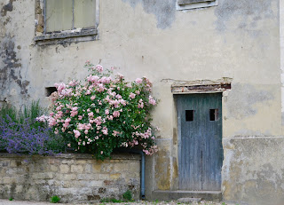
As I walked I noticed the people. So many people and at all hours of the day. Busy people, people laughing, kids playing ball, dogs playing ball, people relaxing at streetside cafes. The people were interesting and colorful. They filled the city and gave it energy. 

The buildings formed the landscape of the city and the people were the spices.
 I wanted to paint them.


Color!

But we were on the move and so I could only take photos. I held my camera discreetly against my side. I kept it turned on and when I saw an interesting scene I clicked the shutter. I didn't want to be obvious and I didn't stop or slow my pace. Did I get any good photos? Not many. I got many photos of feet!  But I got enough to remind me of the flavor of Paris. They will inspire some fun paintings!

Here are a few photos of my quick walk around Paris.

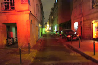
connecting....just not with one another


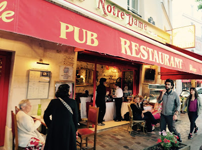
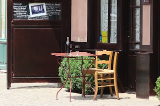
We had a fun evening at this cafe


Dogs are welcome

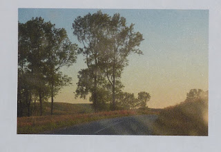
evening shapes and colors


 About today's painting: I printed one of my photos and took much liberty with it. I used a piece of gray Pastelmat paper. My goal was to simplify the clutter and leave out the things that weren't necessary such as the men walking in front of the cafe. I also didn't want the figures to be detailed. They are simple shapes....suggestive of people without putting in too much detail.

the badly reproduced photo that I used for todays painting


In Vincent's Footsteps....Impressions of France part 3

$
0
0
'In Vincent's Footsteps'             9x12            pastel                ©Karen Margulis
purchase painting $150
It was a stop I will always remember. I knew it would be an interesting stop but I wasn't prepared for the emotions I experienced. We were up early to load up the vans for our departure from Paris. Instead of heading straight for Normandy and our home base, Stan had planned for a special detour for us.

The anticipation built as we made our way through the Paris traffic into the French countryside. The sight of the famous wheat fields made me smile. I wanted to stop and walk in those fields. I would have my chance later in the week. Today our detour was to the village of Auvers-sur-Oise.

close up detail with a hidden surprise

Auvers-sur-Oise (say ovayers sur waaze) is the village outside of Paris where Vincent Van Gogh spent the last 70 days of his life. In the wheat fields of this village Vincent shot himself, succumbing to his wounds two days later in his room in the Auberge Ravoux.

We came to Auvers to pay our respects.


It was very quiet here. Only a few people walked the streets.  It was peaceful compared to the bustle of Paris. There were flowers everywhere. Hollyhocks and climbing roses graced the buildings. There were paintings to be made everywhere. Van Gogh painted 70 paintings in the short time he lived here. I can see why.


We walked in the footsteps of Van Gogh. We saw the subjects of some of his most famous works. We walked down the path that he must have walked every day to and from his room and out to the fields carrying his easel, paints and canvases.  The village appeared as though it could have looked the same as when Vincent lived there. 

We took the short tour of the Auberge Ravoux. Vincent stayed in room number 5 at the top of a narrow creaky staircase. It was small. And spare. You could feel the loneliness.  Next we were ushered into another small dark room. We were shown a film about Vincent's days and last days in Auvers. And then it hit me. How very sad it was to be so misunderstood yet to be able to create so much beauty. It was incredibly moving.


After the tour we made our way down the main street to pass the church and head up into the wheat fields and the cemetery to pay our respects. It was my first close up view of the wheat fields. They were in various stages of growth from new to downtrodden. I was inspired to paint them all. I could see why they excited Van Gogh.

I would have my chance later in the week. For now our visit was over. The mood was quiet as we loaded into the vans for the remainder of the drive to Meuvaines.  It is a detour that will stay with me and inspire me.


Click here for an interesting page on Auvers-sur-Oise.
For Part 1 of my trip report click here. In June I spent 10 days with Stan Sperlak and his Painter's Passport group on a workshop expedition in France.

The Haunted Manor... Impressions of France part 4

$
0
0
'Laundry at the Manor'           6x8             pastel              ©Karen Margulis
purchase painting here $95
It would be our home for the week. It was better than any grand hotel. Maybe it was a little rough around the edges but it oozed character. The Manoir St. Paul will forever remain in my memory....for many reasons. Manoir St Paul is a large manor home constructed in the 18th century. It was large enough to comfortably house all of the artists in our Painter's Passport group with room to spare.

The Manoir St Paul. My room is the window on the top left
The house was full of nooks and crannies. The nooks and crannies were filled with an odd assortment os stuff....a military hat collection. Old trunks full of costumes. Bookshelves filled with books in French of course. China cabinets with very old china. Lots of stuff to explore. 

The house was old and it looked as though it had seen a lot. The stone steps were well worn. I imagined the many footsteps that went up and down these stairs. There were 38 steps. I know because my roommate Elinros counted them. We were on the third floor....up these stone steps and some very creaky wooden steps. It was always a good idea to bring everything needed for the day down to breakfast!

The back of the manor opens up to a large field and pastures
The house was interesting to say the least and the grounds were even more interesting. There was a large courtyard filled with roses and calla lilies. There was a greenhouse and and a big garage full of more odd things. And there was a wonderful little laundry house. I'm not sure what it was used for originally  but it now housed the washer and dryer. I found this little house to be most interesting. Especially in the late afternoon light. (which by the way happened around 9:00 pm!)  This little house just glowed. I chose to paint this little building a few times.

The best thing about Manoir St. Paul was it's location in the wonderful little town called Meuvaines. Meuvaines is in Lower Normandy. It has a church. That's about all. There are a some homes and lots of pastures full of cows (and bulls). All is surrounded by wheat fields. Miles of wheat fields. I loved Meuvaines!


Welcome to Meuvaines!


The view of Meuvaines from one of the wheat fields. 
 There is something else about our home. We weren't the only ones living at the Manoir St. Paul. In the beginning of the week we joked about it. It sure looked and felt like it could be haunted. But as the week progressed it became clear to many of us. We were not alone.

We heard her several times. Elinros heard her one night. She told me she spoke to her and that the spirit was a good spirit. The next night I hear humming.  Everyone was sleeping though. Pastels were moved mysteriously and window shutters slammed shut with no wind. Oddly I wasn't afraid ... even up in the attic room. Perhaps she was an artist.

Staying in a haunted manor certainly added to my experience in France. It was a great week here and I will share some of our adventures in the next installment. And by the way, this would not be my last brush with spirits on this trip.


The only photo I have of my room. One of the artists checks out our view.

The view from our room. In the distance we could see the sea...the English Channel.
 If you would like to see my video tour of our manor home, check out my Youtube video. Click here.

Today's painting is 6x8 on watercolor paper with orange toned pumice surface.

The Cows Next Door ....Impressions of France part 5

$
0
0

'The Cow Next Door'          5x7         pastel             ©Karen Margulis
available for purchase here $95
There was a certain fascination with the cows. They were exceptionally pretty cattle and very photogenic. But more than that I think it was the magical setting that made them so appealing. We all fell in love with the French cows of Meuvaines. 

We were surrounded by pastures and wheat fields. It was the ultimate fairytale bucolic setting. Old stone and stucco farmhouses on quiet dirt lanes that led past the meadows filled with fat and happy cows. No matter what road you chose you would see them and hear their moos and bellows and snorts and grunts. Cow sounds along with the buzzing of bees made up the soundtrack for our week in the country.

We didn't want to leave our cows. Like them, we were quite content staying near the Manoir St. Paul.

They posed for us!

'The Cow Next Door II'            5x7         pastel         $95


Kathryn makes friends in the back pasture


Curious Cows

After observing them for a few days and taking many many photos, I was compelled to paint them. Painting cattle en plein air can be a challenge. They don't often stay still long enough. It becomes a matter of capturing their gesture. I worked quickly and blocked in the large shapes with a dark value. I then quickly moved to a middle value and finally the lights. I painted the background last.

It was simply my impression of the cows in the meadow. I could have painted them all week long!

'The Cows of Meuvaines'  5x7   plein air pastel    $95

sold
Not all of the cattle were sweet and gentle. There were several pastures that were home to some very large (in every way) bulls. Several of the artists in the group had some close encounters with one bull in particular. His pasture was next to the church. It was the ideal location for painting the church but the bull made that a dangerous proposition.

Watch out Stan! This bull means business!
 I probably took over 100 photos of our cows. Yes there was a fascination with them but they added the spice in a very peaceful and beautiful landscape. They will certainly be the subject of many more paintings.

Early morning frisky cows


Beautiful 
 Today's paintings are 5x7 on Sennelier LaCarte paper with a mix of pastels, mostly Terry Ludwigs. Visit my Facebook page on Thursday to see step by step photos of the paintings. Be sure to 'like' the page while you are there!


Dancing in the Wheat Fields...Impressions of France part 6

$
0
0
'Dancing at the Edge'              8x10               pastel            ©Karen Margulis
click here to purchase $150
 I wasn't really expecting wheat fields. I was hoping for poppies and flax and maybe even some canola fields. In the end the wheat fields won me over. Our home in Meuvaines France was right in the middle of rolling wheat fields that seemed to go on for miles.   Stepping outside the manor you could choose any direction and within a few steps you would be in the midst of the magic.

How can wheat be magical? Individually they are as interesting as any flower. But there is more to it as I discovered on my daily walk through these fields.


See for yourself. Have a look at this short video clip taken on one of my evening walks. Listen to the wind and watch the wheat dance.


It wasn't just the wheat that was magical. It was the setting and the light. Every time I set off down the dirt road leading up through the fields it was different. The light was special. Sometimes the wheat seemed to glow with the evening sun. It is interesting to note that the magic hour in June lasted for hours. The best light was in the evening after dinner. The best time for an evening walk was around 8:00pm. The sun didn't set until around 10:00! Our evening walks became something I looked forward to. 

Just outside our door


This is a tree with character!

Walking up the gentle hill we would pass a large area of Queen Anne's Lace dancing at the edge of the wheat. (the subject of today's painting) Then we passed a lone tree, a sentinel on the way to the top. I took many photos of this very interesting tree.

At the top of the hill the dirt road intersected with a paved road. Within a mile this road would take you to the beach. The view from the top was unexpected and breathtaking. Perched above the village and our cows we could see for miles. In the distance the sea beckoned. It was amazing!

The sea in the distance

Of course, being in the middle of this magic inspired us to paint the wheat fields. I set up at the edge of the field to paint several studies. This experience only clarified the experience. I was officially in love with wheat!


I did discover a few lingering poppies. My poppy fields would come later in my journey.


Painting notes: Today's painting is on Uart 400 with an alcohol wash underpainting. 

The Beaches of Normandy ...Impressions of France part 7

$
0
0
'Peace'               8x10              pastel                ©Karen Margulis
available for purchase $150
We were in Normandy. The connection we have to this place was palpable.  From the US, Canadian and British flags flying alongside the French flag to the expressions of gratitude from the locals, it was hard not to be reminded of history....of D-Day. Even at the manor, a mile form the beach we imagined what it must have felt like to be in the village of Meuvaines during the invasion. Was the home used for the war effort?  We were reminded of history everyday. We felt it and it became real.


D-day was no longer just a movie or a book. The evidence was all around us. It was incredibly moving and emotional to stand on those beaches....now peaceful ... and imagine the bravery of those who fought.

'Normandy Beach Impressions I'           5x7         plein air    $75

 We took a day to visit the beaches of Normandy and pay our respects. We began with a stop at Juno beach. This was the Canadian beach and since there were four Canadians in our group it was important to visit.  Here in an excerpt from www.junobeach.info

"On D-Day, June 6, 1944, “Operation Overlord”, the long-awaited invasion of Nazi-occupied Europe, began with Allied armies from the U.S., Britain and Canada landing on the coast of Normandy. On D-Day, the 3rdCanadian Infantry Division landed on Juno Beach. The Canadian assault troops stormed ashore in the face of fierce opposition from German strongholds and mined beach obstacles. The soldiers raced across the wide-open beaches swept with machine gun fire, and stormed the gun positions. In fierce hand-to-hand fighting, they fought their way into the towns of Bernières, Courseulles and St. Aubin and then advanced inland, securing a critical bridgehead for the allied invasion. The victory was a turning point in World War II and led to the liberation of Europe and the defeat of Nazi Germany."


Juno Beach

Next we stopped at the American Cemetery memorial.  The cemetery sits high on a bluff overlooking Omaha Beach. I was surprised at how high the bluff was. It was hard to imagine what it must have been like on D-Day. Seeing it firsthand was sobering.  Hearing the bells toll and seeing the rows and rows of crosses and stars was difficult. It was not an easy visit but I am glad we did it.

The bluff overlooking Omaha Beach

"There are two kinds of people who are staying on this beach: 
those who are dead and those who are going to die. Now let’s get the hell out of here."
Colonel George A. Taylor - 16th Infantry Regiment, 1st Division


For an interesting read about the beaches of Normandy and the D-Day invasion check out this article from the Smithsonian Magazine. Click here to read. 


The beaches of Normandy are now at peace. They are some of the most beautiful stretches of sand and sea that I have ever seen. Children now splash in the surf and play in the sand. Artists come to paint. I never really had Normandy on my bucket list but it now holds a special place in my heart and soul.


Make time to paint this summer! Save 25% on my digital demo PDFs this week only. Paint along with me in these step by step demos. Available in my Etsy shop. See them all here.

Food and Friends....Impressions of France part 8

$
0
0
'On the Way to Normandy'            6x8           pastel           ©Karen Margulis
purchase painting here $75
It was billed as a painting expedition. The artists who join a Painter's Passport trip can expect to make forever memories. Yes we paint and work on becoming better artists. But we also explore and get to know the country we visit. We live as locals do...shopping and cooking our own local foods.

In the end it probably won't be the paintings I did that I will most remember. It will be the friendships I made.  They will forever color my memories of my trip to France. We came together as strangers for the most part (some of us were alumni from other PP trips) but in 10 short days we left as good friends.

Bonds were made through art. We supported one another, painted together, learned together. Bonds were also formed over food. What would a French trip report be without mentioning food!

Our welcome to Normandy dinner
I enjoyed my meals in Paris though jet lag prevented me from fully indulging. When we arrived in Normandy, Stan had reserved a room in a wonderful little seaside restaurant. It was amazing. The food was delicious and it was truly fine art.

My selection was awesome!
Meals were taken together in our big house. It was often a group effort with some wonderful food prepared. I thoroughly enjoyed the plentiful baguettes and croissants! It is always fun to discover new and different foods.

Cory and Frances cook a big breakfast for the gang


Gathering around the table for lunch
We were lucky that the weather cooperated for the most part for the workshop part of the trip. We did have one rainy day and we painted inside but otherwise the weather was great for painting....not too hot or windy or buggy! If anything it was a little chilly at times. We enjoyed the area around our house so much that we decided to forgo a day trip to stay home and paint!  


Stan leads the group...learning how to see and become better painters

My turn...after lunch entertainment!
Food and friends. This is the stuff that make for the best memories. Our 10 days in France went by quickly but there were days where time seemed to stand still. These moments I savored. I was fully present and will always remember the sweetness.

Special friends
One in a million


Chocolat at Mont St Michel


The best pastry ever!


Canadian friends enjoying a Paris breakfast

I hope you have enjoyed my trip report of France. After 10 days we returned to Paris and the Charles de Gaulle airport. My adventure was not yet over though. I was on my way to Sweden! My report on Sweden will continue after a short beach break! Stay tuned!


Make time to paint this summer! Save 25% on my digital demo PDFs this week only. Paint along with me in these step by step demos. Available in my Etsy shop. See them all here.

Pastelmat vs Uart Paper ...Test Results

$
0
0
'Sanibel is Calling'           8x10            pastel            ©Karen Margulis
purchase painting $145
Let's go to the beach this week!  I am taking a short break from my Europe trip report to spend some family time at the beach. It is always wonderful to visit one of my favorite places...Sanibel Island in SW Florida. I've painted the beaches of Sanibel many times. In fact when I first started painting, most of my paintings were of beaches and shorebirds. (that is another story!)

Ive been cleaning my studio and came across two paintings of the same scene. I do that often if I am drawn to a place. But I noticed something interesting right away. Even though the paintings were from the exact same photo reference and had a very similar palette.....they appear quite different.

Look carefully at each painting and notice the differences....some subtle.

'In Search of Shells'              10x15           pastel          $165
 What did you notice?

  • The top painting appears to have more texture.
  • The marks in the top painting seem to be applied with a lighter touch.
  • The top painting has more evidence of layering...the colors underneath are visible
  • The top painting feels more painterly and delicate.
  • The painting at the bottom seems bolder
  • The marks in the bottom painting are heavier and seem to be applied with more force
  • The bottom painting has a variety of colors but the layering isn't as obvious.
  • The bottom paintings seems smoother overall.
Did you notice anything else? Why are they so different? It is because of the paper!
The top painting was done on UArt 400 grit sanded pastel paper. The bottom painting was done on a gray piece of Pastelmat sanded paper. Paper choice does make a difference!

This was not really an official paper test. It wasn't intentional but the results give me food for thought. I happen to love both brands of paper. But I have discovered that my painting approach is different when I work on Pastelmat. This paper takes a lot of layers but I don't usually do many layers on it. I love the way it grabs the pastel and keeps it in it's place. It lends itself to bolder and more direct work.

Conclusion: If I am feeling bold, fearless and want to paint directly with no fiddling I turn to Pastelmat. If I want to play with layering and interplay of color or create texture, I turn to UArt.

What do you like or dislike about either of these papers?

Make time to paint this summer! Save 25% on my digital demo PDFs this week only. Paint along with me in these step by step demos. Available in my Etsy shop. See them all here.


Live in the Now....Vacation Creativity

$
0
0


'Treasures by the Sea' Ink on Bristol paper. Karen Margulis

We are practicing mindfulness. I am on vacation this week with my family. We rented a beach house and we have no agenda other than to relax and enjoy being together. It is a wonderful way for us to visit our grown children and grandbaby.


We all had ideas for what we should do or not do while on vacation. One thing was to limit technology. We planned to swim, walk the beach, watch the sunset, do puzzles. Eat, drink, laugh, sleep and love.....the five true pleasures of life. I had another idea for us. Coloring books!


You may be aware of the current interest in adult coloring books. At first I scoffed at the idea of coloring. Wouldn't it be too restricted? Don't we as artists resist coloring in the lines? But the I saw these books for the first time in Sweden. They were special. Then I read an article in the SAS in flight magazine about coloring and destressing. I bought a coloring book.


I liked the idea that coloring in a beautiful book could be a good wast to relax. Research shows that coloring is found to generate wellness and quietness in the brain while stimulating creativity. It would be a perfect downtime activity for our time at the beach. (And I bought coloring books in Finland and France)

We loved them! So much so that our puzzle has been deserted. Replaced now by coloring books, markers and colored pencils. I even decided to make my own coloring page design. I decided to d a beach treasure theme. ( see the top photo) What a fun way to relax and be creative at the same time!


Painting a Sunset with Pastels

$
0
0

'Sanibel Serenity'. 5x7. Pastel. Karen Margulis

Sunsets are a challenge. Conditions have to be right. Timing has to work out. Patience helps because often the most beautiful colors happen after the sun goes down. All this week we have been on sunset patrol at the beach. Every evening we head over to our beach,blanket and cameras and Greta in tow. Every evening we are treated to a different show.


Painting a sunset is a different matter. Is it even possible to capture the colors, the light and the magic of a sunset? The challenge is to make a believable and authentic painting, avoiding the cliche image. Often sunsets are better left as photos or just memories....moments in time. But that doesn't stop me from trying!

Yesterday I took a break from the beach to take out my pastels. I brought along my Heilman single sketchbox. It was the perfect set up for a beach trip. Just enough supplies to have for a quick painting. I set up at the dining table and painted from my camera. This set up is also perfect for plein air....(I call it plein air lite and we will be doing a lot of it on the Art Cruise in February.)

I was happy to have the right pastels for this sunset in my little box. I think there should be a series....7 sunsets! Stay tuned!


A French Landscape with Poppies in 10 Steps

$
0
0
'Where Poppies Bloom'              8x10            pastel                ©Karen Margulis
purchase painting here $145
The poppies were calling my name. I was hoping to see them in bloom on my recent trip to Normandy. It was a little past their prime time but I did manage to find a few here and there. And where they bloomed was like icing on a wonderful cake. A pop of red in a sea of green....what could be better! 

I am back home after a relaxing week at the beach with my family. I was mostly unplugged for the week but now I am back in the studio. For today's blog post I am sharing two things.
  • First, I have created a blog dedicated to my trip to France. The blog includes my trip report posts all in one place. If you have missed an installment I invite you to visit the blog to see my photos and paintings and read my stories from a most magical Painter's Passport trip to France. Click here to visit the blog.
  • Second, I am sharing the 10 steps it took to complete today's painting. Follow along and read my commentary....A French Landscape with Poppies in 10 Steps.


The painting begins on a rust color piece of LaCarte paper. This painting is 8x10. I chose red to help make the green filed more interesting.


After a quick and loose sketch with a piece of Nupastel, I blocked in the dark areas with a dark blue Terry Ludwig pastel. I then moved to the lightest area which is the sky. I used two values of blue and a pale yellow in the sky. The distant land mass is painted with a darker blue. All pastels used are Terry Ludwigs.


I continue to develop the dark areas of the painting. I used some dark,cool greens in the shadowed areas of the foreground. I also use a dark green to suggest the distant trees. I simply make a few marks in the distance.


Now I work from back to front using lighter, cooler greens for the distant fields. I use short horizontal strokes in the distance to push the fields back.


Now I come forward and add some wheat colors. Notice I have not yet touched the poppies which are the stars of my painting. They will come last and because they are small I will be able to add them on top of the greens. I will indicate their location in the next step.


Time to block in the poppies before I continue with the rest of the grasses. I simply use bold marks with a deep brick red. I arrange them in a pleasing rhythm rather than copy how they appear in the scene or reference photo.


Now I can continue adding the grasses. I am using warmer greens in the foreground and I have changed the direction of my strokes. They are still big broad marks though.


I continue working on the grasses making a few linear marks to suggest grass.  I decide to stop before I got carried away and painted every blade of grass!


Now it is time to finish the poppies. I use three different red pastels to suggest light hitting each bloom. Each flower is just a simple mark.


The finishing touches are added. I make a few marks in the distance to suggest the farm buildings. I add a few spices...bright greens in the grass and call the painting finished.

I have painted many poppy meadows but the goal for this painting was to make sure it looked like poppies in France! I am satisfied that it does!


How to Generate Painting Ideas

$
0
0

'Joyful'           5x7            pastel              ©Karen Margulis
purchase painting here $75
It is hard to get started. There always seems to be something else that needs to get done. Painting time often takes a back seat. Especially when you haven't even been home for much of the summer! I haven't even unpacked the boxes from the IAPS convention! They hold all of the demos I painted. I am anxious to see them and share them but the boxes are not my priority. Painting is my priority.

Yes I have a long list of things I need to do but it is important for me to make a little time in my day to paint. I don't need much time. Under 30 minutes is enough. I think of painting time like doing a workout...30 minutes helps keep me fluent and flexible.  All of my daily workouts add up and makes me a better painter.

Making time to paint is easier if you know in advance what you are going to paint.  Having a selection of reference photos or subjects already planned saves much time and energy. 

TIP: Spend some non painting time choosing reference photos and clipping them to the paper you will use. Put these painting ideas in a pile. When it is time to paint only choose from this pile. Feel free to add to the pile only during non-painting time. Generating a stockpile of painting ideas during downtime allows you to be more productive when it is time to paint.


'Happiness'       6x6        pastel           $75

Today's paintings took about 30 minutes. I was able to start painting as soon as I went down into the studio because I had a pile of photos and papers all ready. I was able to get into the zone quickly. I enjoyed the first painting(top) and wanted to do more!  I was inspired by the first painting to zoom in closer to the Hollyhocks and paint another version. 

Often the act of painting will generate ideas for other paintings. My first painting inspired several new ideas that I look forward to exploring.

It was easy to get started when I have so many painting ideas all ready and waiting. It was just a matter of making time and ignoring all distractions!  How do you generate painting ideas? Share in the comments!


My reference photo from Auvers-sur-Oise France


How to Deal with Unfinished Paintings

$
0
0
'Back to the Island'            11x14            pastel              ©Karen Margulis
sold
We all have a few. I call them UFOs. Unfinished Objects. Paintings that were started but never finished. Maybe we got frustrated. Maybe we were just bored or something else was more inspiring. Whatever the reason the UFOs ended up in a pile somewhere. After awhile they need to be dealt with. They are taking up valuable space. Do we finish them or recycle the paper?

I am in the midst of a studio clean up. I am gearing up for fall classes and need to get organized. I was intrigued to discover a pile of UFOs still attached to their foamcore backing board. Some were underpaintings waiting for pastel. Some were failed paintings that I chose to put aside. Some were unfinished demos. Why did I save them?


A pile of UFO's 
 After spending time hidden in a pile these UFOs all had great potential. Time away from them has allowed me to grow as an artist and discover the solutions that these paintings needed.


An unfinished and forgotten demo
For today's painting I chose one of the unfinished demos. It really didn't need much work. It just lacked some spice. I put it up on my easel and carefully planned my attack. The painting was still attached to the original board along with the value thumbnail and some notes I had written about how I wanted to finish the painting. Using these notes as my cue I made the following adjustments:

  • I added more sky holes and finished the trees.
  • I added a peachy pink to the horizon line
  • I pushed back a layer of distant trees by scumbling some blue pastel
  • I added a few well thought out blades of grass.
  • I added a thin pink one to suggest a distant creek
Tip: Start your own UFO pile. Don't throw away unfinished paintings. Store them flat and out of sight. Put them in a box under a bed if you are short on space. Let them sit for awhile. When you are looking for a painting idea....revisit these UFOs and choose one to work on. You will undoubtably have new ideas and insight which you will apply to the painting. It is a great learning experience. 

I know there are paintings that you just need to throw away....but if you are at all on the fence do yourself a favor and put them in your UFO pile. You will learn from them when the time is right!

My Favorite Tip for Painting Sunsets

$
0
0

'Unexpected Beauty'       18x24          pastel           ©Karen Margulis
click here to purchase painting $375
"O setting sun! though the time has come,
I still warble under you, if none else does, unmitigated
adoration. from Song at Sunset, Walt Whitman
Sunsets...hard to capture in a painting. Even photos don't always do them justice. But there is something about them that compels us to preserve our experience through pictures, poems, songs. In a recent post I lamented about the difficulties of making a sunset painting believable. Today I would like to share one of my favorite tips for painting an authentic sunset.

It begins with careful observation. The next time you are privileged to witness a sunset do not take photos. Instead be present and pay attention to how the sunset unfolds. Look at the colors. Not only the colors in the sky but what is happening on the ground. Ask yourself what colors and values do you really see. This is important!

close up detail of the colors in the dark areas

Now that you are armed with careful observation of a live sunset you will be better prepared to interpret your sunset photos. Very often photos of sunsets underexpose the foreground /ground area. Objects on the ground are often dark silhouettes. Sometimes the camera makes things so dark they appear black, especially in our printed photos.


Look at the photo above. See how dark the beach and palm tree look? When I printed the photo these areas were rendered as black. It makes a dramatic photo but in real life I saw much more color and light in these areas.

For a more authentic painting I need to adjust the values and colors in the dark areas. Instead of choosing black pastels (or even the wonderful Terry Ludwig eggplant) I chose several sticks of a dark value dull colors such as navy blue, purple,brown,and green. Layered together these colors form more interesting dark areas. Pure black tends to look flat and dull. Layering dark values is more lively. And after all the sunset is very much alive!

'Sanibel Time'         5x7        pastel          $50

Pastels used for the dark areas....no black!


'Under a Sanibel Sun'         5x7           pastel           $50


What Can you Paint with a Starter Set? Trying Unison Pastels

$
0
0

'Busy Meadows'               11x14                pastel               ©Karen Margulis
purchase painting here $165
I'm not usually a fan of starter pastel sets. They are often too limited. Very often they consist mainly of middle value pure colors. Some sets I've seen have some very intense artificial looking colors. It is difficult to use the starter set alone to complete a painting. So what can you paint with them?

Starter sets are a great way to try out a brand of pastels. But think of them as building blocks or additions to your pastel collection. Consider the pastels in these sets as spices....use these colors to add pop or a finishing touch to a painting.

Before adding the finishing touches. Painting is on Uart 500

Unison Pastels makes a very nice starter set of 18 pastels. I couldn't resist this set when I saw it last winter at a local art expo. I like Unison pastels but don't have many. It is always nice to see the colors in person and the expo price was right! This starter set has the usual bright middle value colors but it also has a few nice grayed colors.

It would be the perfect set to use to add some spice to my Colorado wildflower painting. I came across this painting during my studio clean-up. I remember finishing it and not really liking it but I didn't know why.

Now it was clear why I wasn't thrilled with it. It seemed flat and dull. The flowers were fading into the background and there was no depth to the scene. The painting needed spice.... and some bumblebees!

Unison 18 piece starter set

  •  I used the Unison set to paint the spices. I added some blue to the mountains to push them back. 
  • I used a firm touch with the red pastels to create more definition in the flowers. I did the same thing with the blue flowers. 
  • I used the greens to paint some distinct blades of grass setting up a feeling of space.
  • Finally I painted a few bumblebees to add life the the painting. I remember these summer meadows to be busy with bees. They added just the right touch!


close up detail
I enjoyed using this set for the final marks. Unison pastels are firm yet go on soft. I especially enjoy the fine lines I can achieve with the sharp edge. My next challenge will be to take the papers off the sticks and break them in half. I will then challenge myself to paint something only with this set. It is this kind of experiment that helps me understand the limitations of my palette.


Now You Can Watch Me Paint Live on Periscope!

$
0
0
'Two Friends'            6x9               pastel              ©Karen Margulis
painting available here $75
 It has become a mild addiction. I admit it. I love people watching so this new discovery is an easy way to indulge in some great people watching. I am talking about Periscope. If you haven't heard about it yet you will. It has the potential to become a big thing. Periscope is a live video streaming app. It was purchased by Twitter in March. It allows users to live stream video from their phones.

I have been having fun watching other peoples live videos called 'scopes'. Some of them are fun and interesting and some not so much. But I can see the potential. It is the perfect tool for sharing. It is so easy to pick up the phone and take a quick video in the studio or out in the field. The broadcasts are live so no editing is possible which lends a touch of the real thing to the broadcasts. The broadcasts are available on Periscope for 24 hours. They can also be shared and saved to the broadcaster's camera roll.

After watching scopes for the last couple of weeks I decided it would be fun to try my hand at Periscope. I had my husband take video of me as I painted a quick daily painting.

Watch my Periscope broadcast of my 10 minute demo now on Youtube. Click here to watch.

reference photo
 I had fun painting this little 6x9 study of two trees. This was a scene from my recent trip to Sweden. I used a piece of Wallis paper from my stash and a selection of Terry Ludwig and other misc. pastels.

So how was the experience making a Periscope broadcast? It was fun! I love doing my You Tube videos but they are time consuming.... planning the painting, setting up the camera, uploading and editing video all take time. On the other hand doing a scope is easy....picking up the phone and shooting a quick live video is painless!

I would like to do more Periscope broadcasts and I invite you to follow along. All you need to do is get the free Periscope app. www.periscope.tv and follow me. In the app go to the people tab and search for me @karenmargulis

The broadcasts will stay on your periscope list for 24 hours so you don't have to watch them live. Let me know what you think about my scope! Is this something you would like to see me do more often?

pastels used for the painting 

A Tour of my Pastel Palette

$
0
0
'Amber Waves'             7x11              pastel            ©Karen Margulis
click here to purchase painting $125
I like to keep things simple. My pastels may look messy and unorganized but I do have a system. Yesterday I did a quick demo on Periscope. (thanks to the great response! I'll try to do a new scope everyday so follow me @karenmargulis)  I got a great question from a reader that has prompted today's post. She asked for a tour of my palette....my favorite pastels, why I chose what I chose, etc. Thanks Charlotte for the question!

To answer the question I used the same palette from yesterday's painting on today's painting. This is always a good exercise to see how well a palette works. I like this palette. How did I choose the pastels for these paintings?

It begins with my big box. This is my studio box. It used to be organized by color and value. It never looked as good as Richard McKinley's box but it was neater than it is now! It really doesn't matter though because the pastels in this box are in a holding pen. I choose new and limited palette from this box for every painting. I never work out of this box directly.

My big box of pastels
The big box is a mix of all brands. I do keep my harder pastels such as Nupastels in their own box. I also keep a few special sets such as my Terry Ludwig greens in their original box. Otherwise the wrappers come off and in they go!

My palette after the painting is finished...not so organized!

When I first choose the palette for a new painting I arrange them neatly in a butcher tray. I choose them by value and color NOT by brand. If the color and value are correct I don't really have a preference to the brand. Keep in mind I only use my favorite brands...Terry Ludwig, Unison, great American, Girault, Diane Townsend, Sennelier, Mount Vision. 

I arrange the pastels in the try by section. Each element of the painting has it's own section....sky colors, cloud colors, grass colors, dirt colors etc.  As I use them in the painting I don't keep them organized. I tend to get in the zone and organization goes out the window! I often will make myself use the same palette for another painting. I keep them messy as a challenge!

Below I took the pastels I used and organized them by brand so you can get a better idea of what I used. Here are a few general observations:


  •  Terry Ludwig pastels make up the majority. They are my favorite and I could paint only with them if I had to. They start out square but take on new shapes as they are worn down.
  • I tend to use Diane Townsend soft form pastels for the lights...I love them for clouds.
  • I don't have many Unison pastels but I do enjoy them. I like the hard edge I can get with the rounded top edge. I used them for grasses.
  • I like the creaminess of Great American pastels. I chose these for the color and value though and not the feel.
  • A couple of Giraults made it into this palette. I usually have these in my plein air box.
  • I used a few NuPastels in this painting. I did the initial drawing with the blue pastel and used the others for the linear grass marks.
  • Mystery pastels....sometimes they get so worn down that I can no longer be sure of the brand. I don't stress though. If it is a well loved color/value I do my best to find something close. I don't worry about color numbers or even brands.

 So that is a quick tour of the palette I used for two paintings. I will now put these pastels back into the big box and start fresh for the next painting.

Two Essential Tips for Making Changes to a Painting

$
0
0

'Hurry Home'             8x10           pastel           ©Karen Margulis
click here to purchase $225
I liked it but something about it bothered me. I kept the painting in a simple frame in my studio. I would look at it from time to time and I just couldn't figure out why I didn't love it. It was a snowy Chicago cityscape that I had painted last winter. There were parts of it that I really liked....the suggested buildings, the snow and feeling of cold. But the figures bothered me. I decided to do something about it today. Have a look at the original painting below:

The original painting...before any changes
The original painting had two figures under one umbrella. They were not quite in the center but they were almost too close to being in the center. How could I fix that? I decided to take away the figure on the right and move the umbrella over to the left slightly. That fix might be enough to pull the weight of the figure off center.

But how could I remove a dark pastel figure and cover it with light snow? That could be tricky. It called for my Essential Tip #1 Compressed air.

Removing the bits that I don't like with canned air
A can of compressed air came to the rescue. Sold in office supply stores, a quick blast of air will remove pastel down to the original paper! It is amazing. The straw allows for surgical precision.
Tip: Take the painting outside when using the canned air since the pastel dust will be blasted into the air.

The redo....still not quite happy with the painting

The canned air did the trick and removed the offending figure. It allowed me to cover the area with the snow colors. I was also able to move the umbrella over. There is no longer any evidence of the second figure. I added a dog to pull the figure even further from the center. (and I love city dogs!)

There was still something about the painting that was bothering me. It must be the umbrella. The red color drew my eye to quickly to the figure and I wasn't able to enjoy the other parts of the painting. I needed to change the color of the umbrella but what color should it be?


 Essential Tip #2: Try new colors by putting them on scrap paper and holding them over the area to be changed. These little color swatches are quick and easy to do and give you a preview of the new color without filling the tooth of your surface and/or making mud by making too many changes directly on the painting. (yes you could use photoshop but this old school tip uses the pastel colors you actually own)

I decided to use yellow for the umbrella. I am satisfied now with the changes and the painting. The yellow works well with the purples in the painting and doesn't draw the eye as quickly as the pink umbrella did.

These two essential tips allowed me to make significant changes to a painting without ruining it with experimental changes. Canned air and color swatches.....keep them in your bag of tricks!


close up detail


One Important Thing Every Painting Needs

$
0
0
'Enchanted Forest'         11x14          pastel            ©Karen Margulis
sold

I stood at the edge of the enchanted forest. I entered the shelter of the tall trees and it was like entering a great cathedral. It was silent. Deep moss cushioned my steps. I looked around in awe. It was the forest of fairytales. Deep and dark and mysterious but somehow not at all threatening. We were in the forest on the grounds of Ekenas Slott in Sweden. Searching for mushrooms...and blueberries and beetles. Treasures of the woods. My friend wandered in search of treasure while I wandered with my camera....could I capture the awe and wonder that I felt? Could I capture the gentle whisper of the wind? Or the way the light filtered through the trees and illuminated the forest floor? Maybe not with photos but maybe with paint. This moment needed to be painted. It was my story and I wanted to share.

Treasures of the Enchanted Forest photo collage

I painted my enchanted forest and I painted it with passion and it expresses my heart and soul and hopefully it will speak to others.

So what does every painting need? A good composition? Strong value plan? Good color harmony? A good drawing and handling of the medium are important. These things all contribute to making a painting strong. But there is something else. A very important thing that sometimes is not given enough time and care to develop.

Every good painting needs a story.


The artist needs to have an emotional connection to the subject. This is possible when there is a story behind the subject. Especially if we work from photos we need to have first hand experience with the subject matter in the photo. There is a story behind every photo. Some are compelling. Some evoke strong feelings. Some are just dull and uninteresting with a story to match.
Choose the photos with a good story.

We will have a more intimate and successful painting if we are connected to the story behind our reference photo. The viewer may end up interpreting the painting in their own personal way but if it was painted with heart and soul it will speak loudly.


The value thumbnail, notan and reference photo


Fresh from the Forests of Sweden

 Painting Notes:  11x15 UArt 500 with a value underpainting using a dark blue Nupastel. All greens are from Terry Ludwig's full set of greens...the perfect set for painting enchanted forests!


Choosing Pastels to Paint The Glow of Sunshine

$
0
0
'A Little Slice of Heaven'              4x11                 pastel             ©Karen Margulis
purchase painting on Etsy  $75
 It is a must have color family. It is a bit illusive much like the effect that it helps capture in a painting. There is nothing quite like the warm glow of the sun as it gets lower in the horizon. Everything it touches glows with its warmth. No wonder it is called the Magic Hour!  But how do we capture this glow in a painting? What color is it? Salmony- pinkish -orangey -yellow?

A reader asked: "Can you recommend source for the light peach colours you use? Looked at portrait sets. Other sets seem to have dark yellows or oranges, not that lovely light peach colour."
There is a certain color family that I like to use for the glow of the setting sun. It really isn't one particular color or brand even. 

Since I don't write down color names or numbers it is always a gamble and often a surprise when it is time to replace a well used color. My goal is to find a color  and value to match as closely as I can. I do have several brands that I like to choose from. 

I browse through color charts online and order my selections open stock. I may not always get the exact color but I get something close and it keeps my palette fresh.  Here are a few of my favorite brands along with the color ranges I select from for the sunset glow. Click on the links to see more about each brand.

Unison pastels Red 1-18 www.unisoncolour.com

Unison pastels Orange 1-18 www.unisoncolour.com

Terry Ludwig Vibrants www.terryludwig.com


Great American Artworks www.greatpastels.com


Schminke pastels   www.schmincke.de
As you can see I am showing a variety of colors from pink to peach to orange-yellow. I like to stock a variety of these colors. I use them not only in sunset clouds but also on the edges of tree trunks or anywhere the sun kisses. 

Do you have a favorite peachy color? I'd love for you to share in the comments!


Viewing all 2266 articles
Browse latest View live