Quantcast
Channel: Painting My World
Viewing all 2266 articles
Browse latest View live

When Color isn't the Problem...Fixing a Bad Painting

$
0
0

'Bumblebees Invited'          11x14             pastel                  ©Karen Margulis
painting available $165 click here
I should know better. After all I am immersed in the study of color as I prepare for a workshop. The topic is color!  I am planning to cover the challenges and problems we have when working with color and pastels. One of the points I will cover is the idea that color isn't the answer to every problem.

Sometimes a painting isn't working and color is not the problem!

Take today's painting of coneflowers. It was a demo for yesterday's pastel class. I was demonstrating a watercolor underpainting. The underpainting was successful. And the demo moved along well but after I had gotten my points across I was not quite happy with the painting. Something was wrong.

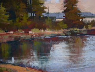
My first thought was COLOR. The colors of the flowers were wrong maybe? So I changed and added more purples. No that was not it. Maybe it was the colors of the grasses. So I changed and added more greens to the grasses. No the painting still felt wrong. Then it hit me.....it wasn't a color problem at all. It was a COMPOSITION problem!  The top two flowers were exactly the same size and height. It threw everything off.


flowers are the same size and height....boring. I brushed out the flower on the right


Often this is the case. The color is not the problem. There may be a problem with the underlying design/composition. Or there may be a problem with the value structure....especially spotty values. We turn to color to 'fix' the problem and we end up overworking the painting and creating a dull lifeless painting by filling the tooth of the paper and over blending.

So I took my own advice and made a change to the design. I brushed out one of the flowers and repositioned it a bit higher and made it larger. I added a taller flower on the left and a couple of bumblebees for interest and movement.

brushing out the offending flower


The slight change to the design was what was really needed. Not a change in color or value. The problem could have been avoided with a better plan. In this case I did do a thumbnail but my brain took over and decided to rearrange the flowers! I'm glad I remembered to check the composition before I did anything more drastic to the colors!

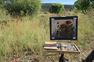
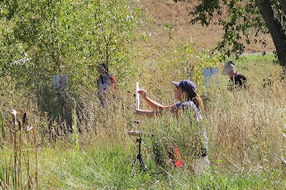
***Newsflash**** We have a couple of last minute cancellations for our plein air workshop in Blue Ridge Georgia this October 2-4. I will be team teaching with Marsha Hamby Savage and it will be a great workshop. Let me know if you are interested!


My Choice for Watercolor Underpaintings

$
0
0
'Jewels in the Wheat'              11x14             pastel              ©Karen Margulis
available $165
 It was never my favorite technique. I admired the wonderful watercolor underpaintings by Richard McKinley. And even though I bought good watercolors and practiced...they still left something to be desired. I just couldn't seem to consistently get the intensity and punch I wanted.

I know that practice has a lot to do with success. Honestly I never spent much time improving my underpaintings. It may be part practice but the choice of materials also has a lot to do with success. The enjoyment of the materials and process also leads to more practice.

I have discovered a new option for doing watercolor underpaintings. 
Cretacolor AquaBriques.

A vibrant watercolor underpainting using Cretacolor Aqua Briques


I discovered them by accident at an art materials fair. The price was right so I decided to give them a try. I fell in love with the intense bold color I was able to get with them. You can use them like traditional pan watercolors or you can actually pick up the brick and draw or color with them and then wet with a brush.  The colors are perfect and mix easily to create wonderful underpaintings.


Aqua Brique is a solid water-soluble block of color used as a traditional watercolor cake or for drawing dry or wet. Use on wet paper for subtle watercolor effects or draw with it dry and apply water with a brush. Special pigments ensure luminous colors, outstanding water-solubility, and exceptional lightfastness.

About today's painting: This is a scene from the wheat (barley?) fields in Normandy, France. I discovered this wonderful vibrant patch of purple thistle growing at the edge of the field. They sparkled like jewels against the golden wheat. 11x14 on white wallis with Terry Ludwig and Diane Townsend pastels.

Behind the Scenes of a Pastel Workshop

$
0
0
'Quiet Cove'              18x24                  pastel                 ©Karen Margulis
purchase on Etsy $450
I had an awesome weekend in Charlotte North Carolina. My demo and workshop for the Piedmont Pastel Society had been on the calendar for a year so I was excited to finally have the chance to share with them.  The topic we chose was color....Cooking with Color....Moving Beyond Local Color. My goal was to share ways that  I use to help my color choices be more interesting yet still harmonious.

I was hosted by the program chair, Deb Rasberry, a very talented artist and wonderful host. (thank you Deb!) The day of the workshop was beautiful. Its a good thing because we were locked out of the venue and almost had to set up outside!  But the door was opened just in time and the program began as scheduled.

I did three demos for the group. Each one illustrated a different aspect of how I work with color. I'd like to share each of the demos with you this week. I'll start with my last painting!

The demo painting after 15 minutes  18x24    Uart 500
 Since we were Cooking with Color....it was a given that we would use color schemes or 'recipes' for a painting. I issued a challenge exercise. The artists were given one of the tried and true color schemes and they had to choose a limited palette based on the scheme for their painting.  We had the typical schemes such as analogous, complementary and triadic. But also threw in a few unusual schemes such as split complimentary and secondary triad.

My demo was based on a Tertiary Triad of red-orange, yellow-green and blue-violet.

The planning board
 Part of the challenge was to make a plan for the painting. In my demo I shared my planning tools. I began with a black and white thumbnail and a color study.  To select my colors I developed a color recipe worksheet. This allowed me to keep my palette limited and with the range of the color scheme.  The artists were given a color recipe worksheet to help them work out their palettes.

The demo palette
The workshop was so much fun but not long enough! I only had four hours and I had so much to share. I decided to make this last demo a quick one so I allowed only 15 minutes to paint. It was enough to get my point across. (see photo above)

finished in the studio
When I returned home I set up my demo paintings and put in some finishing touches. I spent another 30 minutes on this painting. I worked on the trees and sand and refined the sky and reflections. I kept true to the tertiary triad color scheme.

close up detail
Al of the artists had an hour to do their color scheme exercise. Everyone did a fantastic job. I was happy to challenge this talented group of artists! It was truly a wonderful day!

More behind the scenes reports this week!


My Thoughts Behind a Workshop Demo

$
0
0

'Violet Mood'               18x24                pastel                ©Karen Margulis
purchase on Etsy $450
I might as well have been in my studio. I paint demos the same way as I paint for myself in the studio. It doesn't matter if there is a big crowd or just a private student.....I go through the same steps.  I plan the painting, I choose my pastels and then I just paint....but I also talk.

One of the things I strive to do in my demos is to be very clear about everything I do in the painting. I want to share my thoughts about each mark I make and each color I choose. So as I paint I am conscience about sharing everything I am doing. It is easy for me because I do the same thing in my studio!

I have a dialog with myself during every painting. I don't talk out loud though. It is a dialog inside of my head. I go through the steps I want to take. I ask myself questions. I remind myself of the basics and not so basics.  Here are some examples of the things I talk about with myself:
  • After the darks, next comes the lights. Work on the sky. 
  • What kind of sky do you want?
  • Make sure you put the colors in the water.
  • Where is the light source?
  • Have you created depth? How can you exaggerate the depth?
  • It's not light enough, how can I make it look lighter?

I admit, when I am in my studio I sometimes  get to a point in a painting here the chatter stops and I just respond to the painting. Having the plan and knowing where I want to go helps. I pick up the dialog when it comes time to make the finishing marks. This inner dialog helps me express what I am doing out loud when I need to!

planning board for the demo painting
 Today's painting is the first demo I did for my presentation and workshop for the Piedmont Pastel Society. It was so much fun to interpret this scene in a new color palette! Painting done on Uart 500 with an assortment of Terry Ludwig, Mount Vision, Diane Townsends and NuPastels.

preselected pastel palette
 Do you talk to yourself when you paint? How does it help?

Simplifying Trees

$
0
0
'Secret Grove'               8x10               pastel              ©Karen Margulis
painting available $145
 It suddenly hit me yesterday when teaching a private pastel class. We often make things more complicated than they have to be. From everything to setting up and starting a painting to the actual painting process itself...it is always a challenge to keep things simple.

Take trees for example. I avoided painting trees for years because I believed them to be too hard....too complicated. I didn't know how to simplify them. I didn't know how to simplify anything involved with painting. I wish I had pictures of the huge cart of supplies I would haul to pastel class! Live and learn!

Trees don't have to be complicated. They are just shapes after all. Once I learned how to simplify a tree into a basic shape and then carve and mould it like it was a lump of clay, painting trees became doable. Now I enjoy painting trees. Starting and keeping things simple has been the key.

2.5 x 3.5 color study   pastel

Ideas for Simplifying Trees

  • Look at the overall shape of the tree. Is it oval? Square? Round? Triangular?  Does it have lots of little section of foliage?  Block in this big simple shape.
  • Pay attention to the silhouette of the tree....If it was just a big flat shape what would the outer edges look like? 
  • Make sure the shape you block in for the tree is an interesting shape. You want an interesting positive shape as well as have the shape around the tree (negative space) be interesting.
  • Don't let the symbol your brain has for a tree cause you to make a plain, boring and orderly shape.
  • Observe carefully. Be a good observer of trees. Pay attention to how they grow, what kind of foliage do they have? Where do their branches come from?
  • Practice, Practice and practice some more. Don't avoid what frustrates you. (but don't obsess about it either, balance practice with difficult subjects with subjects you have success with.)

Painting notes:  Today's painting is on Uart 500 with a value underpainting/alcohol wash. I used Terry Ludwig pastels. The texture is the result of workable fixative.

Tips for Painting Large Pastels

$
0
0

'Surrounded'               18x24                   pastel                  ©Karen Margulis
click here to purchase on Etsy  $350
 It's fun to be the teacher. I get to ask my students to do things they might not otherwise do. I remember that one of my  college professors did this. The class was children's literature. He assigned us a project that involved interviewing our family and writing a family history. He admitted it had nothing to do with the course but he knew we would value the results. I cherish the interviews I did with my grandparents and I cherish my book! I am grateful to that professor.

So I hoped my class wouldn't be too mad at me for assigning a day to paint large! I was also hopeful that they would value this exercise! I was excited to see everyone come to class with their 18x24 paper attached to big pieces of foamcore. This was going to be fun!

2.5 x 3.5  quick color study
I have a very talented group of artists and I had faith in them. I knew that they would do well with a larger scale painting. Some had never painted larger than 8x10. I was right. Midway through the class the paintings were taking shape and looking great.  And within an hour and a half, most were just about finished. The paintings were awesome and I think I have some big painting converts!  Here are some of the tips we discussed:


TIPS FOR PAINTING LARGE

  • Planning is the key! Don’t begin painting without a plan: concept and black & white thumbnail, then color choices.
  • Choose your palette in advance. 
  • Do a small color study to test your palette
  • HAVE NO FEAR!
  • Start with an underpainting to get a head start and use less pastel. I like Mount Vision pastels for large painting block-in.
  • START BIG: paint the big shapes first. Keep things big and simple for as long as possible.
  • Save the details (decoration) for the end
  • MOVE! Allow your arm and whole body to get into the painting. Think Big bold strokes.

Permission to stop after about 20 minutes


Evaluating the painting and writing down the changes to make

I have not addressed the mechanics of painting large pastel paintings.....what kind of support? To mount or not to mount? How to frame?  I am compiling information for a future post so I'd love to hear from you large scale pastelists! Please share your tips if you'd like!

A hard working and talented group of artists!

My Favorite Tips for Painting Foregrounds

$
0
0
'A Moment of Silence'           9x12             pastel            ©Karen Margulis
purchase on etsy $145
I am often asked about handling foregrounds in a painting. How do we paint an interesting foreground without putting in too much?  Working from photos makes it even more challenging. We see all of the grasses and 'stuff' so it is hard to know how much to simplify.
Foregrounds in a landscape can give me fits.  I don't want to make the foreground too busy and detailed  or it might stop viewers from moving beyond it.  I want to invite viewers into the painting.  In my hesitation to put too much stuff up front, I am often left with a big boring foreground area. How much is too much?  It is a dilemma. But I have a few tips!

  • Plan the foreground area. I try to visualize what I want to happen in the foreground. How will I break up a big empty space? How will I arrange the elements?  How can I use these elements to lead the viewer through the painting?  If I wait and try to wing it I don't have as much success than if I had an idea of how I will treat it.  I sometimes like to block in a path of dark that will get covered up but will subtly move the eye back into the distance. Water and pathways can be designed to lead the viewer into the painting.
  • Less is More when it comes to grasses and flowers and other bushy stuff. Keep in mind that our brains will fill in the missing pieces if we suggest just a few. A few blades of grass or flowers placed in the right places are more effective than worrying about putting in every blade of grass. Be mindful of where you plant things. Avoid putting in random flowers. Put them where they add to the painting. Place your grass blades carefully....every mark needs a purpose. 
  • Let the underpainting do the work.  I love leaving the underpainting showing in the foreground. Letting this area stay a bit unfinished only helps to draw the eye into the inner part of the painting. The edges can be left unfinished.
  • Don't give up on a foreground that isn't working. Some of the foregrounds I am most pleased with come from the second or third attempt. If my foreground ends up too busy I will often brush it out or spray it with fixative or wet it and try again. This often gives me a textured look that suggests grassy stuff without having to paint them!  (I sprayed this demo with workable fixative)
Do you do anything special to deal with a boring foreground? I'd love to hear about it!

Inside My Head: Thoughts about a Painting

$
0
0
'Take Me There'              9x12               pastel                 ©Karen Margulis
purchase here $145
 Inside My Head: This is the name of my new blog segment. Once a week I will attempt to share a painting along with my thoughts about it's development. I'll share the things I think about when starting, working or resolving a painting. I hope you will enjoy!

Today's painting began as a demo for a private student. She is a very talented portrait artist but wanted to include landscape backgrounds in her portraits and figurative work. She needed some quick landscape basics.  My goal for the demo was to illustrate the principles of Aerial Perspective...creating depth in a landscape and ways to suggest details rather than paint them in a detailed fashion. The goal was to give her the tools she needed to have a suggested backgrounds that do not detract from her figures.


I selected a photo which depicted a simple landscape with a few big shapes. Sometimes the simplest landscapes are the trickiest. Deciding how to make it interesting without putting in too much detail is the challenge.


I decided to use Canson Mi-Teintes paper in Moonstone for this painting and blocked in the shapes with 4 values of red orange. I knew that I would have to exaggerate the effects of aerial perspective in this scene to create depth. If I copied the colors in the photo my painting would most likely look flat. Notice how the colors in the photo appear the same from front to back. I made the field in the distance lighter and cooler, even adding a distant blue landmass. I staggered the trees using slightly different greens in each tree.

I stopped the demo at this point (see above photo) but I knew the painting was not finished. I worked on it for about 30 minutes after the student left.


I decided that the painting needed more texture. The foreground was a big uninteresting shape. I wanted to make an interesting lead in to the painting with out overdoing the grasses and other foliage.

  • I sprayed the foreground and trees with workable fixative. This allowed me to build more layers of pastel. I put in more darks and added some peach and lavender.
  • I revisited the background. I felt that it needed more punch and few distant bushes or trees. I added a nice heavy mark of yellow orange around my focal trees.
  • Then back to the foreground. It still needed something. So I sprayed more fixative letting it dribble. I love dribble texture. 
  • I added some light flowers...actually dried weeds. I placed then in a way that helps direct the viewer to the trees.
I was now pleased. I always forget just how much I enjoy working on Canson paper. It has a nice soft touch which lends itself to quiet landscapes.


How to Create a Mood with Pastels

$
0
0

'The Many Moods of the Marsh'                9x12                pastel           ©Karen Margulis
click here to purchase   $145
The marsh was very moody that year.  It was chilly even for late October. A cold front was hanging out causing dreary weather all week.  At least it would be considered dreary by many. I found it to be moody and I embraced it. As long as I had my warm clothes and a heated cottage to return to, I was fine exploring the many moods of the marsh.

I was drawn to the quietness of the marsh under it's blanket of mist. I was drawn to the softness of the colors. I especially loved seeing how the muted colors of the sky allowed many overlooked colors to come alive. But how to capture these colors in a painting? I wanted to paint this moody marsh!


a muted underpainitng 

You've probably heard it before. In painting, value provides the structure and form but it is color that provides the emotion in a painting.  I would need to find the colors to express the moodiness.  We might think that dreary gray days would call for gray pastels. That is true.....in a way.

I think of gray pastels as GRAYED down colors. That is colors that are neutralized or muted yet still retaining color. I avoid any gray pastel that is made with just white and black which is not a very interesting gray.

To paint a moody marsh I would need to choose muted colors! What colors would work?

Back to the idea of value doing the work. I could choose any colors as long as the values were right. So all I had to do was choose some muted colors in the value range of my scene and I should get moody! I selected 4 values of pink/mauve for the underpainitng. It was the perfect choice. The neutral. grayed down pinks gave me the mood I wanted and allowed the touches of green to really pop.

What other underpainting colors would work to create a moody landscape?

Whisper and Shout....Making Marks with Pastels

$
0
0
'River Crossing'                18x24               pastel               ©Karen Margulis
available $450
"It sounds like you are no longer whispering" a student observed as I worked on this demo. It was a great observation. I was no longer applying the pastel with a gentle light touch. I was forecfully pushing the pigment into the paper. I was no longer whispering with my pastel....I was shouting.

At the start of the demo I stressed the importance of applying the pastel with a light touch. My focus is on remembering that the right touch is a light touch. Applying the pastel with light whispering strokes will allow for more layers and more interesting build up of color.

Whispering Mark
Most of the marks I make when painting are with this light touch. I pretend like I am painting with a feather....if I press too hard the feather will break so I keep the pressure light. A light touch allows the colors underneath to show. Our eyes can then blend the colors to make an interesting passage. Look at the photo above....the light layers of blue allow the purple underpainting to provide interest.

Sometimes a light touch is not enough. Sometimes a heavier touch is needed. A shouting mark is called for.

 
A Shouting Mark
 As my student noticed, I had shifted from my whispering marks to more powerful heavy marks. These are marks applied with heavier pressure. The paper underneath is no longer visible.  I use a heavier touch only when I know it will be the last layer or mark in that part of the painting.

Heavier marks can be done at any stage in the painting but they are typically my finishing marks....done at the end of the painting . Shouting marks often create harder edges. They are often my spices....marks of an intense color, or a darker or lighter mark and often near my focal area.  When I make a mark with a heavier touch I make sure I make it with authority. I shout!

Mark making in pastel is like brushwork in oils....we all have our own unique personal calligraphy. I like to whisper and shout with the side of my pastel. What types of marks do you like to make?

When Less is More....Choosing a Limited palette

$
0
0
'High Tide'             12x18               pastel                ©Karen Margulis
purchase $165
Do you ever feel like you don't have enough pastels? Does there always seem to be a color missing? Do you worry about keeping track of your favorites and running out? Is the answer is yes then know you are not alone! Surely there is some kind of chemical in pastels that cause us to crave more.

I have hundreds and hundreds....(maybe thousands :0 ) of pastels and yet I just ordered a few more. It seems we can never have enough.  But we really don't NEED as many as we WANT. Sure, it is nice to have every color available to us but we can paint a good painting with a very limited palette.

The key is Value. As long as we have a range of values from dark to light we can paint anything. It might not be the exact color palette we would have liked but the painting will still 'read'.

Here is an exercise to help prove this idea. I allowed myself just 17 pastels for a painting.

17 pastels comprise my limited palette 
  • I limited the value range for a simple marsh landscape to just four values: dark, light, middle dark and middle light.
  • I choose just four pastels for each of the four values. I selected the pastels primarily by value. I did select some warms and cool colors in each section but this was actually not planned. I was trying to choose random colors.
  • While the colors I chose were somewhat random I did try to choose colors that might work for a green marsh. Being limited to 16 pastels made it challenging.
  • I selected one extra pastel for my spice. (the bright yellow-green)


Painting with a plan = a more painterly painting 
Before I began the painting I did a small black and white thumbnail sketch. I wanted to simplify my subject into a few masses and assign each shape a value. This made it easier to decide where to place my 16 colors....darks went in the dark shape, lights into the light shape, etc. It was as simple as following a map.

An interesting thing came of this exercise. I did two paintings with the same 17 pastels and even with this limited palette I was able to create two different looks to this same marsh.


'High Tide II'          12 x 18         pastel             ©Karen Margulis  $165
 Sometimes Less is More. This  exercise will prove it. It is a good lesson to know we don't need as many pastels as we want.....but don't let that stop you from placing your next order!

A Quick and Easy Start: Pastel Painting Demo

$
0
0

'Simple Beauty'                5x7              pastel                  ©Karen Margulis
click here to purchase     $75
I needed to do a quick painting. I was testing a new technique. More on this tomorrow. I am in the middle of packing supplies for two workshops. I didn't really have time for a larger more involved painting. So I turned to one of my favorite ways to start a pastel painting. It is quick and it is easy. Enjoy the demo photos and commentary!


I begin on a piece of toned Uart paper 500 grit. I am working small, 5x7.  I do a quick sketch with a piece of dark blue Nupastel.


Normally I take a few minutes to choose my palette. This time I decided to use a tray of pastels that I had used for a larger painting last week. I had not yet put them away and they looked like they would work for my subject.


I begin by blocking in all of the dark shapes with a dark blue Nupastel #305


Next, I block in all of the light shapes. In this case that would be the sky. I use a pale peach.


Next I block in the area of the most intense color. This would be the bright section f golden marsh grass.


The next step is to fill in the rest of the paper with a medium value color. I chose a burnt orange to give some warmth to my Autumn marsh.


At this point I have blocked in the entire painting with the extremes. I know what will be dark, light , middle value and intense color. I develop the tree first with some cool greens in the shadows and warm greens in the sunlit side.


Next I develop the sky with a few light pastels....I use blues and peaches and creams. It is hard to see in this photo. I use the cream to make a few sky holes in the tree.


I decide to spray the foreground with some workable fixative so I can get a little texture. I want to suggest the scrub grasses and bushes with just a few strokes. Now it is really dark!


In this photo you can see where I am placing some lighter greens and peaches over the darkened foreground. I added some layers to the distant golden grasses including reinforcing the intense gold of the underpainting. I also add light to the tree with some warm yellow greens and oranges.


As usual I forget to take a photo as I am finishing the foreground. It was just a matter of adding a few grasses and some marks to indicate blooming weeds. I thought I was finished so I signed the painting. I put it in a frame to evaluate it and felt that the tree holes were to regular and the foreground needed a few more spices. I put it back on the easel for those final marks and then I was done!


A New Way to Tone Pastel Paper

$
0
0

'Summer in Finland'            5x7             pastel              ©Karen Margulis
click here to purchase $75
Sometimes I just don't want to think. I don't want to think about underpainting colors or the best way to start a painting. Sometimes I just want to paint directly....no underpainting. No thinking.  I find that a middle value paper makes the best choice for these times. A nice warm toned paper allows me to paint directly without worrying about covering up a light or white paper.

I find that the light bits peeking through my layers can be distracting and a mid value toned paper helps me avoid the light bits!  If bits and pieces of the middle value tone peek through it is more pleasing. In fact it can unify and harmonize the painting.

Of course we can buy colored pastel paper and I do. But sometimes I want to use my favorite paper Uart, but I want it to be more of a middle value. Now I can!  

Art Graf pigment square....unusual and amazing!

I was introduced to this new product at the recent IAPS convention. My friend found them at the trade show and insisted that I have a look. I am glad I did and I am glad I bought the set.  These squares of rich water-soluble pigment create a most wonderful toned paper. And a little bit goes a long way!

They are thin square shapes like tailor's chalk only they are not chalk. They are not pastel either. In fact they feel a bit waxy. But they work like a dream to tone paper. Read more about them here:


It takes very little pigment to create a rich tone.  I tested all 6 colors on Uart sanded paper. I used the side of the Art-Graf to color the paper....lightly!  A brush and some water is needed to liquify and spread the pigment. It took some practice to figure out the right amount of water. More water equals a lighter tone. I got some drips and bubbles on some of mine because I was impatient. I liked the effect though!

I even mixed more than one bock on the same paper to make a custom color.  It was great fun and I loved the results.


 How does pastel react to the toned paper? I am happy to say that it was a great marriage. The pastel responded perfectly. The painting at the top of the post is on the sepia toned paper.  The pigment of the Art Graf did not fill the tooth of the paper. I am thrilled!  I am looking forward to using them to tone paper for my upcoming plein air workshops!

Tips for Working on Canson Paper

$
0
0
'Forest Reverie'            9x12             pastel             ©Karen Margulis
purchase here $150
 It's the paper we love to hate. It is often the paper we use when we first discover pastels. Canson Mi-Teintes paper. It is inexpensive and readily available. We often choose it over sanded paper because of these reasons. It is the 'training' paper of choice. But when we discover sanded paper it is often hard to go back to Canson.

I happen to love Canson Mi-Teintes paper. It wasn't always the case. I struggled with it. It seemed as though my colors weren't as fresh. I filled the tooth too quickly and my paintings quickly turned muddy and dull. I stopped using it and turned to sanded papers.

Curiosity and seeing other wonderful work done on Canson encouraged me to give it another try. This time I was ready for it. I had learned more about pastels and refined my touch. That was the key! Now I understood how to get the effects I wanted. I loved the soft feel to the paper. It is now one of my favorite papers.

Give it another try! Here are 3 tips to get you started:


 1. Choose the correct side.  Canson has a smooth side and a bumpy side. The official correct side is the bumpy side. Most pastelists prefer the other side which is smooth. If you like a regular texture throughout your painting then you want the bumpy side. If you don't want any texture choose the smooth side. TIP: Hold the paper under a light to better see the little dimples of the bumpy side then tape it down right away! (before you forget which side you want)

2. Work with a LIGHT TOUCH. Canson paper does not have much tooth or grabbing power. It is easy to get too much pastel on the paper. When that happens you are finished! The more you try to add the muddier the painting will be.  If you start the painting with a very light touch and whisper your pastel strokes you will be able to build more layers. Let the tone of the paper show through. If you can't see the paper in your beginning layers your touch is heavy. For more layering... whisper don't shout.

The heavily applied pastel looks thick and muddy. The lightly applied pastel looks light and airy.
3. Use Softer pastels. You can certainly use hard pastels such as NuPastels and Rembrandts on Canson but they don't give you the same look as the softer pastels. I have more success with softer pastels such as Terry Ludwig pastels.  Diane Townsend pastels work especially well since the pumice in them opens up the paper.

A light touch with softer pastels on the smooth side of the paper is my recipe for success.

Bonus tip: Try lightly sanding the surface of the paper to rough it up some and provide more tooth.

Here is some information about Canson Mi-Teintes from the Canson website:
Canson® Mi-Teintes® is a pulp-dyed colour paper that has won worldwide recognition for its qualities. An authentic art paper: it is gelatine stock-sized which limits the absorption of pigments in order to show colours at their best.
It has the highest cotton content (more than 50%) on the market, combining mechanical resistance and a sensuous feel. In addition to its qualities as a drawing medium, Canson® Mi-Teintes® complies with the ISO 9706 standard on permanence, a guarantee of excellent conservation.
Furthermore it has the advantage of having a different texture on either side: a honeycombed side characteristic of Canson® Mi-Teintes®; and fine grain on the other.
It boasts the richest range of colours on the market, with 50 light-resistant tones.

Quick Studies on Canson: A Recipe for Fun!

$
0
0
'Mushrooms Ahead'             9x12               pastel             ©Karen Margulis
available $150
 All you really need is a piece of paper and a few pastels.  Sometimes you just want to keep things simple.  I love the versatility of pastels. I love all of the wonderful techniques we have. Who would have believed we could paint with vodka and pastels!  But we can...and it is a lot of fun.

Our choices can be overwhelming. And sanded pastel paper can be expensive. Wouldn't it be great to sometimes just take out a piece of Canson paper and a few pastels and paint a quick painting?  No big plans. No messy underpaintings. No big expense.  Just pure expression on paper. Like today's painting....a few pastels on Canson paper.

I like to go back to basics sometimes. I like to do quick studies on Canson Mi-Teintes paper. Just for fun and for practice. I am always trying to get in my Miles of Canvas!  In my latest digital Demo Download I share my approach for a quick study on Canson.   The demo is available in my Etsy shop for $6. You can view in online as a PDF or print it out and follow along.


a screen shot of the Demo download

Here is an excerpt from the demo:
Like many artists new to pastels, I first started with Canson Mi-Teintes paper, someNuPastels and some Rembrandts. And like many I struggled with this combination. Icouldnʼt get the rich colors that I admired in so many pastel paintings. Mine were muddyand dull. Once I discovered sanded papers and softer pastels I didnʼt buy any more.Canson paper. I decided I didnʼt like it. I am so glad that I decided to give it another tryafter seeing the work of several artists who do beautiful work on Canson.  


A photo from my demo
If this painting looks familiar to you from my recent YouTube video it is the same scene!  I painted two versions. The first was for the YouTube video and the second one was done as a Time Lapse video for my digital demo download.  You can see the time lapse video at this link:


The pastels I ised for this painting
I am excited to share these demos with you. I never have enough space on a blog post to share all I would like so these mini lessons allow me to share even more! Thank you!

Touching Up a Demo...The Importance of Fresh Eyes

$
0
0
'Blue Ridge Memories'              16 x 20                   pastel                 ©Karen Margulis
painting available $250
  I think I am going to make it my mission. I will find a way to make sure I evaluate every painting with fresh eyes. I will also make it my mission to make sure all of the artists who study with me do the same. I have some ideas and I will share them in a future post.

Stepping back  and getting a fresh perspective is one of the most important things we can do to have better paintings. Most of us don't step back enough. 

It happens easily. We are concentrating on the painting and everything else goes on the back burner. Or maybe we are sitting or maybe our space is too small. It happens to me when I am painting a demo. I often don't have enough room to step back and I am so busy talking that I forget!

just after the demo...before the finishing marks
Stepping back allows us to see the painting in a new way. We are no longer on top of it and the whole design of the painting becomes clear. We can more readily see things we should remove, soften, add. Stepping back gives our eyes a break. Fresh eyes see better.

The demo painting in today's post needed fresh eyes. Caught up in the narration of the painting I neglected to step back to evaluate the painting. That is fine for a demo since I was able to use it for my lesson. But it needed a bit more work to be called finished.

Once I returned home from the workshop I was able to take the time to figure out what was needed. Time away made it clear. Fresh eyes told me what to do:

  • Break up the steep diagonal line of yellow. I wanted the yellow flower mass to lead us into the painting but it was too steep and too direct.
  • Fix the big dark blob of trees. Add some lighter, warmer greens to give the tree shapes form. I also used the meadow color to carve into the trees and make them more interesting.
  • Simplify the flower masses and add a few thoughtfully placed detailed yellow flowers. Reminding myself to keep it simple!

the reference photo
 How well do you do at stepping back form a painting? Do you have any tips to share?

This 16x20 demo painting was done in the plein air workshop I just did with Marsha Savage in Blue Ridge Georgia. Despite the rain we had an amazing time. I am putting together a review which I will be posting so stay tuned!

Painting an Impression of Poppies

$
0
0
'Poppy Impressions'            8x10            pastel            ©Karen Margulis
click here to purchase $145
I've painted many poppies. It is always my goal to use as few strokes as possible. My desire is to suggest the petals rather than paint them with detail. I want to paint my impression of the flowers. I have a few tips that help me achieve this.

  • I don't draw the flowers before painting them. If they will be larger than an inch I will lightly draw a circle where they will be placed. If I draw the flowers I tend to want to color in the lines rather than paint. The smaller flowers can be easily painted on top for the greenery.
  • I often use a wet underpainitng. Having a wet and drippy underpainting forces me to let go of the perfection. It gives me some interesting colors and shapes to respond to. A wet underpainting is perfect for flowers.
  • I paint the flowers last. I build up the layers of 'dirt' and grasses and then put in the flowers.
  • I paint the flowers with blocky marks using the side of the pastel. 
  • I begin with the darkest color I want in the flower and slowly add the lighter colors on top.
  • Sometimes I add some linear calligraphy to my flowers and grasses as I did in the painting.
I am not always successful with my goal of saying more with less but the more I practice the easier it has become. Painting an impression of wildflowers/poppies will continue to be my goal and I will keep experimenting with ways to achieve this goal.

***Note that I will be teaching a workshop next weekend in Pecos New Mexico. There will be spotty /limited wifi so I may not be able to blog! If I can then I will!

Reviewing a Month Of Plein Air Workshops part 1

$
0
0

'After the Rain'             5x7             plein air pastel               ©Karen Margulis
sold

It has been quite a Fall! My workshop schedule began in September with wonderful workshops in Charlotte NC and Cumming, GA. I am now home after spending a week teaching and exploring in Northern New Mexico. Each experience enriched me as both artist and teacher. The artists I met were amazing and I now have so many new friends!  I begin the recap by revisiting the plein air workshop I taught with Marsha Savage in Blue Ridge Georgia.

We had all hoped for a gorgeous Autumn weekend in the North Georgia mountains. The hurricane had other plans.  As I watched the weather forecast go from bad to horrible I quickly prepared for plan B.

A weekend of rain didn't spoil the fun!
Marsha and I had reserved a room at the Blue Ridge Arts Association building in downtown Blue Ridge.....just in case. It's a good thing we did! The rain was relentless and heavy so all of the intrepid plein air painters had to set up their gear inside.

Everyone was fantastic about the wrench in the plans. Smiles, laughter, good spirits and wonderful art were the result. Marsha and I were 'tag team' instructors taking turns giving talks and painting demos. We both worked the room helping the artists at their easels. 

In the end we covered so much more material than if we had been outside. All of our teachings and demos were geared toward plein air preparation and how to work from photos as if you were painting en plein air.


Marsh show off the box of Terry Ludwig heart pastels. Thank you Terry!

Terry Ludwig surprised us all by sending a box of special heart pastels. Everyone loved them and they certainly brightened the day!


Marsha demonstrated trees and water. My demos focused on the 6 steps to a painting and field study. I also did a demo on the treatment of foregrounds. 

Intrepid plein air painters!

The third and last day of the workshop provided us with a small window without rain so we took advantage. Everyone set up outside on the grounds of Marsha's cabin on the Toccoa River. We both did a quick demo trying to summarize everything we had talked about all weekend.  The rain held off until lunchtime so at least we had some time outside.

Sharing time!

We finished the workshop with some show and tell and feedback. As everyone took turns and shared their work. It was clear just how much everyone had bonded. It was a wonderful and inspiring session of support for one another. We laughed and we cried. Friendships were made and goals were set. It was an awesome workshop!  Marsha and I enjoyed sharing and had so much fun combining our teaching styles. We can't wait for our next team teaching adventure in the Texas Hill Country in April!

My current workshop schedule is posted on my blog here:http://kemstudios.blogspot.com/p/pastel-classes-and-workshops.html

Reviewing a Month of Plein Air Workshops....New Mexico!

$
0
0

'Monastery View'        5x7            plein air pastel          ©Karen Margulis
available $50
All I can say is Wow! This past week's plain air workshop/retreat was everything I dreamed of and more!  Seventeen artists came together in the Pecos Wilderness of New Mexico to paint and immerse in art.  We were hosted by the BenedictineAbbey, Our Lady of Guadalupe in Pecos New Mexico. The abbey was truly in Gods Country. It was beautiful with more than a lifetime's worth of things to paint. The grounds had it all....mountains, rivers, ponds, beautiful trees including an apple orchard, meadows, adobe buildings. It was amazing!

Tobi Clement invited me to teach this workshop and I told her I would be an instructor and facilitator. I wanted to be sure that I understood each artist's goals for the workshop and help them meet those goals. At our meet and greet I was surprised and delighted to learn that we had several brand new pastelists and several artists new to plain air. I called them my freshmen and it was wonderful to see their growth over the course of just a few days.  The upperclassmen were awesome....working hard on their own paintings and helping to encourage and support the freshmen. What a wonderful mix to have!

'Pecos Fall'           5x7            pastel          $50


 One of the special things about this workshop was the fact that we all stayed right at the abbey. We had our own rooms and private bath in our own wing. All of our meals were provided and the food was simple and good. Living with one another amongst the beauty of the grounds created a bond that doesn't always happen in a workshop. We relaxed, chatted, laughed, cheered one another and left as friends. It was so much more than a painting workshop!


My demo on handling foregrounds

Each day began with a lesson and demo on a plein air subject. I often issued challenges and exercises to inspire the group. They had the morning to paint on the grounds. Another demo happened after lunch with the rest of the day free to paint. The weather was perfect (although a few clouds would have been nice for a cloud demo but I'm not complaining!)


A watercolor underpainting demo of some wildflowers....yes I find them everywhere!


Hidden artists! Yes I did see a few snakes!

The Pecos River runs through the grounds

Rivers and rocks

Our lodging at the Monastery even had some Queen Annes Lace!

The monastery didn't have TV's or cell phone reception. The internet room was in another building so most of us stayed off the grid for a few days. It was nice. We were tuned into nature instead of technology.  Each evening I planned some optional after dimmer entertainment. One evening I did a demo. Another evening we had Art Hack Night where we shared our favorite art tricks. We also had Show and Tell where we shared our work and had goal checks. It was so much fun to see everyone's progress over the week.

It was an amazing week in an inspiring place. I can't wait to do it again!

Evening entertainment with a reading from 'Art for Dummies'


Uses for a Pastel Study

$
0
0
'Golden days'             5x7            oil on panel             ©Karen Margulis
sold
It is time well spent. Taking time to paint small studies has a payoff. Not only do small color studies play a role in making a good plan for a painting, they often stand on their own as little paintings. I enjoy framing or matting small 2.5x3.5 studies. It is easy to find a space for a small piece of art. I also am finding my studies serve yet another purpose. Small pastel studies help bridge the transition between mediums.

Using a study done in your current 'comfort zone' medium as inspiration for painting in a new medium is the key to a more successful painting.

It is challenging enough to learn to be fluent in a new medium....what are the proper techniques? How do we get the tools to do what we want? Do we even have the right supplies? Technical concerns take up much of our efforts.

2.5 x 3.5 inches     pastel study
Using successful studies for subject matter allows us to concentrate on the techniques and the new materials. We remove much of the struggle that goes into painting. We don't have to worry about composition or choosing values and colors. We have already done that work in our study. Now we can pay attention to the new medium....how to mix the color or find the right color. How to manipulate the brush or the pastel. 

One less thing to worry about makes the transition more enjoyable! I have many simple pastel studies that I know will make good subject matter for practice with oils. The next time you want to experiment with a new medium consider using studies from your comfort medium as inspiration!
I can't wait to get back at the easel and paint from my studies!

close up detail
I have been out of town teaching for much of the past month. I wasn't able to blog as frequently as usual but I am back home now filled with ideas and inspiration. I look forward to sharing with you!

Viewing all 2266 articles
Browse latest View live